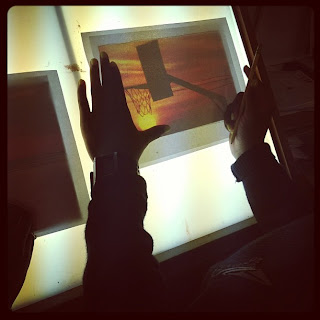
In continuing on with my endeavor to attempt to teach the 2D Design students how to paint landscapes from picture/2D image reference, They have officially entered the stage of the creative process that is Figure out & Focus. Most of them have selected their inspiration pictures - found via image searches on the web as well as combing through their own instagram and other personal image archives.
Each of the students is required to bring in their images - whether it is singular or it is a collective in order to create a composite painting - so that they can figure out a strong visual armature for the composition of their individual paintings. I have been running them through exercises every day of looking at masterworks to both read paintings/images as well as how to identify leading lines, forms, and differentiating contrasting values and colors in order to understand how they all relate to one another in order to inform strong and successful composition. For as complicated as it makes my job sound? They are getting it. They are really really getting it!
One thing I am having all of the students do for each of their designs is to make composition blueprints (for lack of better word). What they do is they lay a piece of clean paper on top of their inspiration image and then they have to draw on the clean paper all of the leading lines and simple forms (see above picture). Once they do that they have to identify and label the foreground, middle ground, and background as well as match/lay out basic colors in their blueprints...
I have shown them examples of images where there is a strong foreground, middle ground, and background as well as showing them images where there is just a foreground, subtle middle ground, and obvious background. I have also shown them how leading lines can steer the viewer's gaze to draw it into a picture/painting so that a person can't help but experience the visual depth in addition to perhaps naturally skipping their eyes (with rhythm) from object to object in the image. I have also been using the instructional book Mastering Composition (in e-book format so I can project the pages and visuals from the book onto the white board) to show the eight different types of composition and visual armatures that can be employed to help add more obvious structure and order to a painting.
We haven't discussed how to use color and value as a tool to create depth and space on a 2D surface but I will be showing them how to use complementary colors in order to make elements of a work of art appear as if they are advancing or retreating within the space/surface of the painting to make it appear to have a lot greater and more dynamic depth.


No comments:
Post a Comment