Thursday, April 28, 2011

Lesson idea: Infographics

Most of the students in the Digital Studio class (which is our advanced graphic design class) are seniors who will be graduating very soon and leaving class even sooner. They have maybe ten days of class left? (I should know this exactly as I'm reminded of the countdown EVERY DAY when they come in.) A graduation requirement at my school is called the Senior practicum. It's basically a year long research and exploration project where the seniors pick an area of interest and then they spend their senior year learning about. At the end of the year they present their research, job shadowed experiences, and self-selected project ideas (basically their research implemented) to a panel to be evaluated. The whole thing is pretty intense despite the fact that I've kind of made it sound very cut and dry.

For this project I decided to do something that could be useful to my mostly upperclassmen students in their senior practicums and end of the year research projects: Infographics made in Illustrator. This style of graphic art allows them to really explore and refine the amazing skillsets that they've each built for themselves and also present information that might otherwise be boring in a visual and much more interesting fashion. We looked at examples of infographics online and analyzed them to determine things that were liked and interesting looking and things that were otherwise not liked and poor in design. I stressed the use of fonts as graphics and arts and also emphasized the importance of using the drawing board space a little more effectively to create a more balanced composition better than what was done on the Illustrated Recipes we just did in class. All in all, these turned out pretty well. Here are some of the best ones I've seen turned in...


I like this project a lot and the students have enjoyed it as well. Some of them did some really funny flowcharts to guide decision making like "Are you a hipster?" and other such amusing topics but I didn't include those since they had student names in them and I just plain try not to showcase that kind of stuff on here if I can help. Privacy reasons and all that, you know.

WiPs: Mini Masterpieces

Our latest endeavor in Interactive Art History is Mini Masterpieces. We are using water-mixable oils by Reeves on mini canvases. The students each have have a 2 1/2 x 3 1/2 sized canvas and when their paintings are done, they will each be given mini easels to take home and gift to their mothers for Mothers Day. (Remember how much I love doing project that correlate with holidays? I think it makes things a little more fun.)

The two periods of art history we focused on for this time frame were the Renaissance through to Post Impressionism. I know. It's a huge block of time. And most serious art history buffs cringe at the fact that I shove them through this part of art history so fast and then spend most of the time making a project anyway but this class is meant to be more project based than lecture and research anyway. Our project after this will be a subtractive sculpturing piece (relief sculpturing with carvable foam blocks) and we will actually jump back to Medieval art for inspiration of that. *sigh* I didn't want to hop and skip around but the Black History month 3-Vu pieces took almost triple time and in order to get the mini masterpieces done for Mothers day it had to be done like that. Anyway. Moving on.

I haven't done many WiP postings so I thought this would be a good one to show. Each of the students picked a style or specific piece of artwork to draw inspiration from and then they tried their best to do a stylized version of that. Because impressionistic stylings are easiest for most of the students, there are a lot in that style. They used the tiniest brushes we had and they will end up putting a solid week of class time just into the painting alone. They are LOVING this project and every other class (advanced studio classes included) have openly voiced their wishes to join in. This is a project that is reserved for the Art History students alone though. I see it as one of those bonus projects that really helps reel the students into a class that seems boring since they see the word history in the course name.


They should be finishing up this project tomorrow so there is enough time for these to dry and cure and be taken home for Mother's day.

Tuesday, April 26, 2011

Lesson idea: Egg Art

As I've mentioned before, I really like doing projects of the holidays. At Christmas time I did faux gingerbread houses with the students of 3D (never posted those pictures but I will try to at some point) and for Easter I thought it would be fun to do a twist on the traditional egg decorating.

I did these last Spring and they turned out reasonably well more than these. This is mostly because last year I used a white glue based mixture for the paper mache and this year I used real paper mache mix. (Playbox brand if you are concerned about that type of thing and I would link it here but Blick doesn't seem to carry it anymore.) Next year when I do this I will go back to the white glue based mixture because it created much stronger egg sculptures for cut designs and ones that were heavily sculpted overall.

The students started with balloons and then simply covered them with 4-6 layers of paper mache. We let them air out and harden over a weekend (I believe) and then we embellished them with acrylic paint, model magic, and other materials we had laying about the classroom. The goal I communicated to them was to take the egg shape and use it as inspiration for something that was definitely not of an egg but lent itself to the natural shape of the egg. Because of how delicate the structures ended up being because we used the Playbox brand of paper mache, many of the egg structures/sculptures barely survived the design fabrication process. I was as bummed for the kids as they were for themselves. I really hate it when things tank and projects get ruined.

Here are a select few that "survived" through every step of this creative process. Something funny to note: many of the students picked the color yellow as a major element of their design. *shrug* Perhaps they were thinking all of the yellow would bring the sunshine to these parts stat. Well, it worked since it's not in the 80s and 90s here.


Tips and Tricks I learned this round:

  • Do I have to say this one again? Well I insist because I'm serious about how much of a difference it made: USE A WHITE GLUE MIXTURE instead of the powdered paper mache mix.
  • Count on at least 2-3 balloons per student because they pop/deflate themselves easily during the sculpting process
  • This is a nit-picky thing but I'm mentioning it. If you want a more natural egg shape, do a layer or so of paper mache and let it dry, deflate/pop the balloon, insert another balloon from the opposite end and inflate it and you will get a less balloonish and more long/oval egg shape. The students and I figured this out on accident.

Lesson idea: Sumi-E painting

This is from the world art study from the interactive art history class I teach. We looked at four different areas of world art - Asian, African, Native American (to include South American), and some European. I chose to do Sumi-E style painting because it was a project idea that would be easiest to fit into the week we have in the schedule for this chunk of time. Sad, but that's how I sometimes have to decide on things.

We used the Holbein Bamboo Brush sets, Yasutomo Liquid Sumi ink, and Kozo paper rolls - all from Dick Blick. Each student was given the following portions or paper - (2) 15" lengths, and (1) 30" length - and they had to submit their best brushwork on a minimum of 15" of paper. They practiced on community sketchbook pages (leftovers from what past students didn't want to take with them) and experimented with the medium. Once they were confident enough with their brushwork and understanding of the way the ink bleeds itself, they developed design ideas from examples they found online as well as from the book Japanese Ink Painting.

Throughout the creative process, I stressed the importance of holding the brush in the proper way like this:

And I also banned "personal music" (from Ipods and such things) for the week and played streamed sounds of nature from Pandora while they painted. The environmental changes in the classroom yielded exceptional work despite the fact that they fussed about the process overall...


A few kids have even told me that they went and got Sumi-E painting supplies to have at home and have continued with this style of art independently! I think it's something that they are seeing is a nice change of pace that has added balance to their very busy and regimented lives.

Here are some more amazing examples of what they did. Last Spring's collection pales in comparison to what is shown here. This is not to say that last year's students are more talented but probably more than I was more  experienced at teaching this style of artwork.


Last Spring I tried to do lanterns made of balsa wood and tissue paper and then I tailed it with this project but  I believe I will stick with this and only this for this course. It's an easy winner and offers the students and experience that they wouldn't otherwise consider for themselves.

Saturday, April 16, 2011

Lesson Idea: Egyptian art on real papyrus

In Interactive Art History, we move from cave art to Egyptian art. Every time we start a new period/era of history, we spend a day looking at a powerpoint presentation and looking at a number of pieces of artwork that will serve as inspiration for the project for that part of history. The students usually have anywhere between a week and two weeks to design and fabricate their projects and I try and push them through their work at a steady but swift pace since there is so much of art history to cover when teaching it in a project-based way. I believe we spent about two weeks total on these pieces and they turned out beautifully and so much closer to what our inspiration pieces were than when I did this last Spring. (Last Spring was the first year I did these so it happens that they get better year after year.)

Each student was given a sheet of real papyrus (ordered via Dick Blick) and then they created their designs by way of researching hieroglyphics and cuneiform writing, planning out their colors and making sure each element of their design was drawn correctly to adhere to the standards that we looked at. They used a mixed media approach that included acrylic paint, black sharpie markers, and Bic permanent marker sets (used before to create the faux-stained glass projects).

Here is a close-up of the textured papyrus so you can see the surface of their paper a little better. The picture was taken on a light table.


And here is are some of the finished pieces.


I think they turned out really well! I'm really proud of my students for investing themselves so much in this project. Now the real challenge is in hanging/displaying them in the gallery in a way that won't break the little budget that we have left. And art teacher's work is never done!

Thursday, April 14, 2011

Lesson idea: An Illustrated Recipe

One class I teach is called "Digital Studio" - basically it's the Advanced class in the Graphic Design set where the students learn the basics and a little bit more of vector drawing in Adobe Illustrator CS2. (Graphic Design focuses on Photoshop.) To set the record straight, I am not a classically trained graphic designer/user of Photoshop and/or Illustrator. I am completely of the school of self-teaching and though I'm headed back to school (graduate level for art education and praying for a start next Fall!) I'm likely going to continue being a "hack" of all things Graphic Design. But hey, I feel like I'm doing OK so, we'll just leave it at that and trust that  the good Lord will take care of all of the nitty-gritty. Anyway.

The basis of this lesson came from one of my favorite blog/website/graphic design thinktanks called They Draw & Cook. Basically you take a real recipe that would otherwise be ho-hum, give it a visual twist and VOILA! You've got two birds with one stone in the way of ART and DELICIOUSness!

The Digital Studio students are mostly juniors and seniors, highly motivated and disciplined students, and just plain awesome young folks that I get to hang out with four out of the five days of the week. (That's a regular class schedule for us - meeting four times a week for 55 minutes a shot.) The class starts out with almost a good month and a half or so of what I like to call "skill building" - basically, learning the ins and outs of Illustrator - and then we take off on creative binges of any I (or the students) can dream up! The self-portraits in cartoon/caricature style I posted a little while back were done by the digital studio students and these illustrated recipes were the next major projects after that...


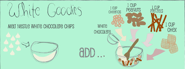
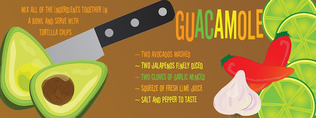
These three were some of the better ones designed of the lot but they all did a really decent job overall. I put them all together in a hardback book through Blurb.com (one of my favorite self-publishing companies!) and here is a digital preview of it.

Recipes for a Starving Artist by 2011 Digital Studio

(I did the cover design and overall design of the interior layout. The kids came up with the very clever name of the book.)

This was a great project for the kids to learn a little more about creating better composition and using words as art. They major project I've seen overall with them (while I've done preliminary evaluations/flip throughs of their work) is that they have a hard time using space correctly and they will group things all together in one spot while there is a large open space elsewhere on the drawing board. But as I said, overall they did pretty well.

The students also did a mini project right before these recipes where they did alphabet posters with self-created/stylized fonts and I'll post those in the coming weeks because some of them were very fun and clever! The project they are working on now is infographics and it's been a great follow-up to the illustrated recipes in that it forces them to take their design work to the next level by forcing them to pick design elements and composition that are that much more meaningful since their visuals are intended to present specific information AND it gives them another opportunity to work on the space issue I noted above.

Sunday, April 10, 2011

Classroom management

Not sure how you manage your classroom procedures but thought I'd share something I do in my class that has been amazingly useful...


Last year when I started teaching at my school I was incredibly challenged with dealing with a classroom that just wouldn't stay organized and/or clean no matter what I did. The problem? Well, by and large - ME. I was my own problem. This is because before I came to the high school level, I was teaching 6th graders! And jumping from middle school to high school is a BIG jump if you have never experienced it. And I wasn't used to working with students who were 1) capable of so much more responsibility and 2) a situation where it was completely fair and reasonable to expect them to do so much more. Was it fair to base a significant part of their grade on classroom participation and management of materials?

The short answer that I came up with: YES.

The long answer/explanation that I continue to use to justify my short answer: Being a good artist doesn't have to do with knowing what materials to use and how to use them. If you want good materials and tools, you have to take care of them!

The way I do it is this...

  • I identified (8) major areas of general responsibility/classroom management that could be fairly assumed by any of students
  • Every week I rotate the classroom roster so that each set of eight student gets a chance at managing their designated area for one school week. The next two weeks after they get a break and then they are up again.
  • Students are usually never assigned a specific designation more than one time and through the semester they will usually get every different designation at least one time.
  • Fifteen percent of their grade is dependent upon the completion of their classroom stewardship designation combined with their "general"/unspoken obligation to just plain do the right thing in the classroom as its called for
Each student's grade is broken down like this...
- 70% - Actual project work
- 15% - Stewardship/Classroom/Community contributions
- 15% - Daily Individual performance

I give students 50 points per week (10 points per school weekday) and a total of 450 points for each marking period at the start of each marking period and then I add/subtract to that number as it's necessary in the online grading system that my school uses noting the date that incidents occurred (for the good or bad/plus or minus) and I will readily add to a grade for the showing of good stewardship as much as I will subtract from it for negligence of responsibility. 

I post stewardship assignments a week in advance to give students a heads-up for their next stewardship assignment and the chart gets flipped at the beginning of every class. This system has worked out very very well this year and despite the fact that I felt like it was a little elementary in feel (in terms of classroom procedures) it's worked out really really well for my high schoolers and I will continue to use this system. It provides great accountable as I can always go back to any week (digitally archived versions are backed up on my computer) or any day if their are any questions but thus far? There haven't been any because everyone has really stepped up, not even complained since they aren't saddled with stewardship assignments every week and the chart being so specific helps the students hold each other accountable just as much as I try to myself. It's a good system.

Some things to note:

  • I work at a private/faith-based school so the use of the word "Stewardship" comes from what scripture asks us to do as we act in Christ-like ways
  • The idea of classroom stewardship and ways I figured out how to portion out the total grade actually came from watching the show about the Duggar family and thinking about their system of "jurisdiction" areas in their household upkeep and their philosophy of living in J-O-Y. In my classroom the jurisdiction is called stewardship and the J-O-Y goes along with Jesus first (70% - actual project work), Others second (15% - classroom/community stewardship), Yourself last (15% - Individual and daily performance)
Related Posts Plugin for WordPress, Blogger...