Wednesday, October 31, 2012

Doodle Rolls for half off? I'll take 30!!!

While the title of this posting and this posting might suggest I have suddenly become a compensated affiliate who is going to start hocking products at you, I assure you. This is no such thing and I am no such type of blogger. Rather, my long-awaited search for never paying full price for another product (I have been coveting) has come to an end.

Have you heard of the Doodle Roll? I think it came out sometime last year and I first saw it on my blog roll. Basically, it's a shrunken down version of rolled easel paper with a set of double-ended crayons all conveniently (and cleverly) packaged for the little artist who just cannot stop themselves from creating any and everywhere they might find themselves. I pretty much just described my child...

Coloring in the car on the way to Ontario, CN... Painting on the porch in Ontario... Drawing at a friends' football party event... and Coloring last evening at our new home art studio table while I queue up blog postings like this one. 


Do you have a kid like mine who cannot go any place without amusements? She is ALL ABOUT the amusements but she is not so into toys and rather she much prefers being able to be constructively creative and drawing, painting, and cutting & pasting more than anything ever. (Wonder where she gets all of this from?? *haha*)

In the past it's been enough to just give her the back of a restaurant placemat or old envelope I might have in my purse and a pen or pencil to doodle with but anymore she requires a little bit more to keep her focused and actively engaged. If she has a handful of her favorite coloring and drawing materials in her favorite palette though? (Right now it's pink, purple, bright blue, and "golden") Well... she will be very intently occupied for at least an hour if not more.

Anyway, last year when I stumbled upon the Doodle Roll I wanted so badly to get one/some for my kid but they actually weren't available for purchase yet. I mean look at how cool they are. I just love when people have awesomely creative and clever ideas like this and then they make them happen...


Eventually the Doodle Roll was available for purchase but they were much more than what I wanted to pay. (I have this shopping motto that goes like this: Never EVER pay full price.) I mean, regular price wasn't actually so bad but, at the same time, I am convinced that I can always save a buck or two if I simply hold out a little bit. It was hard to walk away from them but I did. And so? I do what I always do when I want something but don't get it. I mentally bookmarked the idea of the Doodle Roll and then just went about life.

Well(!) yesterday I was checking in on my email (we were one of the super blessed ones in the region who lost neither power nor wifi) and Zulily was selling Doodle Rolls!!!!! Even better? They were selling the party packs of 12 sets (and normally $72) for a STEAL at $35.99!!! I mean SERIOUSLY. WOW!!!!!! I ended up buying almost 30 Doodle Roll sets - add-ons for Christmas gifts for my nieces and nephews and then also enough for my daughter to use at her June art birthday party.

I have never bought from Zulily before (I have only recently discovered the amazingness that is social networking shopping like Groupon, Living Social, Uncovet, and Totsy) but because I have been a part of Zulily's distro and not yet shopped, I was able to cash in on free shipping on all that I ordered. Not bad, eh?

All of this being said, you can still get the Doodle Roll sets - either just one, one with refills, a couple of them, or the party packs for upwards of 50% off - depending upon which ones you buy. It seems that the more you buy - like the party packs - the greater percentage that you end up saving. HERE is the link to the 'Craft Time Collection' section on Zulily if you are interested in the Doodle Roll as well.


Tuesday, October 30, 2012

I will be cre8ting come January 2013

Have you seen this yet...


I found it by way of my blogroll on the legendary Kathy Barbro's site Art Projects for Kids.

I have no clue who/what is behind it but I think it's 1) BRILLIANT and 2) something I will totally do now that I have a much more workable home art studio for my family and I to use. 

(BTW, I will be giving you all a virtual tour of it as soon as I get the old studio space cleaned and organized - it will serve as the supplies room - and the new art supplies arrive via Fedex for my family to be surprised by.)(I cannot tell you just how excited I am about surprising my husband and daughter with brand new supplies!!! They are going to be BLOWN. AWAY.)

Whatever the case, that video up there totally rings true for me and in an effort to move out of God's way and more fully commit myself to living for Him and serving Him and CREATING as He created me to create, I am absolutely going to be jumping on the creative bandwagon movement. I hope you are too!! 

Monday, October 29, 2012

But now I see

Our own version of a hurricane inside of our house!
What a weekend it was for me! 

If you didn't know, my region (the DC metro area) is currently being hit by Hurricane Sandy. Schools, businesses, and governments started calling for closures starting Saturday but once Sunday rolled around? Well... all bets were off for most everyone in the tri-state area and cancellations were abound so much that I will be surprised if anyone is leaving their homes today. 

Despite all of the hubbub concerning the weather, I did precisely what I set myself out to do on Friday when I talked about how I needed some R&R. I mean, perhaps purging, cleaning, and reorganizing wasn't exactly restful or relaxing for a workaholic like me? It  may as well have been just what the doctor ordered!

I was able to do all of the aforementioned not just one or two rooms of my house but THREE of them!!! (I KNOW.) The goal was to make what would otherwise be the dining room the family art studio room and while it took some serious elbow grease the first picture (above) became the two pictures below in order to be completely ready to receive a wonderfully plentiful shipment of art supplies from Dick Blick sometime this week!!!

Not quite perfectly neat and clean but definitely a far cry from how it started.
My daughter is loving the studio table (that used to be our old dining room table) for all of  her creative endeavors.

The only big disappointment of the weekend is that because of Hurricane Sandy (or Frankenstorm as some of the locals have decided to call it), the art supply order for the home studio will likely be delayed. I mean, Fedex Home is usually pretty good about getting things where they are supposed to go on time (I mean, hello! Castaway was spot on with how good Fedex aims to be!) but I'm also trying to be fair here and say that I might not get the shipment tomorrow or even Tuesday the way it is slated to make it to me. *shrug* It's all in God's time and I am perfectly OK with that. 

Something amazing that I accomplished that I totally didn't expect to make happen? How about this...


It has been YEARS (I'm not kidding) since I have put myself behind the camera in order to get proper portraits done of my own child (I know. How shameful!) but it finally happened!!! In classic "mini-session" stylings, I was able to get all of the above (and then some) in less than 15 minutes in my own backyard with my child no less than 30 minutes from me getting her awake on Saturday morning. Doing it almost immediately after she woke up turned out to be clutch to ensuring that she was clean and shiny to look like how she does above. 

(o_O)

Seriously and truly... I have NO IDEA how I pulled it off. Well... the promise of gummy bears probably didn't hurt either. 

She is NOT a morning person by any stretch and her hair also (miraculously) does not look completely crazy. This means that I didn't have to overhaul any of the images in photoshop to see them as you do above to make them look completely portrait printing ready for me to use in the traditional holiday send outs for this year (that were ordered last night *GO ME!*) or for the grandparents to enjoy and print to their heart's delight. 

I guess I no longer can use the excuse that photographing my kid is such a chore and that's why I never do it. I guess it's true that when it comes to picking up the camera for the sake of perserving the memories and moments of my own family I really am that lazy. Well... lesson learned. The portraits (above of my daughter) have proven to me that so long as I am lazy, I will have less images to treasure the way I always provide to my photography clients.   

Anyway, I couldn't have asked for a more productive and relaxing weekend even with this being a Monday where I am waiting around to see if/when my power goes out and trying to resist opening the refrigerator and compromising the freshness of everything in it because that's always what happens when I am told that I can't open the fridge.

Hope you had a great weekend as well and you are NOT suffering from the impacts of a storm that is said to be 1) of historic magnitudes, 2) of epic proportions, and 3) the worst in many generations. 


Friday, October 26, 2012

Everybody needs a little time away... I heard her say...

Recognize the title of this posting? Are you a Chicago and/or Peter Cetera fan?

If you hadn't noticed, I have been keeping to a posting schedule of Monday-Friday since the school year started for me. My only reason for not posting on the weekends is that I am usually doing other stuff that is usually graduate school stuff but more recently has been photography work. I had a wedding last weekend, I have another wedding next weekend, and I had a family portrait session that was supposed to be this weekend but will likely be next weekend the day after I shoot the wedding.

The classic "What's in my bag" shot of all of my gear ready to go for a full-day of wedding shooting.
A screenshot of the culling process of some of the straight-outta-the-camera shots I captured from last week's wedding.

Yesterday I was doing my typical morning commute while catching up with my mom (we are both early risers) and we were counting our many blessings even despite the sadness brought within recent weeks of my grandfather (on my mom's side) going to be with the Lord last week and an aunt (on my dad's side) who is expected to pass on at any time now. 

Despite the fact that I haven't mentioned it, all of the aforementioned (and plenty more I will likely never mention) has me feeling wicked ragged these days. (I did some of my undergrad studies in New England so using 'wicked' in place of 'very' makes so much better sense sometimes.)

Something I learned long long ago is that I am not superwoman and I cannot do it all nor shall I try. Still, I am bad at remembering things and that's certainly one thing that I forget all too often. And then I get to a point in my life where I realize I have been working eight days a week with no end in sight and only because I made it that way. Pretty much I have only myself to blame for doing it like this and being this way. 

I am not going to say that I won't be posting next Monday or the rest of the week but I will forewarn you to not be surprised if that ends up happening anyway. Yesterday I joined three of my best girls for a bit of Happy Hour (I don't drink so I ate chocolate cake and a cup of soup - in that order) and it was so awesome. We call ourselves "The Unicorn Club" and it was so awesome to be able to get together with them outside of working hours. They do it all the time without me but they are always inviting me and for the first time yesterday I ditched out (for a little while) on mommy and wifey life and IT. WAS. AWESOME.

One of the other gals of "The Unicorn Club" got this for me and the rest of the unicorns. BEST. KEYCHAIN. EVER!!!!

Though I am kind of disappointed that the family portrait session originally scheduled this weekend got bumped to next weekend (or maybe the one after that), I am kind of excited at the fact that I will spend this weekend doing things other than what I have been doing with all of the different types of working I do. I really need a weekend to play hooky (if you will) and do the following...

Kick off the weekend with a little bit of "Friday Night Lights" action at my school's last home game of the year/season


Go to church but NOT to be running the projector (as pictured here) and rather sit in my favorite pew for some praise, worship, and wisdom of the sermons and messages from the amazing pastors and elders.


Prepping my home sweet home to be more of an art studio sweet art studio for my family!!! I have a very small studio for my own personal use but it was unanimously decided that it needed to be bigger so that all of us could create TOGETHER.

I am praying that taking some time for respite will help to inspire me and invigorate me so that when I return to work next week to wrap up this first marking period (all of my grades are due mid-week!!) I can do more and better of what I love: be a working and teaching visual artist, be a wife and mother, and be an active blogger.

Have a great weekend! Hope you will spend it participating in some respite as well.

Thursday, October 25, 2012

Ready, set, PAINT!!! | Set Design for "The Crucible"

The one thing that holds true for my job as a teacher of visual arts is that I never ever EVER have a boring day at work! The thing that is making my days exciting these days? Well, it's the set design and building for the annual Fall play. Last year my school did The Diary of Anne Frank and this year we're doing "The Crucible."

As with all things set design and building, time is of the essence and even when I work hard with my teammates (the faculty advisors, directors, and producers) and don't actually procrastinate and leave things to the last minute, it just seems like "crunch time" happens and I have to toss my daily lesson plans in order to facilitate things like set painting. That's pretty much what happened yesterday.

The view from the stage among the paint cans, paintbrushes, and sound equipment for our weekly chapel service.

While I will never voluntarily put myself front and center on stage, in front of the big bright lights for performance purposes, I will almost ALWAYS volunteer to be a part of the behind-the-scenes creative process of making the big performances happen. Last year we worked with some stage plans in order to create the set we had but this year? Well... the set design was kind of composited and maybe even improvised a little.

One thing I learned (from my department head and faculty director/producer/advisor for all things performance arts) is that the most successful set designs derive from the perspective of the protagonist of the piece being performed. For "The Crucible," I worked with the other two faculty advisors/directors/producers in order to conceptualize the inspiration for the set design. The inspiration was that the set would look like a rogue/alternate universe/reality that was minimalist and uncomfortable by how it made you feel when you look at it. (Does any of that make sense? I am terrible with explaining things with words sometimes. Obviously.)

Anyway, the creative direction (for the set) was established and then I sat and literally drew up the abstract ideas they had (the two faculty advisors) into a visual representation/plan that the set building team then took and turned into reality! So impressive that they took what I was only told to draw (which was pretty abstract) and then turned it into something real. Here are some sneak peeks of the different parts of the set at the students are painting and "dressing" it...


And at the end of day one this is what I looked like in all of my beautiful MESSY glory. Why paint with the paint you have been given to paint with when you can WEAR the paint you have been given to paint with. I guess you could say I truly get into my work and want to blend in with my surroundings...


The crazy thing about me being so a heavily painted is that this is not abnormal for me even on a regular basis outside of play season. I am pretty much always a walking mess OR a mess waiting to happen. *shrug* Such is life as an art teacher!

We have just barely a week to wood grain and detail every surface of the set and it might be the most back breaking style of effect painting I think I might ever have to do for the rest of my career as an art teacher/set designer and maker. It's all worth it though. I really do think so.

Wednesday, October 24, 2012

It's here!!! The Dream. Pray. Create. Lesson Planning Template!!!

It's here!!! It's here it's here it's HEEEEEEEEEEEEEEEEERRRRRRE!!!!

As I have said before, this year I decided to be a first year/sixth year teacher and it has absolutely transformed everything about my classroom. If you have already forgotten what I am referring to I will tell you again that it has all come from my implementation to do inquiry-based teaching with a teaching model I designed and discussed HERE.

Approaching teaching and learning in this way has done the following in my classroom: renewed me with fresh inspiration, empowered and encouraged my students to be more autonomous and personally accountable in their creative efforts, and given both me and my students much needed structure in order to have a working studio art classroom that is more like a "well-oiled" machine than I ever might have dreamed it could be.

I am calling this teaching model "The DreamPrayCreate Teaching method because I can't think of any other way to call it. *shrug* (Seriously.) Calling it "A Framework for teaching Visual Arts Education + The Creative Process" makes it sound so dry and official and while it has become a very official thing for me to use that certainly does provide an amazing framework for Visual Arts Education it jus seems like it could be called something a lot more colorful, imaginative, and inventive (in what it suggests it does for teaching/learning.

The template itself is not necessarily six pages (as seen below in the snapshot of the multi-page view in Microsoft Word) but when I typed it all out for the Our Common Threads | Intro to Printmaking lesson idea, it ended up being longer than the 3-4 pages it started out with in it's blank state.


I have (for you to download and use!!) both the BLANK version of this lesson planning template as well as a completely useable and fully articulated lesson plan for the Our Common Threads | Intro to Printmaking project. Both versions are being stored online in the Google docs folder I set up to be able to share documents with you all...

Regarding the visual formatting of the above documents, the word version of the Lesson Planning template worksheet should be downloaded and not just modified in Google docs because it is definitely off in how it is viewed via the Google docs web-based platform. The correct visual formatting is viewable only via the PDF formats for both the lesson planning worksheet AND the sample lesson.

I invite and welcome you to use both of them AND share them with others in an effort to (perhaps?) inspire, invigorate, and reshape the teaching and learning that happens in your art classrooms. Still though? I feel like this could work just as well for any other type of content-area as well so share it with your non-art education colleagues! What I have designed and created is something that definitely is indicated to be for a classroom/school of Christian faith, the section that indicates the connection to a Christian worldview could just as well be thought of us being a Character trait connection so that the teaching of Visual Art is a vessel for learning principles and values like integrity, perseverance, selflessness, etc.

As for me providing lesson ideas in the future in this format? I am undecided. This year is a curriculum review year for me at my school and while writing up everything in this lesson planning document for each of my lesson ideas would certainly align with the assessing and revamping of my curriculum area, well... I have a lot more to do for this process other than writing lesson plans (micro-level type planning) and I have to focus on the big picture and the long-term/far reaching goals of the visual arts program at my school. While I would like to say I am "that good" and I can both stand a little bit in one place while also making leaps and bounds in every direction, I am realistic in knowing that I cannot do it. Still, it doesn't mean that there might be some lessons/lesson notes that I won't sometimes present in this format. I mean, now that I have it it is certainly a lot easier for me to implement/use/share with you all so perhaps I need to just TRUST in the Lord that He will steer me and provide for me so that I am using it - especially if it is helpful for you all.

I see what I am doing as a little bit of collaboratively planning with you all and I am happy to do it as long as the Lord Almighty provides a way for me to do so. Let me know how you like this lesson planning template and/or how you think it could be modified to be more useful! I know I'm not perfect and so I am always open to constructive feedback of how to make what I'm doing better.

Tuesday, October 23, 2012

An armature for Visual Arts curriculum and instruction


While it's not ready yet, I just wanted to give you all a heads up of a very special something to come!

This year (at my school) it is curriculum review year for my content area and this is really informing my planning and teaching decisions that have largely contributed to my inspiration and motivation to create the inquiry-based teaching and learning method I have been using with my classes. Because I am also doing graduate studies in the Masters of Arts in Teaching program, I am learning the importance of having a good solid armature for my instruction and curriculum and really making an effort to plan ahead and NOT rely solely on teaching on the fly. I mean, definitely the ability of teaching on your feet and being able to go with the flow is important but ultimately? I know (for me as a teacher) I am much more effective in the classroom when I have really thought about what I am going to do before I do it.

All of that being sad? The above image is a sneak peek of what will be unveiled tomorrow so come back and see me then! I will have not only a little bit of an explanation behind the inspiration behind it but I will also have an empty/blank one for you to use (that can be downloaded and/or shared collaboratively) as well as one that is fully articulated and aligns with a lesson idea I did just this year with my 2D classes! This means that you will have my lesson notes for one of my project ideas!! See you tomorrow!!

Monday, October 22, 2012

Just for Fun: The no-sew Superhero cape | Give handmade

Do you sew?

Strange to lead off a posting (on here) with such a question but it occurred to me the other day that of all of the kinds of handmade arts that are out there, the kind that involves or requires sewing does not appeal to me. I don't know what it is about sewing but I am just really REALLY not into it.

Now, this doesn't mean that I haven't attempted to sew or like sewing in the past. I have! And pretty much every time I've done it, I have pretty much failed miserably.

Well, wait a minute... one time I DID succeed (in grand form) when I made a giant teepee out of PVC pipes and Harley Davidson fabric for my nephews for their Christmas/Easter present (no pattern - it was all improvised from pictures I found online).
So, correction: I can sew and I have done it in the past but usually it's for purposes of novelty and/or amusement and not usually things that can be/are intended to be worn.

Anyway, all of this sidetracking is my way of sharing with you all something I stumbled upon in my avoidance to sew (ever). I would like to introduce you to the No-sew Superhero cape!!!!! (see above for a picture of one)

To make the No-sew Superhero cape, you need the following supplies:
  • A crew neck t-shirt (this will be the cape itself) - any size but if you do something much larger than the person's standard size, you might have to cut the neck strap and treat it like a tie-on cape
  • A pair of sharp scissors that can easily cut through fabric
  • A marker or fabric pencil (to outline your cutting line) 
  • Things to embellish/decorate your cape - fabric markers/paint, sticker appliques, fabric glue etc.

And this is how you CUT (not sew!) a t-shirt into a pretty legit superhero cape! Check out this... the dotted line is the path that you need to follow with your scissors in order to cut the t-shirt into a cape shape...


And here are some actual pictures that I took doing this myself...


This cut line of the back view of the t-shirt - so the cape portion that flows down the back..
And this is a cut line of the front of the shirt at the neckline.

Something really important to remember when doing this is to not cut too close to the neck ribbing and leave a little bit of extra fabric outside of the seam (where the ribbing is sewn to the body/torso of the shirt) because the ribbing with a little bit of fabric (maybe a quarter inch?) helps to add structure to the neck strap so it's more comfortable to wear and lays nicer when it is worn. Also, make sure not to cut off the bottom hem of the shirt (in the back that is the cape part) because it helps to provide structure in the way of being a little bit of weight to hold down the cape. The hems of t-shirts are usually tacked with a serger so it should be an issue that the fabric unravels itself OR comes undone all that easily.

In theory, you could use a pre-printed t-shirt with a superhero graphic printed on it but I kind of like taking a plain shirt and embellishing it with fabric paint/markers, etc.

I did this with a whole summer camp of children (ages 4-13) two years ago for "Superhero week" and while it was a lot of prep work for me - making sure every child brought in OR had a t-shirt to begin with, pre-cutting or tracing out the cut-line for the younger kids, having all different types of embellishments (to make a sort of embellishment "bar") for the kids to go crazy with and decorate their capes! All told, I think we made over 150 capes that week at summer camp. It was pretty rad (in the words of my kids).

So there you have it - the No-sew Superhero cape!!! And if you didn't have a Halloween costume planned for yourself/your kids? Well... now you can be your own kind of Superhero and NOT have to deal with the pesky chore of sewing it. Last-minute doesn't have to be a pain, right?


Friday, October 19, 2012

Go Green with Google | Art Teacher Hack

I am not very good with my conservation efforts but I am always very envious of people who are. I mean if there is a (not full yet) recycling bin in the general area where I am  at the time when I could use it - like after I just finish ANOTHER Dr. Pepper - I have no issue putting my empty can in it! Mostly though? My "green" efforts only occur at my convenience.

(I know. I Know. I KNOW! Trust that I am not bragging about this and rather this is me confessing my own sinfulness because I feel convicted at the notion that I am hardly as "green" as I could be.)

All of that being said, there is one thing that makes me decidedly very green despite my best lack of efforts. How is that? Well, in any of the digital art courses I teach, I do things entirely paperless!!! That's right. They get their assignments via our school's closed server/shared drive and they submit their work for grading electronically as well. Recently though, because of server issues, I switched to using Google Docs (well, not it's Google Drive but I am also the person who continues to call New York & Company, Lerner).

 Here is a snapshot of me sorting through student work on Google drive...


I really REALLY like Google Drive because it has made it possible for me to not be on campus and still access all of the student work when I need to grade things. (Which I do. I am SO backed up with things lately. *sigh*) I don't know why I never used Google to do file sharing but now that I have switched? I am NOT going back.

Recently I made a HUGE discovery that is changing the view of the way the shared files are presented to me. I used to have to deal with a long list of text but I discovered on accident the other day that if you toggle the switch (indicated below in the picture) you can see snapshots a little bigger than thumbnails of ALL of your files!!!!


This is SO awesome because it means that I don't have to deal with reading and for as much as I don't like to broadcast it? (Especially after my one posting about teaching reading in Art Education) I am not a fan of reading and I try to avoid it usually to not slow myself down. (Because of my unique learning challenges)

Google Drive is AMAZING and the upgrades they make to it for the purposes of networking, sharing, storage, etc. etc. etc.


Thursday, October 18, 2012

WiPs: "a place of Grace" - the lay of the Land(scapes) | 2D Design

The 2D Design classes are working very hard and most are in the midst of the Figure out & Focus stage from my teaching model. Some of them are even in Stick or Scrap (in an effort to make some final decisions about what to ultimately do with their paintings) and are actually working their way back to Explore & Experiment since they are scrapping what they have done.

One thing that is really helping to inform their decisions about their individual creative processes is the use of color to do underpainting for their works. This project is mixed-media because I am allowing them to do underpainting with the Portfolio brand water-soluble oil pastels (that I love so much and reviewed HERE).

The oil pastels are a great way to ease them into painting because they are able to apply the color with a technique they are familiar with (like coloring with crayons, markers, or coloring pencil) but then they can take a wet brush and spread and manipulate the color like watercolor paint and they are already familiar with that as well. Altogether, it's less overwhelming and intimidating for them to do what they need to do (with color) to just get something down on their canvas panels. They can also scrape their canvases (and scrap, if you will) their ideas if they really need to without wasting paint the water-soluble oil painting classpacks we will be using to layer over top of the oil pastel underpainting.

Before the underpainting happens, I am encouraging them to sketch their designs directly on their canvas panels with pencil.


While they do this I am encouraging them to think critically and strategically about the placement of the different elements of their image (either directly taken from a photo OR done in composite-style) and I am encouraging conversation that implores them to know what type of composition armature they are using. Basically I am doing essential questioning. Examples of what that looks/sounds like are the following:
  • Is it an L-shape? Is it an S-curve? Is it possibly the cruciform? 
  • How can one element of their overall composition add to/detract from the strength and success of the whole piece? 
  • How is space being used in order to suggest depth and dimension to better communicate the feeling that what is pictured is indeed a place to be experienced?
There are a handful of students in each class who are beyond the pencil drafting because they are confident that they have strong visual composition so they are working to strengthen it all even more so by using color and value in the underpainting with the oil pastels...


The majority of the classes are brand new to painting but I feel like overall they are all doing REALLY well with thinking critically about what they do BEFORE they do it on their canvases in addition to being able to be objectively analytically when they are evaluating what they have just done or already done.

I have not instructed them yet about how to use color theory to strengthen their work or communicate a feeling or mood OR to suggest a stronger sense of space (like using complementary color palettes or lightning one element in order for something else to feel darker, etc.) but that is what we are working on this week.


Wednesday, October 17, 2012

Just for fun: The College Board | Interactive Community Art

Do you have any favorite traditions within your school community? I recently shared the tradition that is Field day as my school does it (in the beginning of the year vs. the end). I in the past I have also shared about other traditions like Spirit week (that happens mid year to kick off second semester) in postings HERE, HERE, and HERE (This last one was really good because it has a video of one of my past students. He had made himself a transformer costume that actually transformed!!! BRILLIANT!!!) And there was that one posting I shared right around prom when I helped one of my senior students take a decidedly visual and creative approach when asking his date to accompany him to the big event in this posting.  (the guys asking the girls in fun and original ways is also traditional at my school.

For as much as I consider myself to be a very non-traditional type who prefers to not celebrate or acknowledge the usual traditions in my own personal/family life - like the fact that I/we don't do trick-or-treating or Elf on the shelf or Santa Claus or the Easter bunny, etc. - I really REALLY love all of the traditions that are kept at my school year after year. In my experiences the traditions draw people together every year that they happen and they also really make people (like alumni and family members) want to come and join in the community and remember what makes the school and its community so amazingly special and unique.

One tradition that I have not shared yet is the infamous College Board that hangs in the academic building (we have three buildings and if you came on our campus you might think we were a small college because that's what facilities suggest). Here is this year's college board hanging in the hallway...


The College Board is something that is used only by the seniors but admired by all of the rest of us. It is interactive and participatory and gives a place for senior students to "graffiti" their name as well as all of the colleges where they are accepted and/or decide to go.

Every year the board has a new design and theme and that is determined by the Visual Art prefect (a senior student who is elected by peers to be a leader of specifically defined areas). The senior prefect works with me and other faculty advisors to conceptualize their visual design (that should illuminate a little about what makes their senior class so unique and special) and then they paint their design on the board. The board is a giant piece of plywood that is primed and painted year after year after year which means it's the same board since when it was first started. (Maybe seven years ago?) It is pretty huge physically - approximately 4' by 6' in size. Here is a closer look at this year's design...


The Visual Arts prefect did a phenomenal job this year on the College Board and she just presented it the other day to the whole school during our weekly assembly time. She worked so hard and I am ridiculously proud of the job she did. An incredible amount was spent both thinking about what apps would be included as well as the inspiration behind just using the iPhone itself as subject matter. Some of the apps included don't actually exist but the student did a beautiful job thinking critically about what they would look like if they did exist and then making them happen.

The student worked all summer on it and I stopped in to see her (at her house/home studio! She is VERY serious about her art and her parents are so supportive - such a blessing!) and I know that in addition to her also learning how to go about creating such a major piece of artwork she also learned a lot about technique as well. She learned the importance of preserving the integrity of her marks as well as thinking about creating and depicting the essence of something and how that can be way more powerful and accurate instead of trying to paint it exactly - which, sometimes, results in a painting looking so far from what it actually is a painting of!

If you don't do something like The College Board at your school, I absolutely suggest it as a very awesome thing to try at your school! It truly does take visual art out of the classroom and then it also serves as a catalyst to draw the school community together in order to celebrate and acknowledge the hard work and achievements of the students.


Tuesday, October 16, 2012

WiPs: "Extra-dimensional" - Creative processing | 3D Design

The 3D Design class is running like an incredibly well-oiled machine these days. This means that even though I am treating this year like I am a first year (but really sixth year) teacher, I am keeping to my self-imposed project and teaching schedules. Basically, I and my students are beautifully on pace.

The students are seriously loving this project and I am loving that! They are fully invested in what they are doing, they are showing sincere investment and intention and purpose in their designs and craftsmanship.

Currently they are in the stages of both Figure out & Focus and Stick or Scrap from the inquiry-based teaching and lesson plan model I am doing that can be found HERE. They are learning how to use drafting and drawing tools and techniques to give their design ideas more depth and dimension and they are not being shy about venturing into uncharted territory like the fact that most of them have limited (to no) experience in the way of optical illusion art and design.

For the beginning of the project (Explore & Experiment) they all tried out ideas on drawing paper to satisfy their own curiosities and now that they are beyond that, each of them is required to complete a 6-block worksheet (because the unassembled cube has six faces) where they need to demonstrate correctly and very precisely drawn patterns as they will be put on the faces of the fully assembled 3D cube - each face is 7"x7" but the worksheet has blocks that are 4"x4". 


I am requiring them to complete the worksheet because it serves as a more refined version of a rough draft as well as giving them one last practice run at correctly and neatly drawing their designs before they get to their final piece. The other thing the worksheet does is that it serves as both a formative assessment as well as a visual guide (almost like a study guide for a test) that can be used in open-notes style and form for when they finally apply their finally decided upon patterns to their large 7"x7" squares.

I have definitely been doing my best to inspire and propel conversations that strongly connect what we are doing with creativity and creating back to scripture and to their personal lives (as faith is informing their walk with Christ). I truly believe that the continued conversations are really helping them to understand the truth that the Lord Jesus Christ does exist apart and aside from time and space and the rules don't apply to Him. This is kind of how it is for optical illusion art - the 2D surface that it exists on breaks the rules that normally apply to a flat surface. The place where Christ breaks apart from optical illusion art is that He is not an illusion and He very much exists to love, save, forgive, and uplift despite what it might appear at any given time.

The other day in the midst of me organizing class materials, I pulled out the stack of disassembled cubes and as I was laying them out it struck me that in their unstructured state they make a perfect cross...


I pointed this out to my students and they were just as tickled and delighted with this fact. I couldn't have asked for a better and more instructive teachable moment than to show them that Christ's image is all over and through the process of this project. Truly what we are doing and learning is anointed and blessing us. If this wasn't a "God-moment" type of thing then I don't know what is!

Monday, October 15, 2012

TICONDEROGA PENCILS. Forever and ever!!! (And ever and ever.)

What kind of pencils do you use in your classroom? Do you have a favorite brand? I do. I am ALL ABOUT the brand loyalty and the pencil brand I am most loyal to is Ticonderoga...

This shot reminds me of the movie "You've got mail" with Meg Ryan when she mentions how the beginning of a school year makes her want to have a bouquet of freshly sharpened pencils.

Now, I try not to be an elitist and equal opportunity when it comes to the supplies that are used in my artwork and with my classes but in all honesty? When it comes to pencils, I have learned my lesson that there definitely are some very inferior types and brands of pencils especially when compared to the amazing standard (of superiority) set by Ticonderoga brand pencils.

The thing about Ticonderoga pencils is... well... what ISN'T there to love about them? Seriously! The wood casing is so well structured and of high-quality material that it doesn't splinter or split very easily (if at all). The lead itself applies itself beautifully. Even the erasers are awesome!!! Also, they sharpen really REALLY well and the pencils themselves don't ruin pencil sharpeners the way so many other pencils do. Just this year I got myself a heavy-duty and quite fancy sharpener and though I have (fiercely) protected it by locking it up so it's not used and the engine is burnt out by the whole school (Seriously. I used to have students interrupt the goings-on of my class to sharpen their pencils!!!) - the sharpener is STILL holding up like a champ. I am convinced it is not only because I keep it locked up but also because I am not allowing for low-quality pencils to be burning it out and dulling the blades. Anyway, the pencil sharpener I got is pictured below and it is called the Stanley Bostitch QuietSharp6 Electric Pencil Sharpener. I ordered mine from Dick Blick HERE at the beginning of the year with my annual supplies order.

Pencil sharpener with the pencil organization system everyone on Pinterest also uses.
I feel like this is the first year (in four total) that I have pencils AND a pencil sharpener that are going to hold up against the general wear and tear (and beatings) of the year and if you are in the market for a new brand of pencils and/or sharpeners? Consider both Ticonderoga brand and the Stanley BostitchQuiet6 Sharpener. Both brands will set you back a little bit in terms of time but consider the fact that the money you spend is an investment that will pay itself back in dividends since (at the end of the year) you will easily still have a working pencil sharpener as well as a stock of pencils that don't get eaten up and easily split from regular use.

Friday, October 12, 2012

WiPs: "a place of Grace" - Blueprinting the Visual Composition | 2D Design


In continuing on with my endeavor to attempt to teach the 2D Design students how to paint landscapes from picture/2D image reference, They have officially entered the stage of the creative process that is Figure out & Focus. Most of them have selected their inspiration pictures - found via image searches on the web as well as combing through their own instagram and other personal image archives.

Each of the students is required to bring in their images - whether it is singular or it is a collective in order to create a composite painting - so that they can figure out a strong visual armature for the composition of their individual paintings. I have been running them through exercises every day of looking at masterworks to both read paintings/images as well as how to identify leading lines, forms, and differentiating contrasting values and colors in order to understand how they all relate to one another in order to inform strong and successful composition. For as complicated as it makes my job sound? They are getting it. They are really really getting it!

One thing I am having all of the students do for each of their designs is to make composition blueprints (for lack of better word). What they do is they lay a piece of clean paper on top of their inspiration image and then they have to draw on the clean paper all of the leading lines and simple forms (see above picture). Once they do that they have to identify and label the foreground, middle ground, and background as well as match/lay out basic colors in their blueprints...


I have shown them examples of images where there is a strong foreground, middle ground, and background as well as showing them images where there is just a foreground, subtle middle ground, and obvious background. I have also shown them how leading lines can steer the viewer's gaze to draw it into a picture/painting so that a person can't help but experience the visual depth in addition to perhaps naturally skipping their eyes (with rhythm) from object to object in the image. I have also been using the instructional book Mastering Composition (in e-book format so I can project the pages and visuals from the book onto the white board) to show the eight different types of composition and visual armatures that can be employed to help add more obvious structure and order to a painting.

We haven't discussed how to use color and value as a tool to create depth and space on a 2D surface but I will be showing them how to use complementary colors in order to make elements of a work of art appear as if they are advancing or retreating within the space/surface of the painting to make it appear to have a lot greater and more dynamic depth. 

Thursday, October 11, 2012

Selfish prayers & Abundant blessings

Last Thursday, an amazingly unexpected act of mercy, peace, and grace happened that made my school look like this...


The hallways cleared out in addition to nearly every classroom. Why? Because something happened that broke the plumbing and left the school without running water. Per the county, when something like this happens, the school has no choice but to dismiss everyone from the campus.

This major event happened right after weekly assembly (where the whole student body gathers to be updated on upcoming doings and happenings) and I was covering lunch duty for a colleague of mine who so graciously covered my lunch duty the day before. The dining hall was buzzing with excited whispers that we might be getting ready to be dismissed early. (This event has occurred frequently enough in the past that when the plumbing breaks, we all know that we will get a break too!)

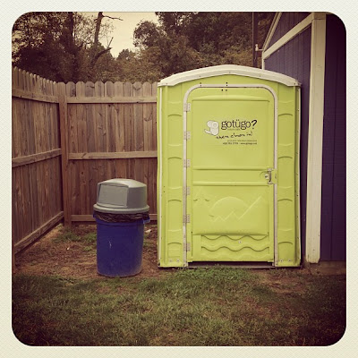
Some of my students had just asked me if they could get special permission to walk out to the soccer fields to use the port-a-potties...


And another group of students were desperate to try and weasel the REAL word from me about whether or not we were going to be dismissed or not. Truth be told, I am usually the first to know a lot of things (because I hear so much student conversation in the art rooms) but when it comes to things that most faculty might know? I am usually out of the loop! As the students insisted that I (somehow) knew something and wasn't telling them I INSISTED that we pray about it and I led the students in possibly the most self-centered prayer ever that outright asked that school be cancelled and as soon as humanly possible. Why? Because as life has happened (not just for me) but also some of my students, things have been very trying, challenging, and an unexpected opportunity for respite is a very welcome thing.

To make an already long story even longer, school was dismissed and here I sit all by my lonesome trying to not only line up blog postings for (what is now) this week but also catch up on graduate school work and prepare for other such things not related to school and work.

Lately I have come to the real truth that I absolutely cannot do it all. Things of life are breaking me at the knees so I can't even kneel to pray for mercy and I am instead having to lay myself out prostrate in submission (and just as much shame) that I can't do it all and I shouldn't make it out like I can.

Just before dismissal one of very good friends from work sent me the (see left image) text message. Normally I would jump at the opportunity to do something like what she suggested but lately? I can't. It's not even possible for me to look at all of it and even endeavor to imagine that I can do it by myself.

And? That's the key right there. I can't do it. (I can't do it!) BUT, I WILL DO IT under the mercy of the Lord Jesus Christ. I CAN and I WILL do it not by myself but with Christ's blessing, provisions, wisdom, preservation, and redeeming grace.

Someday I am going to look back on this particular time in my life and understand what it was all worth. In the midst of it though, it IS true what they say about being in the trees. I totally cannot see the forest and I feel lost on any given day. However, on those days and in those moments when I really don't want to feel lost anymore, I remember that I can always call out to be lifted up by Christ and no matter how selfish my prayers are, He will even answer those.

Wednesday, October 10, 2012

Lesson Idea: Fruits of the Spirit - Contemporary Propaganda study | Graphic Design

 In a little less than one month, the United States of America will be casting their votes to elect the next president. I normally don't involve or concern myself with anything political but it's hard for me not to take notice of the hub-bub of it all. Even I can easily get caught up in the spirit of things and I am perhaps one of the most unconcerned and unlikely political types (for the most part) ever. And for this reason? I decided to do a politically inspired project idea with my Graphic Design students.


*** Feel free to scroll through this to get to the project notes***

A little background: Recently, I made the decision to take myself off of facebook (for personal networking purposes - my business ventures still have a presences there). I had been toying with the idea of doing it for quite some time now both because of my disagreement with Facebook user policies that not only readily permits but also encourages people to overshare things about themselves. This coupled with the fact that the upcoming election has made people almost combative with their personal political platforms and concerns? I don't know. I just think Facebook has become a place that simply isn't for me anymore. Still, even with all of the reasons I feel like it is bad (disguised as good), I didn't leave there without taking some inspiration for an art project idea for my student artists!!

I don't really watch TV that much these days so I have been pretty shielded from the ridiculous political mudslinging that is likely happening and picking up momentum in that way. However, I have been able to witness some it via people I knew on Facebook that very much served as the catalysts that I was ready to be done with it once and for all. Perhaps it's because I am very aware of what can be visually communicated but there were a number of memes out there (from and for either side of the political showdown) that I think are just ridiculous. I won't share them because I don't even want to give them anymore web space than they already take up but basically they take some of the most unflattering pictures of both candidates and then they say some pretty ridiculous things about them that are just plain unnecessary, usually untrue, and definitely unfair. Now, normally I don't feel like this is a problem so much but I started noticing that as people were posting things, it was inspiring one of two things:
  1. Serious division between people who were actually friends at one time but had all of a sudden felt like because of their differences of opinion in the realms of politics, they couldn't be friendly or even sometimes friends anymore
  2. Certain people who might have been "on the fence" about politics to believe things that were outright wrong about the two candidates so much that it was actually shaping their motivations to vote in one way or the other
You might be thinking, "What do you care what people think? Really! I mean, and what do you care and WHY do you care?" You know what?  I am not ashamed to say that I do very much care about the fact that such a thing is happening and has happened (and easily this is why Facebook is not the place for me). I care about how people interact with one another because I know (as my faith informs me) that what people say and do to one another whether virtually or in-person makes a differences. It can build up or tear down.

I know this all too well, in fact, because recently I believe that I actively and perhaps even subconsciously contributed to the annihilation of what I always believed to be a very deep and close friendship. I can't take any of it back no matter how much I am shamed by it but I know I was wrong and that the situation itself was just wrong (all together) and it only serves as even more evidence to me that people need to be a lot more careful and intentional about the things they are saying and doing. When you say and do things, you can say your apologies but the digs and cuts that you might make leave scars that are painful to deal with long after they allegedly healed. And so? I (even before the aforementioned event) am keenly aware of the importance of saying what you mean and meaning what you say and trying to make that be reflective of the fruits of the spirit as much as possible. I mean, I will get it wrong. I absolutely will but that truth doesn't have to stop me from trying to do it just the same. And so? That's where the idea of this project idea originated.

*** End of background information, start of project notes ***

I am a firm believer that the Lord and His gospel can be found within every and any part of the grand and intelligently designed thing that we know as the world and our lives. With this in mind, I examined and discuss the work of Shepard Fairey as well as the scandal that ensued because of it with my graphic design student artists. Are you familiar with what I am talking about? He was behind the infamous Hope poster done around the time of Obama's election that became iconic of Obama's campaign and actual election to the presidency. Here it is to refresh your memory...


Now, I totally think that what happened because of it was warranted and fair with the rulings for the Associated press photographer and against Shepard Fairey but that doesn't mean that I don't still think the work isn't truly noteworthy, successful, and just plain really solid and amazing design work in the way that Fairey turned it and twisted it to be what is. And this is exactly what I told my student artists! We also talked about how so much of what might be swirling about (in the way of graphic and pictorial propaganda and promotion) was bad - both in design and in actual content. I challenged them with the notion that we could take inspiration from Shepard Fairey's creative genius and also learn from what others are doing that is negative (with their political commentary) and do inspired pieces that promote fruits of the spirit just as the gospel promotes it. So? That's what we did!

Each student was assigned a specific fruit of the spirit and they had to take that and then design something that visually encapsulated and intentionally communicated what it would look like similar to what Shepard Fairey attempted to do with the Hope poster design. I created a keynote presentation that "unpacked" the details of the design and explained the anatomy in terms of specifics like the use of only (3) colors, using posterization to transform the the colors/images, using a single word to literally communicate in conjunction with the images itself, etc. I also showed them some very amusing spoofs on the Hope poster and talked about why things like that exist as a result of what happened. One last thing I did with them was to not give them a step-by-step tutorial. I wanted them to see what needed to be done and then figure out (by inquiry-based working mode) how to do it in photoshop. 

Here are some of the finished pieces that they turned out...


Now, before anyone says, "You just endorsed them 'lifting' other peoples' work just like Fairey did!!" Calm down. I absolutely did not. They were very aware of the fact that their work was not solely their own AND they would not and could not call it that. They were also made aware that what we were doing was a study and so it was kind of like doing a mastercopy of Shepard Fairey's work and that required them to use what someone else already did BUT they could not take credit for the other person's work and they would need to be able to explain where and how their image originated.


Related Posts Plugin for WordPress, Blogger...