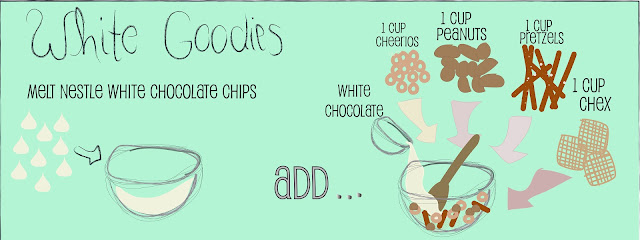
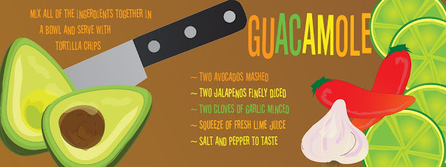
The basis of this lesson came from one of my favorite blog/website/graphic design thinktanks called They Draw & Cook. Basically you take a real recipe that would otherwise be ho-hum, give it a visual twist and VOILA! You've got two birds with one stone in the way of ART and DELICIOUSness!
The Digital Studio students are mostly juniors and seniors, highly motivated and disciplined students, and just plain awesome young folks that I get to hang out with four out of the five days of the week. (That's a regular class schedule for us - meeting four times a week for 55 minutes a shot.) The class starts out with almost a good month and a half or so of what I like to call "skill building" - basically, learning the ins and outs of Illustrator - and then we take off on creative binges of any I (or the students) can dream up! The self-portraits in cartoon/caricature style I posted a little while back were done by the digital studio students and these illustrated recipes were the next major projects after that...


These three were some of the better ones designed of the lot but they all did a really decent job overall. I put them all together in a hardback book through Blurb.com (one of my favorite self-publishing companies!) and here is a digital preview of it.
Recipes for a Starving Artist by 2011 Digital Studio
(I did the cover design and overall design of the interior layout. The kids came up with the very clever name of the book.)
This was a great project for the kids to learn a little more about creating better composition and using words as art. They major project I've seen overall with them (while I've done preliminary evaluations/flip throughs of their work) is that they have a hard time using space correctly and they will group things all together in one spot while there is a large open space elsewhere on the drawing board. But as I said, overall they did pretty well.
The students also did a mini project right before these recipes where they did alphabet posters with self-created/stylized fonts and I'll post those in the coming weeks because some of them were very fun and clever! The project they are working on now is infographics and it's been a great follow-up to the illustrated recipes in that it forces them to take their design work to the next level by forcing them to pick design elements and composition that are that much more meaningful since their visuals are intended to present specific information AND it gives them another opportunity to work on the space issue I noted above.


No comments:
Post a Comment