
- Line
- Texture
- Form
- Shape
- Color
- Space
- Value
And then I try to introduce the principles of design (again, listed below in no particular order) concurrently while I'm teaching the aforementioned elements:
- Emphasis
- Balance
- Harmony
- Variety
- Movement
- Rhythm
- Proportion
- Unity
By the end of the first nine weeks, all elements and principles will be used and the students will have a reasonable grasp of each of (what I consider) the fundamentals in order to do complete work that is more complex and largely self-directed.
For the very first lesson/project of the 2D class, I almost always do a scratchart piece. This teaches the students how to use the simple element of a line in ways that can show both texture and variety to differentiate difference surfaces and things. Last year I did landscapes and used some of Van Gogh's landscape art to inspire the students. This year I went with animal portraits because they seemed more fun (read: LESS boring) and lent themselves to (what I felt) greater creative self-expression.
In order to prepare the students for their final scratch art works, I ran them through a battery of steps to ensure that they would 1) know exactly what they wanted to do before they started and 2) not waste the expensive scratch boards that I try to spring for (always as close to if not actually artist-grade quality). These are the things they must do to get their final scratch board for their final piece.
- Small rectangle of "throwaway" scratch paper in neon or sparkle divided into 12 boxes and each box must have a different pattern, texture, or small picture => For this I take larger sheets and cut them down to smaller sizes.
- Brainstorming of ideas for animals/subject matter
- At least (3) thumbnails of their ideas so that there is one good idea interpreted three different ways or three different ideas tried out in order to narrow it down.
- One large scale drawing with details and labels of what will be scratched out and how
Once the students successfully completed step four, they were issued their scratchboards and then they went through the process of transferring their images to the board - some did it by going over the lines of their drawings repeatedly in order to impress a light design into the ink of the board but many transfered their image with free-hand. The students were repeatedly remind to work from the foreground to the background and also to lay a piece of clean paper underneath of their hands to avoid transferring too much oil from their skin to the inked board which in turn makes it harder to scratch through/out.
With regard to the designs, I encouraged the students to take unique approaches in illustrating their animals other than in ways that might be commonly first thought of. I encouraged them to illustrate perspectives from different vantage points (like, worm's eye view, bird's eye view, or of the animal's eye view) and even employ (if possible) a little bit of humor and/or fun in the way they depicted their animals in their natural settings. I also made required them to scratch out/texturize at least 85% of the scratch board surface in some way.
All of the students work really hard to push themselves creatively and when it came time to pick pieces to go in the school's student gallery hallway (set up like a legitimate public gallery) it was really hard to pick which five would represent the over 75 students who had created work. The truly remarkable thing about all of the work is that most of was done by first-year visual art students who have little to know intensive visual art training/education. Perhaps I'm biased but I feel like all of this work is very exceptional in light of the fact that it's from the foundational/introductory courses. (Please note: pixelated portions of the pictures were my doing to block out student names)

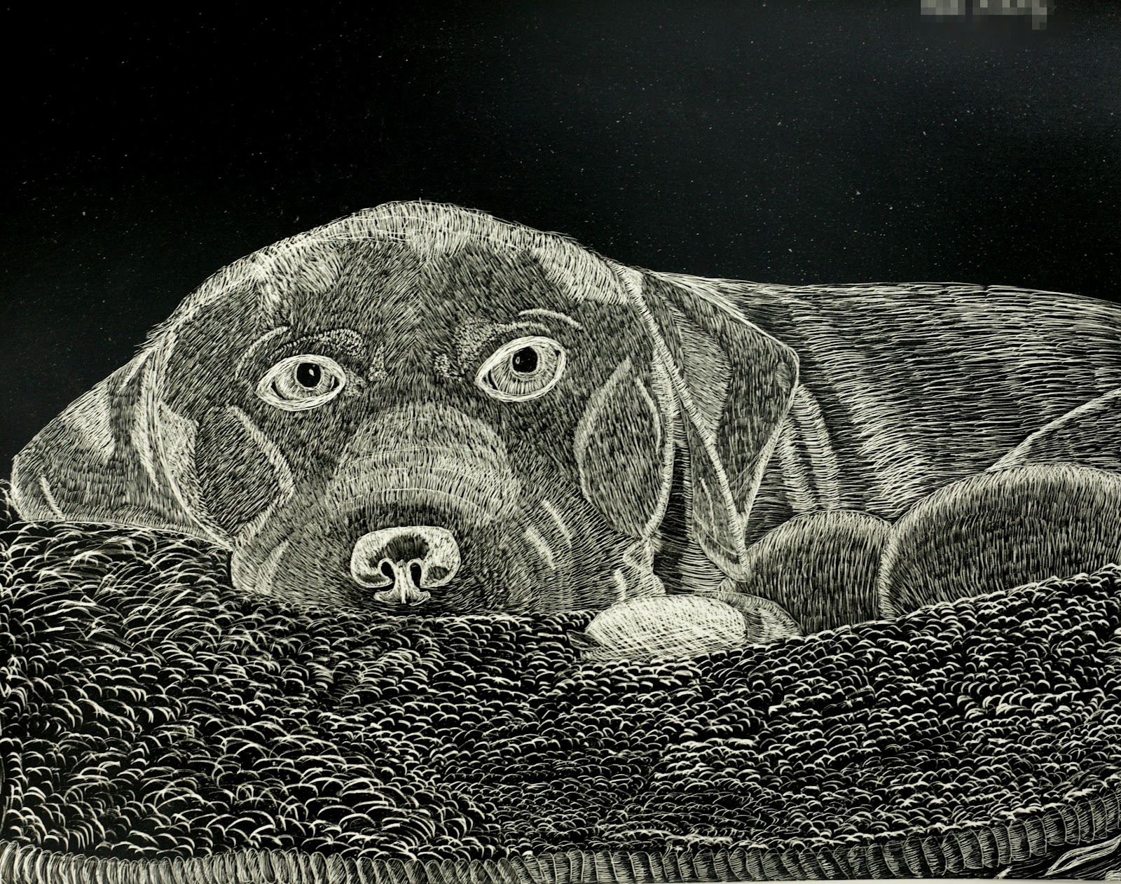


Not bad for student artwork, eh? I'll do this one again and forego the landscapes. These were way too much fun and the students learned a tremendous about how many ways lines can be used other than to just connect to points in addition to adding all kinds of visual art vocabulary to their natural vernacular - background, foreground, contrast, negative space, etc.
No comments:
Post a Comment