Showing posts with label pastel. Show all posts

Tuesday, September 17, 2013

Creation from CREATION because we were created to create

Yesterday was the first day of 2D Design class OUTSIDE. You should have heard the joyous cheering from my student artists as they have been working toward this day for weeks now.

The foci of our latest creative endeavors (yes - there are way more than one) include but are not limited to the following:
  • Learn how to draw and paint from observation
  • Learn how to make marks with greater integrity and of a more "painterly" quality
  • Get a feel for working with wet into wet mediums with oil pastels that will segue us into oil paint
  • Learn how to create space within a work of art using an open palette of colors and their values
  • Working alla prima type fashion
  • Draw less of what we think something looks like (i.e. "lollipop" and broccoli trees) and more of what things really look like

Our set-up to work en plein air utilized the following materials:

Large drawing boards with Blick sulphite paper quickly and simply "stretched" with masking tape 
Individual cups with single servings of one of each color from Crayola's Portfolio-brand Oil Pastels to give each student artist an open palette. Some students also opted to bring a fine-tip sharpie as well.

While the morning gave us plenty of rain, the afternoon provided just the right amount of overcast so it wasn't too sunny or hot to work out in our favorite spot surrounded by lots of interesting looking trees and a great view of the sky for attempts at both treescapes and cloudscapes.

This shot was heavily processed via instagram (my username is DreamPrayCreate, of course!) as the sky wasn't nearly so ominous looking as is pictured. Please pardon the artistic license I took.

And because I am doing my best to fight a horrible cold and flu bug sweeping through my school community and trying to overtake my household, I am barely making it through the day without indulging myself in the only vice that I think I might ever have: an ice cold can of Dr. Pepper bought at a heavily inflated price of $1 from the school store. The way I see it, at least I am supporting the school by indulging myself, right?

Also from my instagram feed. One of the alumnae that follows my instagram stream said the shadow cast makes me look like I am taking in an afternoon smoke or something. *facepalm* I AM NOT A SMOKER. I'm only a drinker of Dr. Pepper.
Anyway, I feel like all I do lately is apologize for not posting things that I said I would on this hear blogsite. Uhm... I have been sick. I have been completely souped up on Nyquil and covered in Vicks Vapo Rub. I have been working my way through TWO graduate school classes for my final month that will completely finish my Masters in Education. I have been doing what feels like eleventy billion other things that don't make sense to me but seem to suck up time that I didn't have in the first place. *shrug* I don't know what else to say other than all of this. *wink*

And I will not end this with another apology OR promise to be back here soon with things that I easily won't deliver.

Friday, April 26, 2013

Artist Trading Cards are so amazing

Today the Interactive Art History students are finally getting their paint brushes at their mini canvases for the ever popular Mini Masterpiece project idea. In the past they have been both excited and incredibly intimidated by the teeny-tiny canvases both this year I think I finally discovered a way to allay the fears because check out what they did with these Artist Trading Cards...


If these don't show that they are reasonably prepared and confident for really turning out some extraordinary tiny paintings that I don't know what will prove it. They will work on their tiny canvases for at least a week (starting today) in order to leave enough time for them to set and dry to give as mother's day gifts. I really look forward to sharing their finished works with you all because if this is any hint at what's to come? Surely they are going to be amazingly done!

Thursday, April 25, 2013

Mini Masterpiece prepping with Artist Trading Cards :: Interactive Art History

This is my third year of doing the ever popular Mini Masterpiece project with the Art History students and this year I decided to add something into the creative process of it by having the students do some trial runs with artist trading cards (ATC). Do you do ATC at all with your students?

In all honesty, I have wanted to get in on the ATC "game" for quite a while and I even have quite an inventory to do it - I ordered different supports in ATC size at the beginning of the year - but I haven't been able to get it and keep it going. I blame the ridiculous schedule I keep at any given time with working full-time, graduate studies (also full-time), married and family life, and everything else in between.

(Next year, my goal is to definitely get ATC creation and exchanges going here within the school's art community and then eventually have it connect with another school/art community. I think it would be a great for a student leader to spearhead and so it's on my goal list to make happen in that way. Anyway...)

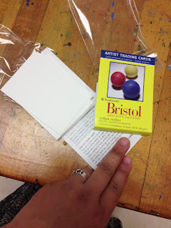
I have all of these ATC but I haven't used them this year so far. Last week there was a major school-wide field trip that happened though with the Science department and I was left with only half of my students in almost every class! It was the perfect time to break out some ATC for the students to do some creative processing and exploration. I found it especially useful with the interactive art history students since they are prepping for doing the Mini Masterpiece project and the ATC are just the right size to get them to start thinking about scale in order for them to do more successful works of art when they get their final materials.

I put my hand in this shot so you can get a better understanding of how small they are! 

The students used the Portfolio brand Oil Pastels that we are such a huge fan of and they all turned out some pretty amazing ATC that many of them took with them in order to be able to give to their friends and/or hang in their lockers.

I have never done ATC before but I feel like it really worked as a nice stepping stones for art history students to feel a little more prepared and confident for when it comes time for them to put paint to canvas.

Tuesday, April 23, 2013

Why ride waves when you can paint them :: Oil Pastel studies of waves

In continuing to prepare the 2D Design class to jump right into landscape painting from picture reference for their turn of doing a Place of Grace, we got our proverbial feet wet by wave painting!

While we could have done a youtube instructional video for this one, after the clouds in the sky and the tree, I felt like they should attempt the waves a little more on their own. I did provide some instruction for the purposes of prompting them to connect what they would do with the waves back to the tree and the clouds - like helping them to realize that the crest of the wave is not unlike the clouds or the foliage of the trees. I also helped them to see the darks, mediums, and lights of the sections of the wave as well as helping them to understand where things should be more heavily blended and where their marks should be preserved as they are.

Overall, the goals of the wave painting were to allow them to have a lot more autonomy, be a little more intentional with their marks, and prove to them that they can paint (and well at that!) by using a picture as a reference. I differentiated the instruction by allowing them to select which wave they would do but by the end of the exercise they all had attempted to do both to of them. I projected two pictures I found of wave paintings online and I projected them split-screen style on the dry erase board so I could label them as I needed to.

You can see some of the labels I drew on top of the pictures. 

And here is the student work! The students are getting better and better with their marks and I am so delighted with how they are becoming more "painterly" with their work overall. I am especially excited because this is a class of student artists who are very much foundational in what they know of art so this is their first major endeavor into really producing something that (for them) will feel a lot more legitimate. See if you can figure out which wave (A or B) that they did based upon their work!


This student wasn't done but I believe they have the essence of the wave they were attempting.


There was a lot of peer tutoring going on amongst them a they did their work and I know that helped. Many of them also learned (and demonstrated!) the importance of not just drawing in the center of the paper and using the whole space of the paper. Showing them how to bleed and anchor the shapes, colors, and values to the different sides of the paper really helped them to better understand the overall composition of each of their pieces.

One last thing I did was to play a youtube video as background "music" in order to make their painting as full sensory as possible. It was so relaxing hearing the waves crash every day that they did this. Here is one I used...


This is the first year that I have used youtube at least every other day - for either co-teaching instructional purposes OR to do things like helping to create a more authentic experience of creation in the studio classroom and I am going to keep doing it because it has really made a difference for the students and their work.

Something else of all of this painting of landscapes? I am convincing them (as I told them I would!) that despite any of their individual claims that I ALWAYS hear from them of "I am not an artist," they not only will come to love and crave the experience of painting but they will also be good at it too!

Wednesday, April 17, 2013

Co-Teaching Art Education with Youtube :: How to Paint Realistic Trees

One of my favorite things to do with my projector set-up is to use it to present e-book pages, student work, masterworks, etc. on the white board instead of the projector screen. Why? Because then I can write and draw things on top of and/or around the image in order to better tell and show the students different things that they need to remember for their work. This teaching methodology works just as well for Youtube videos, too!

You can see some of the labels I drew in order to help the students focus on key points for their tree paintings.
In addition to the labeling, I also wrote a bulleted list (not pictured) for the students that included items like, "Don't forget that the silhouette of a tree's foliage is ORGANIC in shape - not perfectly round and lollipop-like." I also made a connection with their prior knowledge from Science studies and said that the shapes of their tree foliage should be almost amoeba shaped and the trunks with their extending branches should be almost arteries with their vein systems. I LOVE drawing connections from visual art studies to core content areas!!!

Here is the Youtube selection I used for the "co-teacher" this time...


And here are the before and after works of the students' trees! This time I had them each quickly draw what they thought trees looked like and, as expected, there was lots of "lollipop" stylings initially. Luckily, they learned a lot and quickly too about how to go about doing a more realistic and painterly visual depiction of a tree! The improvement from most all of their befores to their afters is astounding in some cases and even the most advanced students learned how to improve their technique!


In this example, the before is very broccoli like with the trunk being stalk like and everything! 


This student took it upon themselves to attempt a second tree (in the after) and was able to achieve great results  too.


What an improvement from before to after, eh? I think this one was very successful with the value and color work too.


Actually a very advanced student's work but even the before is very broccoli like. 


Much improved since the after doesn't have the exposed roots - though I get what they were going for.

I feel like some of the hardest (but most requested by them) techniques to teach are things like drawing/painting clouds and trees. Both are very similar in how you do them - and the students are slowly making that connection - but this repetitive exercise between what I shared yesterday and then today really help them to see that what looks so hard actually isn't that hard. Also, they are learning to see simpler shapes and masses within larger and more familiar forms (like trees and clouds) in order to better create them in their individual works.

The next step I took them to after this one with the trees (and yesterday's with the clouds) is to have them create a realistic sky with clouds. So, basically I am taking yesterday's work and having them apply it to today's so that they have a finished work of art. I am also going to encourage them to look up other tutorials like ones for waves or mountains in order for them to better understand how to combine different techniques to achieve a more realistic and refined landscape piece for the place of grace project that they are about to launch into.

One of the biggest woes that I heard the last time I did place of grace last semester was students who had issues doing the simple things like clouds and things. After doing these brief exercises with Youtube the way I have, I predict that the students will turn out even stronger work than last semester just because they will be more confident and will have a decent amount more working understanding and real experience to apply to their individual works.

And one last reason why teaching using Youtube as your co-teacher? If you have students who are out of class for any number of reasons, you can simply direct them to your collective of linked videos and they don't have to be totally behind because they missed in-class demos!

Monday, April 15, 2013

Co-Teaching Art Education with Youtube :: Teaching how to paint realistic clouds

How do you feel about co-teaching methodology? Is it something you use at all? Do you like it? Love it? Or could you honestly just leave it?

I teach at a private high school currently but I used to teach core subject (Reading and then Social Studies) in a public middle school. While I don't have a requirement to use the co-teaching model anymore - both because of where and what I teach - I, honestly, miss it. Whether in a special education setting or not, I feel like it's an effective way to teach students especially for certain things. Now, visual art education is not something that would typically have co-teaching even in the public school because it's usually restricted to special education settings for core subjects alone. However, that doesn't stop me from trying to bring it into my visual art education classroom. Sometimes an extra set of hands in the classroom for the sole purpose of doing "hand over hand" type guiding would be awesome and it occurred to me that I could make it happen with the extra set of hands being my own!

Perhaps I am behind the game on this but I am discovering that Youtube is a wonderfully useful instructional tool to use in the art classroom specifically for the following reasons:

  • You can start and stop it or replay portions of it as often as needed
  • In real time demos, sometimes you can't redo certain steps but maybe one time for the students to see again so it can feel like you are using unnecessary amounts of materials. 
  • When you are doing real-time demos you also can't see the students doing things alongside you as easily because you are the one in the front of the class. 
  • If the students end up really going in the wrong direction while following you (in a real-time demo), they keep going that way (and using unnecessary amounts of materials, in turn) until it's too late to stop them. Of course, you can use their misstep as a teachable moment like anything else but? Well... I don't have an exorbitant amount of materials to use like this - do you?
  • Youtube or streamed video almost always yields a captive audience for this age-group. Even if the video is bad? Well, it's that much more compelling for them to watch from beginning to end.
First off, picking the right Youtube video is key. I have about 53 minutes of instructional time but even with that much time, I have to consider getting the students set up with their materials and then the stopping and starting and replaying of the video that will inevitably happen. Through trial and error I have discovered that five minutes running time is about the most ideal. Below is a video that runs slightly longer than that but not so much that you can't make up the time with just fast forwarding through it. 


Here are some samples of what was turned out! Bear in mind that many of these student artists have incredibly limited experience in the studio arts. The 2D Design class is a foundational course which means many of them have never taken a high school art course before and maybe even never will again since taking this course satisfies a half fine art credit that they need for graduation. Considering all of the aforementioned, I would say the student work is very successful.


Some of my goals with this were the following:

  • Quick(-ish) skill building for the purposes of having more successful and realistic finished works in the Place of Grace painting project that they are about to embark on. 
  • Help them to realize the importance of the integrity of the marks they leave in their work so they are more painterly and, in turn, produce more realistic depictions of things in the end
  • Teach them to paint what they see vs. what they think a cloud looks like
  • Build confidence within them so they can see that doing something the right way can be learned relatively easily, can be very fun, and makes a huge difference in the quality of their work in the end
  • Show them how to use color AND value together along with layering in order to show depth and dimension on a 2D surface
  • Prove to the students the importance and power of following directions just as they are given because it really does produce stronger and better results in the end
  • Complete an assessment for the creative processing of their individual paintings
Something that can be done in conjunction with this for the sake of really strong experiential learning and connection is by having them do a quick exercise before this where they draw/paint what they think a cloud looks like with no reference whatsoever about how it really should be done. They will likely draw the puffy, cartoon-like clouds and be convinced that is not only adequate but even successful visual depictions overall. Once they do the follow along with the Youtube demo at least one time they will see how easy it is to draw/paint realistic clouds and they will want to do it that way because it honestly does look so much better. 

Tomorrow I will show you one more round of co-teaching with youtube along with student work that was before the demo and after they had completed it. I will also discuss where to take this skill-building and how to connect it with others in order to have a series of assessments to evaluate them from in the end.  

Friday, October 12, 2012

WiPs: "a place of Grace" - Blueprinting the Visual Composition | 2D Design


In continuing on with my endeavor to attempt to teach the 2D Design students how to paint landscapes from picture/2D image reference, They have officially entered the stage of the creative process that is Figure out & Focus. Most of them have selected their inspiration pictures - found via image searches on the web as well as combing through their own instagram and other personal image archives.

Each of the students is required to bring in their images - whether it is singular or it is a collective in order to create a composite painting - so that they can figure out a strong visual armature for the composition of their individual paintings. I have been running them through exercises every day of looking at masterworks to both read paintings/images as well as how to identify leading lines, forms, and differentiating contrasting values and colors in order to understand how they all relate to one another in order to inform strong and successful composition. For as complicated as it makes my job sound? They are getting it. They are really really getting it!

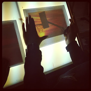
One thing I am having all of the students do for each of their designs is to make composition blueprints (for lack of better word). What they do is they lay a piece of clean paper on top of their inspiration image and then they have to draw on the clean paper all of the leading lines and simple forms (see above picture). Once they do that they have to identify and label the foreground, middle ground, and background as well as match/lay out basic colors in their blueprints...


I have shown them examples of images where there is a strong foreground, middle ground, and background as well as showing them images where there is just a foreground, subtle middle ground, and obvious background. I have also shown them how leading lines can steer the viewer's gaze to draw it into a picture/painting so that a person can't help but experience the visual depth in addition to perhaps naturally skipping their eyes (with rhythm) from object to object in the image. I have also been using the instructional book Mastering Composition (in e-book format so I can project the pages and visuals from the book onto the white board) to show the eight different types of composition and visual armatures that can be employed to help add more obvious structure and order to a painting.

We haven't discussed how to use color and value as a tool to create depth and space on a 2D surface but I will be showing them how to use complementary colors in order to make elements of a work of art appear as if they are advancing or retreating within the space/surface of the painting to make it appear to have a lot greater and more dynamic depth. 

Wednesday, September 19, 2012

(First EVER Giveaway) WIN a few of my favorite things!!!!

Hello blog friends!!!!!

Now, I know I have said time and again that this blog/website has been an incredible blessing to me because of the way it has connected me with incredible working artists and art teachers. I have also shared with you all the fact that I have the great blessing of being able to do what I love (be an artist and an art teacher at an AMAZING school with just about every resource I could dream to have) despite the fact that the economy is the way it is (with teachers losing their jobs left and right) and this is my 3rd (but final) career.

I am so blessed and I want to share some of that with YOU!!!! Last week I happened to hit posting #200 for this blog and since I started it? My blog stats tell me that the hits on the site and certain pages/sections have gone from a couple hundreds hits to almost TEN TIMES that on any given day, week, and for the whole year. It's amazing to me that I can share with you all the way I do - dyslexic and ADHD writing style and all, and you keep coming back and encouraging me to not stop.

To celebrate all of this and thank you all, I picked out some of my most favorite things I have used - both in teaching and for my own personal art creation endeavors. I thought and prayed for weeks about what to pick to giveaway and then I ordered it all (this is not a sponsored giveaway unless you want to think of the Almighty God as that which I think is fair in all honesty). My goal is with what I am doing here is to take from what Matthew 25:14-30 says with the Parable of the bags of gold and live that out loud here and now.

So, without further adieu, here is a video of me presenting to you a "few of my favorite things" that make up the total prize package of what you can win...


But if you don't have the time (nor interest) in watching the video, here is a list of what is included in the "prize package" I am giving away the following:
  1. The tried and true book that I simply will not stop talking about called DRAWING LAB FOR MIXED MEDIA ARTISTS
  2. A set of Crayola brand Portfolio Series Water Soluble Oil Pastels - 24ct color set
  3. A 9x12" pad of vellum Bristol board by Strathmore that is awesome for mixed-media as well as the amazing aforementioned oil pastel set!
  4. A roll of Paint Splatter Duck Brand Decorative Tape that is sold at your local craft/art stores but it is so awesome that more of it is always useful so that's why I included it
Not too shabby, eh? But what you really want to know is "How in the world can I enter to win all of this awesome stuff?!!!

OK. There are TWO ways you can enter this giveaway.  Here's how to enter to win my "favorite things" prize package:
  1. LEAVE A COMMENT on this entry telling me what YOUR favorite art product is to use and explain why. This could be something that you like using in your art education endeavors as much as your own personal works. 
  2. Connect yourself with me and "follow" this blog via the section over on the right sidebar - the button is blue and it says "join this site." Leave a SEPARATE comment telling me you have done so to confirm this second entry. I am actually not doing this to get myself more followers but more because if you do so, I can easily add you to the active feed of "Favorite Art Bloggers" (also on the right sidebar) a whole lot more easily.  If you already are a follower of this blog, that's fine but I still need you to leave me a comment telling me that you are already a friend of the blog.
The rules of the giveaway are below so don't forget to read those before you try and enter. The contest will close on Tuesday, Sept. 25th so please leave a comment no later than midnight EST of Sept. 25, 2012.

Thanks so much and I will announce the winner on WEDNESDAY, Sept. 26th 2012 here on the blog!!!


RULES OF THIS GIVEAWAY:
  •  This giveaway is open to US and Canadian residents only. (Sorry! Had to do it like this because I purchased the whole prize package and I am shipping it on my own dime. I may be blessed but I still have to be a good steward of my blessings too.)
  • You may only enter TWICE - (one for a comment of your favorite type of art supply and one for the comment confirming that you are a follower of this blog) and if you attempt to submit multiple entries, I will only count your initial entry for the selection of the winner. 
  • You must provide me with an email address so I can get in touch with you if you win!!! I will not share your email address with anyone but I need to be able to contact you if you win so I can send you all of this cool stuff!
  • Anybody can enter this (meaning art teachers or just working artists) and if you win, you must provide me with a  standard mailing address via email so that I can send you your prize!!
  • There is no guarantee that you will win and the winner will be selected at random.
  • Your prize package is not exchangeable or returnable for money, goods, or services from me.
  • Your entry will be automatically disqualified if you use any profanity, discriminating/prejudice expressions, or personally attacking or offensive (of my discretion) comments toward me and what I do here on my blog.
  • I will pay for shipping & handling fees in order to mail the package to you but once it leaves my hands (meaning, it's being mailed to you) I am not responsible to anything that might happen to it OR providing you with a replacement if it gets lost or stolen during the mailing process.

Wednesday, August 1, 2012

iPad App review: Artrage and Art Authority

OK. So I have finally completed what I feel like is a reasonably share worthy piece via one of the aforementioned art apps called Artrage.

In all honesty, I am pretty happy with it despite the fact that I feel like it isn't all that great. I mean, well... it's definitely lacking in some places in terms of solid technique. Aside from that though, I wasn't looking to create a masterpiece and rather just do a quick study of my four year old daughter while she was sitting still and painting a birdhouse.


While I would have liked to have done this with the Sensu brush, I did it with the stylus part of the brush. *shrug* The medium I picked was chalk pastel so using the cushioned stylus end just worked better and felt much more natural and intuitive.

Here is an instragram of the cushioned rubber stylus end of the Sensu.

I tried doing it with brush end but it didn't work so well. I attribute this to the fact that I am still just trying to learn my way around the app itself. Pair this with the fact that I have very limited experience with the chalk pastel medium and what you get is what you see above.

My initial aim was to try and do the oil painting but it just wasn't working so I switched to chalk pastel. That's why you see such a heavy grain of the support itself. (I chose a canvas grain support gessoed in black.) I REALLY wanted to try and work with the Sensu but it just wasn't working out. I'll get there though. I feel like it was a good move for me to just think about familiarizing myself with the range of the app versus trying to turn out a masterpiece.

I *think* Artrage allows for the use of layers but I didn't do that. I am actually going to try not to (for all of the apps that I review) if I can can get away with it. Why? Because you really don't use digital layering in real artwork - I mean, the closest thing would be to let each layer dry before doing the next but I never do that. I like working wet into wet and since my goal is to use the apps to imitate the techniques I'm used to, I'm going to avoid using layers.

One other app I have discovered that I REALLY am liking is called Art Authority. Basically it's a very comprehensive art gallery (in virtual form) as much as you could ever imagine. I mean, every artist and their works are not in it but the big names and major movements in art history are there enough. I LOVE studying masterworks and this is app is making it really REALLY easy to do that. My goal is to use some of the masterworks to do mastercopying via some of the iPad apps.

So that's it for now. I would say on the whole I really like Artrage. I almost started doing the above in Artset but it didn't have quite the more specific adjustments (like adjusting pressure and color saturation, etc.) the way Artrage did so I switched from Artset to Artrage almost immediately.

Will continue to keep you all on the up and up of my experimenting with all of the apps. If you, too, have been trying out the apps, I would love to stay connected with you and trade thoughts, tricks, and inspirations via the comment section below. Thanks so much.
Related Posts Plugin for WordPress, Blogger...