Showing posts with label Line. Show all posts

Wednesday, October 30, 2013

Lesson Idea: All Creatures Great and Small | 2D Design


This work was done almost three semesters ago by the 2D art and design students and I never got around to sharing it with you all! While it didn't pan out entirely as I had planned it would, I feel like the final works are still interesting and provided a great in depth study of lots of the principles of design and elements of art. I called this project endeavor "All Creatures Great and Small" since the subject matter was animals.

The inspiration of this project endeavor came from Heather Galler's Art on etsy. Clearly the students saw what Ms. Galler did and took a whole lot of creative liberties but I didn't have the heart to tell them not to be quite so ambitious and adventurous.

The students worked on poster board support and then used solvent based pens and markers to draw and color each of their works. I stressed the importance of using the positioning and arrangements of the patterns in order to show correct form as much as possible.


Friday, February 22, 2013

YouTube is the BEST :: Drawing with Anna

How often do you use this youtube? Never? Well... allow me to possibly change you mind about that!

Back up a little bit: Do you ever remember your days in school when you would walk into class and standing at the front of the class where the teacher would be was the coveted and adored A/V cart? (A/V=Audio Visual). You know what I'm talking about, right? The tall metal cart that had a television and VCR (and later DVD/VCR combo) secured to it that basically meant one thing - VIDEO DAY IN CLASS!!!!!!!!!

Well, using Youtube videos are just about the equivalent to having a video day in class for any kid. Seriously. They almost don't even care if the youtube clip is hokey or not. Most of them will watch just about anything you present to them AND enjoy it AND remember it. Which is the BIG kicker!)

For the purposes of visual art instruction, I am a hardcore believer in the power of demonstrations. I mean, what better way to explain something than to SHOW them how and what to do, right? But in all honesty, demos kind of drive me crazy sometimes. For whatever reason, they require an immense amount for me to set up for both my classes and myself to experience together. I mean, I suppose I could just set up the demo and do it and have the kids do nothing but sit and watch but I have found that to be unproductive to a point because they will get side tracked and just generally do their own thing and waste materials. Also, if they need/want me to repeat a certain step after I have gone beyond it? Well... most demos that I do are very prohibitive of that being able to happen.

Enter the Youtube's Drawing with Anna!!!!!

Perhaps you already know Anna very well and I am behind the times but if that's not the case, join me and get with it!!! Drawing with Anna is AWESOME!!!!! She has only a handful of instructional videos but they are very useful and I have recently used two - the Continuous Line Drawing video and the Blind Contour video:


I used both of these videos in the 2D Design class that I am currently teaching and while Anna can be a little hokey for high schoolers - she is honestly pretty sweet, an awful lot like someone's really nice mom, and she does a pretty decent job at teaching the general jist of both Continuous Line drawing and the Blind Contour drawing. It was also nice to be able to have a video that I could stop and start and back up as I needed to in order to specifically speak about different things that are relevant to what I am doing with my students and their project work currently.

So there you have it! I am a fan of Drawing with Anna. And now you can be too!

Monday, December 10, 2012

Lesson idea: Extra-dimensional | 3D Design OpArt study

It's been quite a while since I shared a lesson idea and/or a video with you all so you all are in for some real treats today!! ;)

This lesson idea is a spin on something I have been doing with the 2D Design classes (OpArt studies) that pairs with things I have seen on Pinterest as well as it being something that has made the rounds on the art education blog circuit. It takes the geometric 3D form (the cube) and  expands on the idea of dimension by applying Op-art patterns and designs on the different faces of the cube so that the finished piece looks incredibly dimensional. You can see some of the works-in-progress of this project HERE and also HERE.

This project was incredibly labor intensive for all of the student artists because OpArt needs to be so carefully thought through and then even more carefully created and colored. Whenever I do OpArt projects it always takes me a lot time to evaluate the work because looking at it makes my head spin and I have to take a whole lot of breaks. I told the students this and they thought I was being dramatic but when they started working on their pieces? Well... they totally understood. Ultimately, the project ended up taking almost a solid month for us to complete (including a bunch of random days when our class time got shorted for one reason or another). Just the same, I was fine with it. I'm doing my best to just go with the flow these days.

While I could show you only still photos of the finished pieces of student work, I don't feel like still photos will do the presentation of this lesson idea the justice it deserves. As a collective and the way it is being displayed is quite something to see in real life and the closest way I can come up with to show it to you would be to do a video. And so? Here it is! The school's senior visual art prefect joined me for this one and in the video I will be sharing with you some of the inspiration behind the overall collective of work. It's quite thought provoking in the way it all came together and it might be my most favorite exhibit we have done so far. Go figure - it's pretty much another exhibit of installation art!! (It just happened like that.)


Just in case it was hard to see the student work, here are two stills I also took in the midst of taking the video...


And because outtakes are always fun and it IS Monday, here is a quick outtake that otherwise would have ended up on the "cutting room" floor because I am so bad at using my video camera on my phone. *shrug* ENJOY!!! (at my expense)


Friday, October 12, 2012

WiPs: "a place of Grace" - Blueprinting the Visual Composition | 2D Design


In continuing on with my endeavor to attempt to teach the 2D Design students how to paint landscapes from picture/2D image reference, They have officially entered the stage of the creative process that is Figure out & Focus. Most of them have selected their inspiration pictures - found via image searches on the web as well as combing through their own instagram and other personal image archives.

Each of the students is required to bring in their images - whether it is singular or it is a collective in order to create a composite painting - so that they can figure out a strong visual armature for the composition of their individual paintings. I have been running them through exercises every day of looking at masterworks to both read paintings/images as well as how to identify leading lines, forms, and differentiating contrasting values and colors in order to understand how they all relate to one another in order to inform strong and successful composition. For as complicated as it makes my job sound? They are getting it. They are really really getting it!

One thing I am having all of the students do for each of their designs is to make composition blueprints (for lack of better word). What they do is they lay a piece of clean paper on top of their inspiration image and then they have to draw on the clean paper all of the leading lines and simple forms (see above picture). Once they do that they have to identify and label the foreground, middle ground, and background as well as match/lay out basic colors in their blueprints...


I have shown them examples of images where there is a strong foreground, middle ground, and background as well as showing them images where there is just a foreground, subtle middle ground, and obvious background. I have also shown them how leading lines can steer the viewer's gaze to draw it into a picture/painting so that a person can't help but experience the visual depth in addition to perhaps naturally skipping their eyes (with rhythm) from object to object in the image. I have also been using the instructional book Mastering Composition (in e-book format so I can project the pages and visuals from the book onto the white board) to show the eight different types of composition and visual armatures that can be employed to help add more obvious structure and order to a painting.

We haven't discussed how to use color and value as a tool to create depth and space on a 2D surface but I will be showing them how to use complementary colors in order to make elements of a work of art appear as if they are advancing or retreating within the space/surface of the painting to make it appear to have a lot greater and more dynamic depth. 

Tuesday, October 9, 2012

Pinterest for the Visual Art Education classroom

How do you feel about social networking? What's your favorite avenue for that? Are you a Facebooker? I recently decided not to be for my own personal interests and concerns. I used to be an avid Facebook user but it just seemed like it was counterintuitive and counterproductive to actually connecting people as it supposedly seeks to do. So... I quit it. (Facebook.) Despite what this might suggest, I am not against social networking. I mean, I'm an avid blogger (obviously) and I am questionably addicted to instagram. Another type of social networking I know and love? It's Pinterest!

I have been on Pinterest since it first started. I am blessed enough to be very well networked and so I got one of the earlier invitations that were given out. As Pinterest has grown and more people have discovered it, it has been exciting to sometimes even stumble upon people's pins made from my very own website!!! I know a ton of teachers who use it for lesson planning and classroom organization and I have used it for that very same purpose. Recently though, it occurred to me to use it for something other than just inspiring my curriculum and instruction.

The 2D Design class is starting a new project of painting where they are learning how to paint from/by photo and image reference. This endeavor was NOT planned and I had much different plans but I veered from them about two weeks ago and I have been praying about it and knowing that I need to make it happen for my student artists. Trouble with all of this is that teaching painting is something I am definitely NOT (entirely) confident or properly trained to do. Still... that isn't stopping me. *wink*

Taking notes from my amazing painting professor from the summer course I just took, I am crash coursing my students on understanding how to use visual composition in order to help them intentionally design and thoughtfully create works of high quality and successful visual art. One thing that has really helped me is the book called Mastering Composition. Another thing I am doing? I am looking at a TON of different types of visual art examples (masterworks, pins from people on Pinterest, personal works, etc.) with the students. AND(!) I am encouraging the students to DRAW on them in order to help "unpack" how and why the composition on each piece is either really successful or not so much.

Last week I projected one of my Pinterest boards up for my classes and we went through multiple photographs and I had draw on the white board all of the leading lines, forms, and space that helped to contribute to the successful visual composition. The goal is that by doing this, they will learn to read composition so that they can translate what they read to be strong composition into their own work. 

Monday, October 8, 2012

WiPs: "Extra-dimensional" - OpArt study | 3D Design

Every year I do an Op-art study but normally I keep it to the 2D Design classes. I have had this idea pinned to my art education project board on pinterest for I don't even know how long and this year I felt it was finally time for me to give the multi-dimensional work of optical illusion studies room to expand in the 3D Design studio art class. 

So here are some questions I have been thinking about... when you teach in your classroom... 

1. What do you use to inform your teaching decisions or methodology of how you actually instruct? 

2. Do you ever use visual art and teaching the creative process as the vessel to deliver a lesson/message beyond just teaching students techniques and art appreciation?

One of my goals (always) is to teach my students just as much about visual art as about life. Because I am a follower of Christ, this means that my worldview is shaped by Christ's teachings in the holy gospel. I see my mission field as being my classroom and my school community and it is always my goal to align the hearts and minds and SOULS of my students with belief in and devotion to the Lord's intelligent design and message of salvation and grace.

Now, I understand that I might have already lost a whole lot of my readers already based upon what I just said. (Seriously. They were gone as soon as I made mention that I am a Christian.) I am going to keep talking though to whomever is still here - either because you, too, believe in what I believe, or maybe because you are just curious about what more I could possibly say.

Here's something that you might not expect (that is VERY personal): I am a Christian now and I work at a Christian-school (this means I work in ministry) and I am very VERY vocal about my beliefs and commitment of being a Christian but I have not always been this way. I was not raised in the type of community I now live and work within and I only committed myself to walking and talking in this life of Christian faith almost nine years ago in my 20s. Before that, I led a life of serious debauchery (for lack of any other better word) and it has cost me an immense amount that I have had to make amends in order to find the peace and providence I now have in my life. My life has been a testament of things that include serious abuse, major illness, pushing myself to the brink of death (more than once), and then being delivered from all of it. And the punchline there - the delivery from all of it - came in the form of Christ and my commitment to following His teachings and that is how I came to be a Christian. 

Anyway, perhaps at one point I might share my testimony in greater detail than the very abbreviated version above but that's not the point here. The point is that my own experiences of life and with visual art have taught me that visual art and the creative process can be a really beautiful vessel for sharing some of the serious life (and faith) lessons that I have so far. I regularly use projects and daily conversation with my students during class to "unpack" (as one of my good colleagues like to say) all of the incredible things the Lord has blessed me with in my life. I even mean the blessings that might not seem like blessings because when they were happening and even after they happened they were really very tragic. (That's not an exaggeration by any stretch.)

I am a firm believer that the Lord gave us visual art in order for us to use it to understand Him better and draw nearer to Him. I believe that when we create (even for people who are not believers in Him), it fills us with something that is indescribable because HE is indescribable and when we create as He created (because we were created in His likeness and can imitate Him every and any time we create) - we are only adding into His intelligent design that already exists. 


Earlier today, I ran into my department head and we made an attempt to update each other on current doings and happenings in no less than five minutes. She reminded me of this one thing: "If God brings you to it, He will bring you through it!" How easily I forget such a truth exists especially  in the moments when I need to remember it most.

When I introduced this project idea to my 3D Design students, I certainly did let them know that it was something meant to teach them about Optical Illusion artwork but the overarching theme (that they should push themselves to understand) is that the Lord is multi-dimensional. He exists both within and beyond the boundaries of time and space and sometimes (like optical illusions) what He really looks like is far from what He is. Apart from optical illusion art, He can put a message within a mess, He can take a tragedy and turn it into a triumph, and He can use something broken and transform it into something amazingly and astoundingly beautiful. And the way He does this is through us and with us. This means that despite what we might ever feel or think or see - He is sovereign and almighty and that means there is nothing above or below what He can and will do. It's just a matter of us submitting ourselves to Him and acknowledging the tools He readily offers to us to accomplish His might works.

If you are not a believer and you have made it this far in this posting, I thank you for giving me this opportunity to share this much with you. I know it's not easy to hear this type of thing and be preached to because I honestly was once a disbeliever and a non-believer myself. It kills me sometimes to have to take stock of my own life and realize how much I had to go through in order to finally see and ACCEPT and embrace what real truth is since (in the process) I have lost so much. Still, I can look at the whole picture (the BIG picture) and see that if I had to lose my whole world to gain the amazing grace, always new mercies, and everlasting faithfulness of the Lord, I guess then all of that and even more would make it worth it on any and every given day of the week.



Friday, October 5, 2012

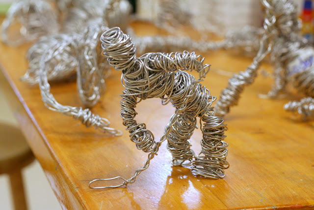
Lesson idea: Continuous Line Art - Wire sculpting | 3D Design

This lesson idea is one I haven't done in quite a while but found I found these pictures (on an old portable hard drive) and thought they were worth sharing!

I did this project with the 3D Design students my first year teaching visual art ever and I led them into the project with a continuous line drawing study. Each of the students was required to come up with one object that they would sculpt in 14 gauge aluminum wire (you can purchase it here from DickBlick.com) but before they could sculpt it, they had to show me their idea drawn with a continuous line. When they had completed the continue line drawing of their chosen object, they each received 90 feet of it that they were not permitted to cut in order to echo what they learned in the continuous line drawing exercise.


Overall, this project idea was a big hit but it I also couldn't push it to last for any more than one solid week of class meetings. That's pretty quick for me because my goal (from the beginning) has always been to do longer term project endeavors. I believe the students turned out very successful and interesting samples of work but it went very fast for them (during both years that I taught it) and I don't know that they learned anything super significant other than that wire wrapping is cool and fun.

If the future I would really push the students to focus on contours lines when they draw in continuous line technique and I would definitely push them to not do just any object but one that has purpose and meaning to it once it is fully sculpted.

Wednesday, October 3, 2012

Lesson Idea: Our Common Threads - Printmaking | 2D Design

In this introduction to printmaking project, some of the learning objectives included the following:
  • Create original works as inspired by the masterworks of printmaking artists such as Andy Warhol and Claes Oldenburg
  • Visually present social and cultural commentary (explained below) from a Christian worldview
  • Learn how to design and create limited edition prints from start to finish
  • Use a 2D surface to show a 3D image/form
  • Learn and use visual art vocabulary of printmaking
I kicked off this project with a Keynote presentation of printmaking that focused on the works of Warhol and Oldenburg so that they students could see and discuss examples of Pop Art. We took the idea of what Pop Art does - glorifying the already glorified - and we attempted to create designs that did  a little bit of the opposite by picking every day object and glorifying those. The students were instructed to pick objects that would be owned by the "haves" just as much as the "have nots." They were to think about and be able to verbalize the reasoning of why their object might be something the "haves" take for granted while the "have nots" might really prize for specific reasons. We had lots of in-class discussions about the differences between the haves and have-nots and I also share the work of photographer James Mollison in the collective he created called Where Children Sleep. (I showed them the website but I also have the printed book - which is outstanding - and the students were awed by what they saw.)

The students used scratch-art foam printing plates to create their printing matrices and they went through an exhaustive process (as framed by this original instructional method that I developed and have been using for all of my lesson plans) in order to go from inspiration to as series of four limited edition prints per student. Each student was required to destroy their individual printing matrices right after their fourth impressions were made in order to absolutely ensure that their prints would all be limited editions.  Why limited editions? Well, because I want them to feel as much like true artists as possible! I posted something of the creative working process last week and HERE IS THAT POSTING if you want to see what we did and how we did it.

Here is a sampling of some of the amazing print sets I will be going through to evaluate and grade. I am SO proud of what the students designed and created but I'm also really overwhelmed by the amount of artwork that I now have to grade!!! Normally it's only one piece per student. Requiring the students to do a four part series of work basically quadrupled my work load. Oh well. It's worth it. (Or I keep telling myself that.)

I think these prints - shown in two different orientations - were very successfully created.

This particular student artist is VERY naturally talented at drawing specifically so her design was very well done.

This is another student who is great at drawing and has terrific attention to detail. (Obviously.)

I am not sure if the misspelling of the word 'homeless' was on purpose or not but knowing this student, it's probably safe to assume that it was completely intentional. Such clever students I have!

This design was so simple but so successful! I had a hard time picking which print to share with you. 

One of the few prints that was done in grey ink. I am such a fan of grey but I love how this student mixed the color and then applied the ink so it resulted in having a very subtle vignette to this print.

I appreciate the distressed quality of this print. I also think the color combination helps to add to its success.

This is one of my favorites overall. The design of the plate itself was wonderful and the use of color to make it look like the color of the flame and then the black that represents charring? And the distressed look of the ink? AWESOME!

I really enjoy the simplicity of this one and the fact that the student used just one single color. 

This project was a HUGE hit for the students and I will most definitely do a printmaking project again with the 2D class. It was just enough of an introduction to this artform that it really whet their palettes and left them hungry to do more art of this type and... well... any type really. Now that this project is over they are super excited to get started on the next one (which is even more challenging). It's all about strategic planning and I am delight to report that my strategy is playing out very nicely. *wink*

Thursday, September 20, 2012

Lesson Idea: The OneLiner | 2D Design

One of my favorite things to do with the students is continuous line blind contour drawing. It almost always yields works of art that are interesting and intriguing. The element of surprise and leaving the act of creation up to a little bit of chance helps the students to let go of themselves and learn to trust themselves as well. It also proves to them that successful pieces of artwork don't always come in moments of highly-controlled planning and preparing and some of their best (and most favorite) works sometimes come organically and spontaneously.

This project was called the "One-liner Modern Art" drawing but I decided to just call it "The OneLiner" because I felt like for my purposes? That just makes more sense. The idea of taking the continuous line drawing and melding it with the technique of blind contour drawing aimed to teach them to learn to do mastercopy type work as well as drawing from still-life observations. They were also able to experiment with mixed media and they used crayon, watercolor, graphite, charcoal, ink, and marker for the coloring of their line drawings.

I adhered to the same framework I started with and introduced to you all last week with the Drawing from the Abstract lesson idea and this project idea (like the aforementioned) was inspired by something that I found in the Drawing Lab book that I love so much. I tried to preserve the essence of the drawing exercise but I expanded upon what it suggested and then fit all of that into the framework I am continuing to use for the creative process the students are learning to follow:
  1. Explore & Experiment - The students did speed drawing exercises both from still-life set ups as well as masterworks (I used this one from Picasso that is so popular - yes, the students did this upside down)
  2. Figure Out & Focus - The students did multiple peer reviews in order to help them consider techniques that they might have tried OR identify which technique they have used so that they can use it again and then intentionally create a work of art using that technique. They also did trials of either mastercopy works and/or working from a still-life set-up. They also tried out color palette ideas and different mediums.
  3. Stick or Scrap - The students looked critically at their own work and they decided whether they liked what they had been doing or if they wanted to go back to step #1 or #2 in order to create something that they felt was a little bit more successful and adhering to their goal with the work of art. Some of the students decided to abandon their mastercopy efforts and decided to go with one of the still-life set-ups and vice versa. They used intentionally decided upon color palettes and applied the color in specific ways.
  4. Know & Go - This is when the students got their final support to work on (watercolor paper) and they went confidently in the direction using specifically decided upon techniques and color palettes. 
I differentiated instruction with this project by offering them four different drawing examples for them to choose from if they did mastercopy works and two different still-life set-ups if they wanted to work from observation. I also allowed them to use whatever medium they wanted to work with as informed by their creative processing. Here are the two still-life set-ups that I gave them to work from...


I encouraged the students to get up from their seats and position themselves as they decided would output the best and most interesting perspective of the still life they selected. They had large drawing boards and I also allowed them (on some days) to listen to "personal music" in order to help them stay focused on their task at hand.

Some of the final works the students created are here! I am SO proud of them for what they both learned, figured out on their own, and created INTENTIONALLY vs. just making for the sake of making something. They worked very hard and it definitely shows (I think)...

Mastercopy work

Still life

Mastercopy work

Mastercopy work

Still-life

Still-life

Still-life

Still-life

Many of the students initially thought that they wanted to do a mastercopy but then they changed their minds because they realized the creative liberties they could take by creating something completely original (and in their unique styles) by working from observation. It was very exciting to see this discover this and also watch their technique and individual works develop from trial to trial and then make it to the final work that they turned in. I am having an especially difficult time picking pieces to go into the student gallery and that makes me so excited!! Now if only I could have the wall space to be able to show them all.


Don't forget to enter the contest 
of this blog's first ever giveaway of my "favorite things!!!"

REMEMBER: You have to leave your comments on the blog post that announced the contest found HERE VIA THIS LINK in order to be officially entered and considered in the final count to be randomly chosen for the prize package. Don't forget that there are TWO ways to be entered in the giveaway and the cut off time/date is Tuesday, Sept. 25th at midnight EST!!

Tuesday, September 11, 2012

Lesson Idea: Drawing from the Abstract

This lesson idea originated from that one book I love so much Drawing Lab for Mixed-Media Artists: 52 Creative Exercises to Make Drawing Fun.

I believe (in the book) this one was called Imaginary Creatures or something of the sort but I decided to call it drawing from the abstract because that is exactly what it instructs to do!

What students do is they watercolor paint abstract forms in three colors - the book suggests limiting the palette to the primary triad, waiting for it to dry and then turning the finished painting around and about until you (the artist) can see forms within the painted abstraction.

The book suggests this as an exercise and not necessarily a full project but I adapted it's instructions so that it is something of a much longer running project endeavor. I did this by taking the general idea of it and adapting it into an inquiry-based learning experience. This is because I am learning that the best practices for the art classroom I am teaching in is when it is 1) inquiry-based and 2) allows for the following stages of learning to occur in order for them to understand what their own individual creative process so that they can ultimately become more independent and autonomous in their visual art idea cultivation and creation. I came up with this framework just this year and it is working so well even with their second project that I am going to use it the whole year in the studio classroom at least with the plans to come up with something for the digital classroom ASAP. The names are just what I like to call them though there might be a formal name for them that I am unaware of...
  1. Explore & Experiment - When the student artists get their hands immediately on and into art mediums and can try them out with little interference of direction from me other than, "I don't know. What do YOU think it does? Maybe you should try it?"
  2. Figure Out & Focus - When the students are starting to have a better of what the medium does (or doesn't do) and they take that and align the project objective with it in order to make informed decisions about what they may (or may not) want to do in order to achieve the results they are striving for. This process involves peer review and critique of work that has been done in different stages, me doing demonstrations of possible best practices, and answering questions they may have formulated based on the Explore & Experience stage.
  3. Stick or Scrap - This is basically the single defining stage that either forces them to go back to Explore & Experiment a little bit so they can go through the Figure Out & Focus at least one more time (that's usually all it takes) OR for them to know and believe with confidence that they want to go in one direction with their project or another. It is usually known (by them individually) subtleties as much as how they should be holding their paintbrush to achieve a certain effect on the support they are working on, what exact color palette they will use, etc.
  4. Know & Go - This is the final stage of their creative process where they are confident to step up to using finally and high-quality/grade art materials in order to create something intentionally that will be complex in it's presentation and also show evidence of good technique that is obviously apparent, the subject matter will say something as much as show something (meaning they are being a visual communicator instead of making something because "it looked cool"), and, finally, they will be completely confident to stand by their work and defend it as a successful work even if someone challenges it and calls it unsuccessful.
Definitely, this approach to teaching/instruction/learning is student-centered and requires a LOT of time for it to happen as it does. I have the time to do it though (or rather I am permitted that sort of luxury) because I work in private school education and I teach high school student artists (who are incredibly high level in their abilities and understandings already). I have found that doing long-term projects is better and teaches them more than shorter ones. It allows me plenty of time to do demonstrations (as I did for this project already) without leaving out opportunities for them to do speed painting that forces students to let go of themselves a little especially when I know they are having a hard time doing it.

The students worked through all of the above stages and this is what they came out with. This project is considered mixed media since the bottom most layer (that informed the top layers) was water color painted freely and then the top layers of ink, marker, charcoal and wax/crayon were applied because of what the watercolor layer looked like initially. The supports I used were the following and in this order - white drawing paper, watercolor paper, and then aquabord.

None of the student artists knew what their pieces would look like in the end and that was the point because I wanted to kick off with a project that would require them to throw a little caution to the wind and TRUST both me for asking them to do "outlandish" things as well as themselves that they could create and not just make. Enough of all of my verbosity - Want to see their finished works?


Overall I believe this project was successful and I would definitely use it again. The final pieces were only 5x7 but I would love to try it on a larger scale and adapt it to be less about just living creatures and more about their environments as well. A larger scale would make this creative endeavor even more like the long-term project I was going for initially and it would certainly demand a lot of investment of each student artist both in the way of thinking very creatively as well as demonstrating solid technique to make sense of the "mess" that they might see before them.

Monday, July 2, 2012

Life as an art student | Day 17 of 20

Weird start to the day and week (the last one for this class - boo!) as this area was hit in a seriously bad way by all of those storms that hit the huge chunk of the mid Atlantic coast. I was blessed enough to lose power no longer than 24 hours but had a place (my parents' house) to stay in that had electricity, wifi and central air. Others in my area have not been so fortunate and are sitting at day three without any of the aforementioned. It has been projected that many of them might not even have power until this coming weekend! No bueno especially with regard to the record breaking temperature highs this time of year.

Anyway, all of this had me completely unsure if I would even have painting class. This last week was going to be focused on more landscape work created en plein air like last week because (with the 4th being no class) we only really have two days to paint since the last day (on Thursday) we are going to do a bit of a presentation of each of our collectives of work. Well, when I went to the picnic grove on campus where we have been working, I found the place looking pretty much like a war zone. Trees done, metal picnic tables damaged beyond repair, and nobody in my class (including my professor) there. I started emailing my professor and he eventually showed up to look at the damage and then made the executive decision to just go to the studio classroom. Thus, it was decided that we would do self-portraits after all. So, that's what we did today.

We started it all with a big discussion about what the expectation was for our output and then talked about how we get to that point. Today's working goal was to do a straight line drawing in charcoal of ourselves on paper with a focus on only the planes of the face.


Tomorrow we are supposed to be able to get right into painting. I am really jazzed to paint vs. do charcoal work and I am finally going to get to use the canvas I stretched on the second day of class.

Tuesday, February 7, 2012

Lesson idea: Cassette Tape Portraits

[I'm in the process of cleaning out my hard drive in preparation to finally make the jump to Mac world *wooohoooo!* and I found a file of student work from my first year of teaching art at my current school I haven't posted yet! There are a little less than a dozen project ideas and here is the first one.]

This is a project I did with my 3D students way back in the Fall of 2009 when I was a newbie here at my present school. I came upon the idea in my blogroll long before there was the wondrous world of pinterest. The original works/artist can be found on flickr HERE where you will see a decade long collective of their body of work that aims to create portraits of all manner of artists and other noteworthy folks using cassette tape cartridges and the tapes they have within.  The total collective is known as "Ghost in the machine."

I loved the idea because I am a fan of just about any type of portraiture but nontraditional portraiture is one of my favorites of all.  I also loved being able to upcycle items that have seemingly "gone the way of the dinosaur" like cassette tapes. Funny anecdote that occurred during this project: One of my students picked up one of the cassette tape, shook it around and then put his ear up to it while curiously demanding, "How do you even listen to something like this?!!" *sigh*... I have such fond memories of cassette tape listening.

Anyway, this project was the next to last one on the project list for Fall 2009 and it was VERY challenging for the students to complete. I think I put aside a total of three weeks for the whole thing (and they also had the winter holiday break to take it home) and that still was barely enough. The project demanded that they have incredible attention to detail, ridiculous dexterity with an Xacto, and extreme patience to adhere all of the pieces of the teeny-tiny-hard-to-lay-down-in-just-the-right-way pieces of slippery cassette tape. Despite the challenges it presented (and for foundational students no less!) they were incredibly committed to completing exceptionally done final results. I was SO proud of them and when we hung them in the student gallery there was no shortage of raves about them.


In order to ensure the students started the project fully invested in the idea, I allowed them a lot of liberties in what individual they chose to illuminate in this way. This seems like a given of something to do but the more I teach art, the more surprised I am at how often it's not done like this. My goal in all of this was not to wield control but to inspire open-mindedness that despite this was challenging and questionnably above their skill-level - all of my students COULD do it so long as they committed themselves to the possibility that it was all within their reach.

We used pebbled matboard from another project for the canvas and then we collected cassette tapes (obviously) from whomever would give them to us as well as cups of diluted white glue for the adhesive. I allowed the students to use printed off pictures (from Google) as visual guides and while some of them attempted to free-hand sketches onto their supports/matboard, a number of them put their pictures on the matboard and then used the point of a compass to perforate through the picture onto the matboard leaving a tiny dotted outline where their major lines of cassette tape would go. It was a shortcut of a way to do it this way but I wasn't concerned with that detail and more with the overall scope of the project.

Fall 2009 was the first and last time I did this project because it was just way too time consuming and I also like to change things up from year to year so the same things aren't shown in the student gallery over and over again. Another reason why I never did this project again was because, toward the end, it became REALLY hard to locate more cassette tapes when we started to get strapped for them. If I do this again I will likely do it in 2D instead of 3D because thought the medium was 3D, the picture came out to be more 2D so it only makes sense that it should be done there instead.

Anyway, if you want to see another round of student work, you can check out Art of Apex High School!  They just did a version of this project just this past Fall and the way they approached it was decidedly less time consuming (but still plenty of fun!) than what I showed you here.

Monday, January 23, 2012

Lesson Idea: Worm Tunnels

Just a reminder: this project idea was not an original one and was actually something I saw on another amazing art education blog called "Art with Mr. E."

Mr. E originally did this project with elementary aged students but that didn't deter me from considering as something for my high school level artists. Every one of them would attest to the fact that this project was far from simple and also amazing to have been able to work on and enjoy in its finished state. (See samples of student work below)


I adapted this project for the high school level by making this piece larger in scale overall - each piece was 22"x28" in size. My reasons for doing this were the following:
  • Larger surface area of design allowed for this to be a long-term project
  • The finished design is quite a sight to behold but even more impressive if it's on a large scale that encourages it to be framed and kept by each artist
  • This was used as a bit of a final assessment piece meant to evaluate their overall understanding of the following items: technique for drawing lines and using shading to show contouring, selection of a workable and interesting color palette based on color theory, management of class time and personal workflow issues
I am very pleased with this collective of work the students did both for their 2D Design experience for Fall semester (the foundational class is only one semester). Though some students failed to complete high-quality work because they didn't finish their pieces at all or completed them in obviously messy and rushed ways, this project worked to be a reliable indicator (i.e. a solid assessment piece) for how far they have or haven't come.  It was interesting enough for them to be self-motivated to keep working on, serious enough for them to be challenged on a multitude of levels, and beautiful (as finished pieces) for them to want to save as their last hurrahs for their 2D Design studies OR to be baited into taking more art courses.


Related Posts Plugin for WordPress, Blogger...