Showing posts with label 2D. Show all posts

Saturday, January 4, 2014

What to do now and next

Hi! Sorry for not being around for a long while. I don't have any good excuse of how/why it happened like this other than to just note that I really really needed a break from this blog.

I have been blogging on and off (but mostly on) for over a decade now and (if you've never tried to before) it can be quite a lot of work getting in the habit, staying in the habit, and delivering fresh content. This is especially true for content specific or niche blogging (which is what I do here). After I finished my masters degree (about October/November time) I found that I really and truly needed a mental break from writing papers and doing research and trying to get back on the metaphorical horse after doing such an amazing amount of blogging last year was only harder because of the break that I needed. So? I took the break and that's why it's been so radio silent here.

So I'm back here today to post this but honestly? I don't know when I will be back again and I am still trying to pray about what to keep doing beyond me just feeling like I need to be still and focus on other things (than this blog). I find that by not blogging here, I am much more connected and present with my 5.5 year old daughter and husband and students. I am thinking a lot less about how to churn the life and art teaching on my everyday into blog content and more about just being fully present and focused. This year for the One Little Word campaign I decided on the word "treasure" and I think it's going to work much better than last year's word of "joy" because it's been a focus of mine most recently in what I do, how I do things, and how I regard things before me. I've become so much more aware of the need for me to have less of a life virtually and more of a life actually.

I have loved this blog so much but I really and truly feel like I will probably not return to the posting schedule I had last year because it made it really difficult for me to have the time and energy I now know I want to have for my family and my students and to serve my school community. Blogging so much also makes it difficult for me to create artwork for my own professional development. I haven't painted in months and having realized this I decided that I needed to change that by trying to do something of my own art creation because I was starting to feel stagnant.

I have never kept up with a sketchbook OR done watercolor painting in all of my life but I recently started to do both in an effort to get beyond my own prejudices and learn something new that I had previously been so staunchly against. I got a visual sketchbook for both myself and my daughter and we have been trying to do a page a night in our books with either ink and watercolor or just plain watercolor. We both have less than a half dozen finished pages but it's been amazing so far and I am amazed that I was ever so against daily art creation (like in a sketchbook or visual journaling) OR watercolor. I have been "doing it wrong" the whole time. Thankfully, I have seen the light.

A page I finished last evening in my journal after everyone in the house was sound asleep.
I know I don't want to abandon this blog but I also know that how I have done it in the past is not a way that I can keep doing it in the present or in the future. I have a lot of content on here and I am regularly getting unique hits because of people finding things I have archived in the way of art lesson project ideas. (I'm so glad that what I have shared continues to be so useful to others!) Still, well... maybe it's time for me to deliver less that ends up being much more because it has greater substance at least as it applies to what I originally create - either in my painted sketchbook or with my own explorations of the creative process, creative callings, or what I am learning about the art of teaching art.

In any case, I hope you all are doing well in your classrooms and with your own artwork. I have previously "preached" the importance of being an artist as being actively creating art pushing yourself to do better design and stretching your creativity. I think perhaps it's time for me to do that sort of thing rather than giving myself endlessly to the efforts of others, the development and understandings of their creative processes, and enabling them to create beautiful works of art. That's what I do every day and when I leave work, I need to do a better job of allowing myself the same sort of gift.

So, I'm not quitting this blog or even taking it offline in any way. It'll keep being here. I just might be here less often but perhaps at the same time with a more worthwhile presence.

Tuesday, November 12, 2013

The things we all carry :: Arts Integration

What kind of arts integration are you doing these days? I mean, I know that you might be an art educator so art education is not only what you do but also what you do best but that wasn't my question. 

One thing that I am very aware of as an artist is the importance of connections and relationships. In order to design and create a successful work of art, one element or principle is not nearly so effective or meaningful if it's standing completely on it's own. Pulling the different elements of art and principles of design together - even if it's done in simple ways - is so powerful, communicative, and amazing to behold. Artist and art educators know this as fact but if we don't share that with others by INTEGRATING what we know with what everyone else knows (apart from the arts), we are keeping the richness and beauty of the arts to ourselves. And what fun is that? Seriously. Misery might enjoy company but happiness and delightedness enjoys a big ol' party that everyone is invited to, RSVP's to, and actually shows up to.

I mentioned last week that I am embarking on a new project with the 2D Design students that draws upon the power of using our lives to tell stories in order to explain how the sum of the parts is way more than the parts themselves. Every day I have been offering the students parts of myself and my story (as a way to practice what I both preach and TEACH) and I have shown them a different way to "read" things other than words on a page. Trying to do this on the daily has challenged me in all sorts of ways that I never thought it would because I'm literally trying to come up with more than a half dozen ways to say and show the exact same idea.

One of my favorite books that I have ever read is called "The Things They Carried." I read the book in my college freshman English class and it was one of the most illuminating and illustrative writings that I have ever read took a very VERY abstract concept and put it in words very simply and in a way that was easy to understand. And this concept made me think about what I carry and what my students carry on the daily that offer very interesting perspectives of who, what, and how we are in our lives. Want to see what I have been carrying out so far this school year (at least)? Here are the contents of my crossbody/shoulder bag (basically a purse) that I don't leave home without. These are the contents of what is in that bag without editing (well, photo editing not withstanding)

The contents of your bag can tell all sorts of things about you. Here's mine! What? You don't carry a tiny hammer in your purse too?

I have been hitting my student artists hard with the importance of reading beyond words on a page for the past week or so and while it's been incredibly taxing for me on any given day, it's been enormously rewarding for me to see their understandings and abilities "click" into place on the subject of non-verbal and written literacy.

Thursday, November 7, 2013

Are you an ARTIST teacher?

This series of images documents the ongoing progress/process of a very large in-class demo of oil painting.
Just this past summer, I had the great honor and pleasure to meet one of my blog readers (Hi, K!) in part because they were doing their graduate studies capstone research project on the matter of not just teaching art but being an artist who just as well teaches. The whole idea was so curious and intriguing to me because I never stopped to think about what kind of teacher I am and even seek to be other than just trying to be the best professional art educator myself. 

Still, it got me thinking - have I been an artist teacher? What does it take to be an artist teacher if you aren't one? And, if you aren't an artist teacher, should you seek to be? And if you are an artist teacher, when do you stop being an artist and start being a teacher of art - or are those identities/roles so beautifully braided together that they don't beg to even try to be separated?

When I met with my blog reader, the intent was to be interviewed by them about the whole notion of being an artist teacher but it ended up turning into a very interesting and thought provoking conversation about that plus many other things. At one point they asked me something along the lines of if I wasn't an artist teacher or even an artist, what would I call myself. I sat and thought for a moment and then I declared that I am "curious" and that's what I believe that I am. Even now, months after that interview/conversation, I feel like "curious" is the best way for me to both explain, define, and identify myself. 

Last year, I believe I struck upon something incredibly important that has truly changed the trajectory of what I was trying to do when I first became an art educator five years ago. I realized the importance of process within the creation of art and I also started making a great distinction between the notion of CREATING art vs. making art. I did this not only in my own life but I also stressed this within all that I was teaching my student artists. 

I believe it's because of this that I finally started seeing more original, interesting, thought provoking, intentional and REMARKABLE artwork from my student artist more than I ever had before. It was incredible and the difference between what I did last year with my student artists and years before? You can totally see how much more on a different "level" it was and then continued to be with each next step they took with their learning and project endeavors. The difference between the two was that I made my teaching objective and curriculum a lot more about them (so, student-centered and inquiry-based) and a lot less about me (lecturing, deliberately steering each of them through very narrow paths of techniques for making things rather than creating them).

This year I tried something even more adventurous than what I did last year with an even greater emphasis on the importance of developing and having a creative process in order to be a more intentional artist and designer. While I have readily used in-class demos before, it's been in a way that kind of disconnects me from the process for the most part - meaning, I don't really show them much other than just demonstrating specific techniques. In my own experience as an artist though, I have learned that process isn't just figuring out and refining technique. It's about the perseverance, the critical thinking, deep emotional investment and personal connection with whatever work of art is currently in the works. All of that is even more integral to the creative process than refined technique but if I don't show the students that I go through this? I fail to show them some of the most important parts of the creative process and any finished work of art I might show them that I created seems to just appear vs. it being something that they truly see and understand was a labor of love (if you will). 

Finally got the stem and leaf (on the right) done the other day! Now to keep myself from going back and messing it up.
I have been working on a giant oil painting of a Hoa Quynh flower for weeks and going on months at this point. To say that it's been slow going would be an understatement and this is as much because I can't spend a ton of class time on it because I am constantly circulating and interacting directly with the student artists and their artwork as much as I have been just avoiding painting as I am wont to do even in my home studio. I am committed to pushing the painting through to the end though and even though the students have now finished their oil paintings, I refuse to give up on finishing mine because there is still so much process to share with them for them to learn of that I know will help them in their own journey to find and use their unique artist voices.

Monday, November 4, 2013

Teach with [the stories of] your life :: The ART of a good story

Year after year, there are a few project ideas that I keep around because of how much students enjoy them. For 2D Design, the two that rarely get scrapped are the printmaking one and the fingerprint one. This year I decided to do something unique with these two and instead of doing them separately, the students are going to do a hybrid of them. They are going to do macro fingerprint designs that will be carved into printing plates that they will use to make a set of limited edition prints.

Wednesday, October 30, 2013

Lesson Idea: All Creatures Great and Small | 2D Design


This work was done almost three semesters ago by the 2D art and design students and I never got around to sharing it with you all! While it didn't pan out entirely as I had planned it would, I feel like the final works are still interesting and provided a great in depth study of lots of the principles of design and elements of art. I called this project endeavor "All Creatures Great and Small" since the subject matter was animals.

The inspiration of this project endeavor came from Heather Galler's Art on etsy. Clearly the students saw what Ms. Galler did and took a whole lot of creative liberties but I didn't have the heart to tell them not to be quite so ambitious and adventurous.

The students worked on poster board support and then used solvent based pens and markers to draw and color each of their works. I stressed the importance of using the positioning and arrangements of the patterns in order to show correct form as much as possible.


Friday, October 25, 2013

Giving YOU the good stuff :: Prang Marker Giveaway

Thanks so much for sticking with me through this week of belated Dixon Ticonderoga's Prang product reviews. As promised in all of my reviews, I have a giveaway for you of my most favorite Prang product that I was so blessed to have try this week. And it is? The markers!!!


via

Just to be completely clear, this is not a giveaway sponsored by Prang (meaning: they did not give this to me to giveaway) and rather it was inspired by my experience with all of the Prang products that I reviewed. Also, to clarify things, I did not review the fine line markers but I do own them at my home studio (shared with my 5 yo daughter) and I made the decision to buy them for our supply inventory because of my very positive experience with the Prang broad tipped markers.

Anyway, I am giving away the 96-set of Prang fine line markers just as you see them above to anyone who wants them whether you are an art teacher, working artist, homeschooling teacher, etc.

Here's how you enter to win them! Leave a comment on this posting telling me the following: 
What was your favorite product from Prang/Dixon Ticonderoga that I reviewed this week and why?

And that's it. That's all you have to do. You don't have to tweet anything or follow me on any social networking conduits. Just answer that question in the comments below and then I will pick a winner randomly next Friday. That means if you missed this whole week of of reviews and and need to go back and read them all then you have time to do that and then still enter the contest!

For your convenience, here are links to all of the reviews that I did this week:

And that's that! It's been a long while since I have done a giveaway on here and I hope that this isn't the last one for a long while but it honestly all depends on you! If it seems that you all are receptive, perhaps I can manage to do some more and more often. Remember! You have until next Thursday at midnight to enter the contest and I will announce the winner next Friday, November 1, 2013 at 7am Eastern Standard Time. 

Thursday, October 24, 2013

Apples and Oranges sure are hard to compare :: Prang Ticonderoga Product Review

Disclosure: Compensation was provided Dixon Ticonderoga company
Opinions expressed herein are those of the author and are not indicative 
of the opinions or positions of Dixon Ticonderoga.

So, I might have hinted to much of what conclusions were drawn with this review simply by the very cliched title I selected but... well... here's the review. 

It's another Prang vs. Crayola showdown and I am impressed (yet again) that Prang opted to send me a Crayola brand product instead of Rose Art or something. I feel like this says a lot about Prang's confidence in their product and I really appreciate that. Upon initial inspection of the packaging it's almost like looking at some throwback (of just a couple days but still) pictures of the marker review. Everything I noted before of the packaging is about the same but this time Prang didn't trump Crayola's palette by more colors... or wait... does it actually?


Wednesday, October 23, 2013

This showdown (of two pencils) was almost a DRAW :: Dixon Ticonderoga Product Review

Disclosure: Compensation was provided Dixon Ticonderoga company
Opinions expressed herein are those of the author and are not indicative 
of the opinions or positions of Dixon Ticonderoga.

To be quite honest, I almost didn't want to do this particular review. This is because I pretty much already have my own opinions formed of Ticonderoga pencils (which is that they are the best pencils EVER) and this isn't for lack of experience with them. I've had quite a number of experiences with standard wood and graphite pencils and I have yet to find any other pencil/brand that can come even close to touching the awesomeness of Ticonderoga pencils. And for all of these reasons I haven't wanted to really review the pencils. I mean, clearly I am biased toward them on top of the fact that I am a brand loyalist on top of the fact that Ticonderoga pencils are the best! (Period)

It's like a duel of the most unexpected two subjects ever. Who will be the winner and who will be the lose?

All of this said, I still did the review and I must say... I was quite surprised by my findings about how a Walmart brand (of all brands!) was able to stand quite strong up against the ever favorite and popular Ticonderoga brand. 

Monday, October 21, 2013

Maybe I do like Watercolor Painting Afterall :: Prang Ticonderoga Product Review

Let me just preface this by saying that watercolor painting is my least favorite medium to use and so I rarely use it in my classroom. The way you should take this is to know that I already come from a place of not liking watercolor paint/painting and that means it would take A LOT to "sell" me on the idea that it's worth my time to even try out or even consider. Does this all say that I am stubborn? Probably. That's the truth though. I am. OR... it means that I have very sharp abilities to discern what is worth both your time and mine. All of this said, here is my review of the Prang Watercolor set sent to me for review.


Disclosure: Compensation was provided Dixon Ticonderoga company

Opinions expressed herein are those of the author and are not indicative 
of the opinions or positions of Dixon Ticonderoga.


Dixon Ticonderoga sent me the Prang Watercolor paint set alongside a competing set by Rose Art.


Tuesday, September 17, 2013

Creation from CREATION because we were created to create

Yesterday was the first day of 2D Design class OUTSIDE. You should have heard the joyous cheering from my student artists as they have been working toward this day for weeks now.

The foci of our latest creative endeavors (yes - there are way more than one) include but are not limited to the following:
  • Learn how to draw and paint from observation
  • Learn how to make marks with greater integrity and of a more "painterly" quality
  • Get a feel for working with wet into wet mediums with oil pastels that will segue us into oil paint
  • Learn how to create space within a work of art using an open palette of colors and their values
  • Working alla prima type fashion
  • Draw less of what we think something looks like (i.e. "lollipop" and broccoli trees) and more of what things really look like

Our set-up to work en plein air utilized the following materials:

Large drawing boards with Blick sulphite paper quickly and simply "stretched" with masking tape 
Individual cups with single servings of one of each color from Crayola's Portfolio-brand Oil Pastels to give each student artist an open palette. Some students also opted to bring a fine-tip sharpie as well.

While the morning gave us plenty of rain, the afternoon provided just the right amount of overcast so it wasn't too sunny or hot to work out in our favorite spot surrounded by lots of interesting looking trees and a great view of the sky for attempts at both treescapes and cloudscapes.

This shot was heavily processed via instagram (my username is DreamPrayCreate, of course!) as the sky wasn't nearly so ominous looking as is pictured. Please pardon the artistic license I took.

And because I am doing my best to fight a horrible cold and flu bug sweeping through my school community and trying to overtake my household, I am barely making it through the day without indulging myself in the only vice that I think I might ever have: an ice cold can of Dr. Pepper bought at a heavily inflated price of $1 from the school store. The way I see it, at least I am supporting the school by indulging myself, right?

Also from my instagram feed. One of the alumnae that follows my instagram stream said the shadow cast makes me look like I am taking in an afternoon smoke or something. *facepalm* I AM NOT A SMOKER. I'm only a drinker of Dr. Pepper.
Anyway, I feel like all I do lately is apologize for not posting things that I said I would on this hear blogsite. Uhm... I have been sick. I have been completely souped up on Nyquil and covered in Vicks Vapo Rub. I have been working my way through TWO graduate school classes for my final month that will completely finish my Masters in Education. I have been doing what feels like eleventy billion other things that don't make sense to me but seem to suck up time that I didn't have in the first place. *shrug* I don't know what else to say other than all of this. *wink*

And I will not end this with another apology OR promise to be back here soon with things that I easily won't deliver.

Wednesday, June 12, 2013

Learning to listen and then let go

Some weeks back, I started oil painting again after taking an unintentional sabbatical for quite some time. I was able to complete two 36 x 36 pieces in one weekend. I felt pretty uplifted by them both.

And then something happened with the second one I did. The longer I looked at it, the more I become convinced that it wasn't as it was supposed to be. There was an unnatural darkness about it that made me feel uneasy and prompted me to try and make adjustments to help illuminate it. Everything I did only made it worse and spread more darkness over it. My husband tried his best to convince me that I should just let it be and friends of mine gave me plenty of affirmations that is was "pretty good." I wasn't convinced though I ended it quickly by rubbing it down with turpenoid and not even thinking twice about it. I knew that finishing it and then wiping it clean was absolutely essential to the creative process for what this painting would be.

Monday, May 20, 2013

This is why I paint and why I should be painting a lot more often

This weekend provided the first opportunities in months for me to really invest some time and paint in my home studio. Here are the fruits of my labor...


Both were done in Gamblin oils on stretched canvases that are 36x36 in size. Both are completely original works for me and this is a huge first for me. Both were also done - start to finish - within less than 48 hours of time. I have no titles for them yet but I am working on that. The inspiration for the subject matter should be obvious enough but largely it is informed by my Christian beliefs and experiences so far in my life.

Friday, April 26, 2013

Artist Trading Cards are so amazing

Today the Interactive Art History students are finally getting their paint brushes at their mini canvases for the ever popular Mini Masterpiece project idea. In the past they have been both excited and incredibly intimidated by the teeny-tiny canvases both this year I think I finally discovered a way to allay the fears because check out what they did with these Artist Trading Cards...


If these don't show that they are reasonably prepared and confident for really turning out some extraordinary tiny paintings that I don't know what will prove it. They will work on their tiny canvases for at least a week (starting today) in order to leave enough time for them to set and dry to give as mother's day gifts. I really look forward to sharing their finished works with you all because if this is any hint at what's to come? Surely they are going to be amazingly done!

Thursday, April 25, 2013

Mini Masterpiece prepping with Artist Trading Cards :: Interactive Art History

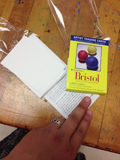
This is my third year of doing the ever popular Mini Masterpiece project with the Art History students and this year I decided to add something into the creative process of it by having the students do some trial runs with artist trading cards (ATC). Do you do ATC at all with your students?

In all honesty, I have wanted to get in on the ATC "game" for quite a while and I even have quite an inventory to do it - I ordered different supports in ATC size at the beginning of the year - but I haven't been able to get it and keep it going. I blame the ridiculous schedule I keep at any given time with working full-time, graduate studies (also full-time), married and family life, and everything else in between.

(Next year, my goal is to definitely get ATC creation and exchanges going here within the school's art community and then eventually have it connect with another school/art community. I think it would be a great for a student leader to spearhead and so it's on my goal list to make happen in that way. Anyway...)

I have all of these ATC but I haven't used them this year so far. Last week there was a major school-wide field trip that happened though with the Science department and I was left with only half of my students in almost every class! It was the perfect time to break out some ATC for the students to do some creative processing and exploration. I found it especially useful with the interactive art history students since they are prepping for doing the Mini Masterpiece project and the ATC are just the right size to get them to start thinking about scale in order for them to do more successful works of art when they get their final materials.

I put my hand in this shot so you can get a better understanding of how small they are! 

The students used the Portfolio brand Oil Pastels that we are such a huge fan of and they all turned out some pretty amazing ATC that many of them took with them in order to be able to give to their friends and/or hang in their lockers.

I have never done ATC before but I feel like it really worked as a nice stepping stones for art history students to feel a little more prepared and confident for when it comes time for them to put paint to canvas.

Wednesday, April 24, 2013

iHeart this iPhone app :: Toca Tailor app review

One of my daughter's favorite apps on my phone these days is one by a company called Toca Boca called Toca Tailor. Toca Boca makes a bunch of really cool apps - Birthday party is a close runner up for us but Toca Tailor is the hands-down favorite so far. It is a paid app but it's only 99 cents and since that hardly breaks the bank I have felt like it's more than worse the money. 

(I know this is a departure from the norm here on the blog but as an art educator who is also a parent, I am always interested in apps that have a little more intrinsic value than just temporary amusement. I also appreciate apps with decent illustrations.  I feel like Toca Tailor provides both of those things. Also, I am not being compensated by them in any way. I am reviewing this strictly because I am a fan of it.)

The way Toca Tailor works is it takes the idea of virtual paper dolls and it stretches it so far that you you can use patterns to actually create clothing for the little doll! It's really pretty neat and I feel like when my daughter is using it, she isn't just mindlessly passing the time and is even sometimes thinking critically about what she wants to do next and how she is going to do it. Here is a youtube video about the app (from the developers, of course)


And here are some amusing examples of what my almost 5 year old daughter did on my phone while on the bus on the way back from a field trip to the zoo last week. She is an obvious fan of mixing patterns and wearing as many accessories as possible. And the backgrounds that she chose for the pictures were ones she imported by taking them with my camera phone!


I love how grumpy this girl looks. 
The funny thing about this app is my daughter creates and dresses ensembles much like what I support her to wear in real-life. At any given time she is a visual conglomerate of clashing shapes, colors, and patterns and she will wear as many accessories as she can get away with. (I limit the accessories only because I don't want them to get lost since they do so easily and many of them mean a lot to her.)

Tuesday, April 23, 2013

Why ride waves when you can paint them :: Oil Pastel studies of waves

In continuing to prepare the 2D Design class to jump right into landscape painting from picture reference for their turn of doing a Place of Grace, we got our proverbial feet wet by wave painting!

While we could have done a youtube instructional video for this one, after the clouds in the sky and the tree, I felt like they should attempt the waves a little more on their own. I did provide some instruction for the purposes of prompting them to connect what they would do with the waves back to the tree and the clouds - like helping them to realize that the crest of the wave is not unlike the clouds or the foliage of the trees. I also helped them to see the darks, mediums, and lights of the sections of the wave as well as helping them to understand where things should be more heavily blended and where their marks should be preserved as they are.

Overall, the goals of the wave painting were to allow them to have a lot more autonomy, be a little more intentional with their marks, and prove to them that they can paint (and well at that!) by using a picture as a reference. I differentiated the instruction by allowing them to select which wave they would do but by the end of the exercise they all had attempted to do both to of them. I projected two pictures I found of wave paintings online and I projected them split-screen style on the dry erase board so I could label them as I needed to.

You can see some of the labels I drew on top of the pictures. 

And here is the student work! The students are getting better and better with their marks and I am so delighted with how they are becoming more "painterly" with their work overall. I am especially excited because this is a class of student artists who are very much foundational in what they know of art so this is their first major endeavor into really producing something that (for them) will feel a lot more legitimate. See if you can figure out which wave (A or B) that they did based upon their work!


This student wasn't done but I believe they have the essence of the wave they were attempting.


There was a lot of peer tutoring going on amongst them a they did their work and I know that helped. Many of them also learned (and demonstrated!) the importance of not just drawing in the center of the paper and using the whole space of the paper. Showing them how to bleed and anchor the shapes, colors, and values to the different sides of the paper really helped them to better understand the overall composition of each of their pieces.

One last thing I did was to play a youtube video as background "music" in order to make their painting as full sensory as possible. It was so relaxing hearing the waves crash every day that they did this. Here is one I used...


This is the first year that I have used youtube at least every other day - for either co-teaching instructional purposes OR to do things like helping to create a more authentic experience of creation in the studio classroom and I am going to keep doing it because it has really made a difference for the students and their work.

Something else of all of this painting of landscapes? I am convincing them (as I told them I would!) that despite any of their individual claims that I ALWAYS hear from them of "I am not an artist," they not only will come to love and crave the experience of painting but they will also be good at it too!

Monday, April 22, 2013

Work Smarter, NOT Harder :: Why you should sometimes use PicMonkey instead

So, obviously, I am an art educator but did you also know that I am quite well versed in graphic/digital/visual design overall? It's something that I have been doing for 10+ at this point while going the many paths my career has taken me in the way of printed marketing material, creating or refreshing visual brands, doing web design and publication, and designing multi-media presentations (powerpoint, keynote, prezi, etc.)

While it might seem strange and also strongly support the argument that I am nothing less than a workaholic, I really enjoy doing visual design work. It's always challenging for me to be able to create (or re-imagine/spruce up) something and it is really gratifying and relaxing for me because you can literally start with a blank (digital) canvas and then let your imagine go wild! As it goes, I have become the go-to gal where I work for visual design work that has essentially made me their in-house graphic designer. I always love being able to support and help my colleagues in this way - I see it as a way of sharing the things that I have been blessed to be able to do. It has taken a few years (yes - years!) to "train" everyone to understand that I do my best work when it isn't requested at the 11th hour but even when it goes like that, I always try and churn out the best thing I can and honestly? Visual design work comes pretty easily for me and through the years I have really been able to hone my workflow and technique so that if/when I need to pick up pace? I can deliver whatever is called for.

Two weeks ago my department head (whom I adore and would do anything for!!) emailed me asking me to take an old poster design (see below on the left) and fix it to have new information so that it could be used for my school's soon to be inaugurated outdoor theater. (I will share about this at some point if I can!) She said that nothing fancy would have to be done with it, she just wanted new info to be "plugged in" but since she knows very little about how digital and graphic design is done? Well... she didn't know that it can't just be done like that without it looking pretty bad. I worked up a fresh design from her original and gave her what you see below on the right with the goal to maintain the feel and look of the original design, including the new information, and also making it look a lot more polished. The whole thing took me maybe a few hours start-to-finished that included researching some inspirational ideas via Google Images and then whipping it up in various visual design software.


Perhaps all of this is small potatoes or "Greek" to you but I gotta tell you that when I "whipped up" the newly designed poster, I kind of really mean it as it is suggested to mean and that is that it was sort of a cake walk of sort. I mean, I can use photoshop and illustrator but honestly? There is something out there that is even more useful than that! And that is PicMonkey (formerly known as Picnik).

PicMonkey saves time, money and hassle - EVERYTHING you see here was done in PicMonkey (with upgrade)
Why is PicMonkey is a great web-based platform that makes visual design a little bit more approachable (and take up a LOT less time) usually?

  • It's drag-and-drop in a WYSIWYG (what you see is what you get) kind of way 
  • It requires very little technical knowledge like photoshop or illustrator or even gimp need in order to get it to work the way you want it to.
  • It is completely affordable since a lot of what it offers is for FREE and requires ZERO registration.
  • You can upload already existing photos and/or graphics to it and then do effect work on them and/or add text or graphics to make things look that much more snazzy. 
  • Overall, it makes photo editing and simple visual design very approachable and even enjoyable.
  • Even if you pay for the upgrade, it's only $5/month OR it's $33/annually and it opens you up to a whole bunch to graphics that aren't totally canned in addition to macros/actions for photographic editing - also, all of these bonuses are regularly updated to match whatever is trending in graphic design at the time. 
  • It's a GREAT alternative to not having to pay for vector graphics one by one since it has that regularly rotating inventory to begin with. 

One drawback of PicMonkey that is a little hard to explain to you all is the fact that it can be hard to fully originate a working file. This means that you can't totally start something from scratch in PicMonkey and for my purposes sometimes I will create a blank file in Photoshop - with the dimensions that I want and everything to begin with - and then I will import that into PicMonkey and then export it back out again (to Photoshop) if I need to. Does it sound like extra work that I have made for myself when I otherwise could have done everything in Photoshop? Well... I at least save money doing it like this by not having to buy vector graphics one by one OR I save major amounts of time by not having to make them first and then bring them into Photoshop.

Now, for those of you who are veteran visual designers, you are probably either laughing at me or scoffing at me and insisting that what I am doing is not REAL graphic and/or visual design. Well, let me tell you - and I am not trying to sound haughty or like a jerk - I don't really care about if people think I am legit or not. As far as I am concerned and from actual experience, NOBODY CARES or even asks how I accomplish most things I need to get done. My philosophy is almost always to work smarter not harder and don't get hung up on the details because doing so will actually keep you from getting anything done at all let alone doing something well. In my opinion and experience, what I do sometimes (with PicMonkey in the mix) adds to the success rather than subtracts from it.

Of course, you can't do every single thing with such ease in PicMonkey. Some stuff is better left to Photoshop because it is faster and a lot more painless. Working with layers IS a lot easier in Photoshop and being able to save in editable format (with layers) is something else that Photoshop does and PicMonkey simply does not allow. Other things like pixelating things for censorship and privacy (like what I might do here on the blog sometimes) is also a lot easier in Photoshop because it requires being able to create and manipulate layers. Still, it's completely do-able to do as much as you can quickly in PicMonkey and then import it into Photoshop and do a little more specific things per whatever you need. (See below)

Here I photoshopped in a layer of texturized revolver graphic and pixelated out the location information for privacy

Here is the finished poster with a different graphic since the criss-crossing revolvers are not quite to friendly for our purposes of them hanging around school. I expected that they would be edited out but for the purposes of having a visual placeholder until it was decided what would go in there (which was the locomotive)...


So there you have it! And perhaps if you have never tried PicMonkey before? Now I have convinced you that you must do so. And by the way, I am not plugging the service because they have compensated me in any way and I am telling you about it just from my own personal fandom.

Wednesday, April 17, 2013

Co-Teaching Art Education with Youtube :: How to Paint Realistic Trees

One of my favorite things to do with my projector set-up is to use it to present e-book pages, student work, masterworks, etc. on the white board instead of the projector screen. Why? Because then I can write and draw things on top of and/or around the image in order to better tell and show the students different things that they need to remember for their work. This teaching methodology works just as well for Youtube videos, too!

You can see some of the labels I drew in order to help the students focus on key points for their tree paintings.
In addition to the labeling, I also wrote a bulleted list (not pictured) for the students that included items like, "Don't forget that the silhouette of a tree's foliage is ORGANIC in shape - not perfectly round and lollipop-like." I also made a connection with their prior knowledge from Science studies and said that the shapes of their tree foliage should be almost amoeba shaped and the trunks with their extending branches should be almost arteries with their vein systems. I LOVE drawing connections from visual art studies to core content areas!!!

Here is the Youtube selection I used for the "co-teacher" this time...


And here are the before and after works of the students' trees! This time I had them each quickly draw what they thought trees looked like and, as expected, there was lots of "lollipop" stylings initially. Luckily, they learned a lot and quickly too about how to go about doing a more realistic and painterly visual depiction of a tree! The improvement from most all of their befores to their afters is astounding in some cases and even the most advanced students learned how to improve their technique!


In this example, the before is very broccoli like with the trunk being stalk like and everything! 


This student took it upon themselves to attempt a second tree (in the after) and was able to achieve great results  too.


What an improvement from before to after, eh? I think this one was very successful with the value and color work too.


Actually a very advanced student's work but even the before is very broccoli like. 


Much improved since the after doesn't have the exposed roots - though I get what they were going for.

I feel like some of the hardest (but most requested by them) techniques to teach are things like drawing/painting clouds and trees. Both are very similar in how you do them - and the students are slowly making that connection - but this repetitive exercise between what I shared yesterday and then today really help them to see that what looks so hard actually isn't that hard. Also, they are learning to see simpler shapes and masses within larger and more familiar forms (like trees and clouds) in order to better create them in their individual works.

The next step I took them to after this one with the trees (and yesterday's with the clouds) is to have them create a realistic sky with clouds. So, basically I am taking yesterday's work and having them apply it to today's so that they have a finished work of art. I am also going to encourage them to look up other tutorials like ones for waves or mountains in order for them to better understand how to combine different techniques to achieve a more realistic and refined landscape piece for the place of grace project that they are about to launch into.

One of the biggest woes that I heard the last time I did place of grace last semester was students who had issues doing the simple things like clouds and things. After doing these brief exercises with Youtube the way I have, I predict that the students will turn out even stronger work than last semester just because they will be more confident and will have a decent amount more working understanding and real experience to apply to their individual works.

And one last reason why teaching using Youtube as your co-teacher? If you have students who are out of class for any number of reasons, you can simply direct them to your collective of linked videos and they don't have to be totally behind because they missed in-class demos!

Monday, April 15, 2013

Co-Teaching Art Education with Youtube :: Teaching how to paint realistic clouds

How do you feel about co-teaching methodology? Is it something you use at all? Do you like it? Love it? Or could you honestly just leave it?

I teach at a private high school currently but I used to teach core subject (Reading and then Social Studies) in a public middle school. While I don't have a requirement to use the co-teaching model anymore - both because of where and what I teach - I, honestly, miss it. Whether in a special education setting or not, I feel like it's an effective way to teach students especially for certain things. Now, visual art education is not something that would typically have co-teaching even in the public school because it's usually restricted to special education settings for core subjects alone. However, that doesn't stop me from trying to bring it into my visual art education classroom. Sometimes an extra set of hands in the classroom for the sole purpose of doing "hand over hand" type guiding would be awesome and it occurred to me that I could make it happen with the extra set of hands being my own!

Perhaps I am behind the game on this but I am discovering that Youtube is a wonderfully useful instructional tool to use in the art classroom specifically for the following reasons:

  • You can start and stop it or replay portions of it as often as needed
  • In real time demos, sometimes you can't redo certain steps but maybe one time for the students to see again so it can feel like you are using unnecessary amounts of materials. 
  • When you are doing real-time demos you also can't see the students doing things alongside you as easily because you are the one in the front of the class. 
  • If the students end up really going in the wrong direction while following you (in a real-time demo), they keep going that way (and using unnecessary amounts of materials, in turn) until it's too late to stop them. Of course, you can use their misstep as a teachable moment like anything else but? Well... I don't have an exorbitant amount of materials to use like this - do you?
  • Youtube or streamed video almost always yields a captive audience for this age-group. Even if the video is bad? Well, it's that much more compelling for them to watch from beginning to end.
First off, picking the right Youtube video is key. I have about 53 minutes of instructional time but even with that much time, I have to consider getting the students set up with their materials and then the stopping and starting and replaying of the video that will inevitably happen. Through trial and error I have discovered that five minutes running time is about the most ideal. Below is a video that runs slightly longer than that but not so much that you can't make up the time with just fast forwarding through it. 


Here are some samples of what was turned out! Bear in mind that many of these student artists have incredibly limited experience in the studio arts. The 2D Design class is a foundational course which means many of them have never taken a high school art course before and maybe even never will again since taking this course satisfies a half fine art credit that they need for graduation. Considering all of the aforementioned, I would say the student work is very successful.


Some of my goals with this were the following:

  • Quick(-ish) skill building for the purposes of having more successful and realistic finished works in the Place of Grace painting project that they are about to embark on. 
  • Help them to realize the importance of the integrity of the marks they leave in their work so they are more painterly and, in turn, produce more realistic depictions of things in the end
  • Teach them to paint what they see vs. what they think a cloud looks like
  • Build confidence within them so they can see that doing something the right way can be learned relatively easily, can be very fun, and makes a huge difference in the quality of their work in the end
  • Show them how to use color AND value together along with layering in order to show depth and dimension on a 2D surface
  • Prove to the students the importance and power of following directions just as they are given because it really does produce stronger and better results in the end
  • Complete an assessment for the creative processing of their individual paintings
Something that can be done in conjunction with this for the sake of really strong experiential learning and connection is by having them do a quick exercise before this where they draw/paint what they think a cloud looks like with no reference whatsoever about how it really should be done. They will likely draw the puffy, cartoon-like clouds and be convinced that is not only adequate but even successful visual depictions overall. Once they do the follow along with the Youtube demo at least one time they will see how easy it is to draw/paint realistic clouds and they will want to do it that way because it honestly does look so much better. 

Tomorrow I will show you one more round of co-teaching with youtube along with student work that was before the demo and after they had completed it. I will also discuss where to take this skill-building and how to connect it with others in order to have a series of assessments to evaluate them from in the end.  

Friday, April 12, 2013

New and sale products too good not to tell you about

I don't order supplies until summer (about July - it's just how it goes around here) but it's my understanding that a lot of you all submitting your supply orders now. I've noticed a spike in my blog stats/readership that specifically hits pages and sections of my blogsite looking at lesson ideas as well as the materials page - both links to page can always be found across the top header of my site.

That being said, I am getting bombarded with sale catalogs and emails from supply companies and thought I would alert you all to some of the neat things that I will either be ordering in small amounts (to try out for the classroom) OR ordering in order to replenish because it's such an amazing deal and I know that it will used well.

Note: I am not being compensated in any wayby any of these suppliers OR product makers and I am plugging all of this purely of my own volition. That being said? If you are  interested in me reviewing your product/service that is visual art related, I might be open to such an opportunity and please don't hesitate to contact me directly for me to consider it. Thank you!

SKETCHBOX TABLE EASEL - originally $150, NOW => $35


image snagged from Dick Blick's product listing
Right now Dick Blick has dropped the supply on this amazing tabletop sketchbox easel (see left) that we use in the advanced studio classes at my school year after year. We have 18 of them and they are so great for the students to use because they are solidly built of wood AND they have built in storage. They can also accommodate canvas sized of up to 32"!!!!

The are originally priced at around $150 but they are on sale right now for about $35 (and they have limited quantities on hand, of course). Can you believe that price?!!! That is SUCH A DEAL!!!!! And if you want a class set or even just want one for yourself? I can vouch for the fact that one would have been a real deal even at $50 per piece. Don't delay and pick up one of these before they sell out. Seriously. I can't imagine they will last and I don't understand why they are getting rid of them OR how they are lasting this long at that price anyway. Buy it from Blick HERE.


Playcolor brand Water-Soluble Solid Tempera Sticks - on sale!


Are you a fan of Tempera paints? I am very much so. I use the tempera cakes at home with my
daughter and I use jugs of tempera at school for projects that I know cannot risk sun bleached color work - sadly, something that frequently happens in the student art gallery. The only thing I don't like about it is how it can be so dry and flaky after it dries. I like it so much though that I just ignore that part.

Anyway, I have just stumbled upon some tempera paint that is in solid state form! It is by a brand called Playcolor and it is reminiscent of oil pastels a little in that you can blend it, layer it, and it stays highly saturated in color presentation. Something else though? Unlike painted tempera it apparently doesn't crack!!! I LOVE THAT. I mean, I don't know if it actually works like that but it appears that it does. Here is a promo video for it that (of course) presents it in the most positive way possible but I feel like it's at least worth a trial run for me at home with my almost kindergartener daughter...


I have never used this brand and/or product before but right now School Specialty has it on sale in their print catalog that I just received. For whatever reason it's not on the website but Dick Blick does have a listing for it but they aren't on sale like they are in the Sax Arts printed catalog. Sax's sale price is a little less than $2 off the listed price on Blick and regularly in the printed catalog. My plan is to get a 12 count of the standard palette and I will (of course) let you know how it goes once I get them and put them through some trials. 


Related Posts Plugin for WordPress, Blogger...