Showing posts with label Painting. Show all posts

Thursday, November 7, 2013

Are you an ARTIST teacher?

This series of images documents the ongoing progress/process of a very large in-class demo of oil painting.
Just this past summer, I had the great honor and pleasure to meet one of my blog readers (Hi, K!) in part because they were doing their graduate studies capstone research project on the matter of not just teaching art but being an artist who just as well teaches. The whole idea was so curious and intriguing to me because I never stopped to think about what kind of teacher I am and even seek to be other than just trying to be the best professional art educator myself. 

Still, it got me thinking - have I been an artist teacher? What does it take to be an artist teacher if you aren't one? And, if you aren't an artist teacher, should you seek to be? And if you are an artist teacher, when do you stop being an artist and start being a teacher of art - or are those identities/roles so beautifully braided together that they don't beg to even try to be separated?

When I met with my blog reader, the intent was to be interviewed by them about the whole notion of being an artist teacher but it ended up turning into a very interesting and thought provoking conversation about that plus many other things. At one point they asked me something along the lines of if I wasn't an artist teacher or even an artist, what would I call myself. I sat and thought for a moment and then I declared that I am "curious" and that's what I believe that I am. Even now, months after that interview/conversation, I feel like "curious" is the best way for me to both explain, define, and identify myself. 

Last year, I believe I struck upon something incredibly important that has truly changed the trajectory of what I was trying to do when I first became an art educator five years ago. I realized the importance of process within the creation of art and I also started making a great distinction between the notion of CREATING art vs. making art. I did this not only in my own life but I also stressed this within all that I was teaching my student artists. 

I believe it's because of this that I finally started seeing more original, interesting, thought provoking, intentional and REMARKABLE artwork from my student artist more than I ever had before. It was incredible and the difference between what I did last year with my student artists and years before? You can totally see how much more on a different "level" it was and then continued to be with each next step they took with their learning and project endeavors. The difference between the two was that I made my teaching objective and curriculum a lot more about them (so, student-centered and inquiry-based) and a lot less about me (lecturing, deliberately steering each of them through very narrow paths of techniques for making things rather than creating them).

This year I tried something even more adventurous than what I did last year with an even greater emphasis on the importance of developing and having a creative process in order to be a more intentional artist and designer. While I have readily used in-class demos before, it's been in a way that kind of disconnects me from the process for the most part - meaning, I don't really show them much other than just demonstrating specific techniques. In my own experience as an artist though, I have learned that process isn't just figuring out and refining technique. It's about the perseverance, the critical thinking, deep emotional investment and personal connection with whatever work of art is currently in the works. All of that is even more integral to the creative process than refined technique but if I don't show the students that I go through this? I fail to show them some of the most important parts of the creative process and any finished work of art I might show them that I created seems to just appear vs. it being something that they truly see and understand was a labor of love (if you will). 

Finally got the stem and leaf (on the right) done the other day! Now to keep myself from going back and messing it up.
I have been working on a giant oil painting of a Hoa Quynh flower for weeks and going on months at this point. To say that it's been slow going would be an understatement and this is as much because I can't spend a ton of class time on it because I am constantly circulating and interacting directly with the student artists and their artwork as much as I have been just avoiding painting as I am wont to do even in my home studio. I am committed to pushing the painting through to the end though and even though the students have now finished their oil paintings, I refuse to give up on finishing mine because there is still so much process to share with them for them to learn of that I know will help them in their own journey to find and use their unique artist voices.

Tuesday, October 29, 2013

It's that time again :: Set Design :: Little Women - Fall 2013

Don't forget to enter the "Giving YOU the good stuff" (from Prang) fine-line marker giveaway by this coming Thursday, October 31st, at midnight HERE in the comments sectionThis isn't sponsored by Prang and is something that I just wanted to do because I like the Prang products so much after using them.

Remember: You don't have to tweet anything or follow me on any social networking conduits. 
Just answer the question in the blog posting HERE in the corresponding comments section and I will pick a winner randomly and announce it on Friday, November 1st! Good luck to you in winning it the prize!


One of my major responsibilities annually is handling the artistic direction of some of the major
dramatic performance productions at my school. While this used to just entail set painting and dressing and prop creation and making, it's also become an even bigger task because I sometimes even draw up set plans for the faculty directors/producers/set building crews as informed by multiple meetings and "visions" that any involved might have for the finished show. This is what the aforementioned looks like...


Monday, October 21, 2013

Maybe I do like Watercolor Painting Afterall :: Prang Ticonderoga Product Review

Let me just preface this by saying that watercolor painting is my least favorite medium to use and so I rarely use it in my classroom. The way you should take this is to know that I already come from a place of not liking watercolor paint/painting and that means it would take A LOT to "sell" me on the idea that it's worth my time to even try out or even consider. Does this all say that I am stubborn? Probably. That's the truth though. I am. OR... it means that I have very sharp abilities to discern what is worth both your time and mine. All of this said, here is my review of the Prang Watercolor set sent to me for review.


Disclosure: Compensation was provided Dixon Ticonderoga company

Opinions expressed herein are those of the author and are not indicative 
of the opinions or positions of Dixon Ticonderoga.


Dixon Ticonderoga sent me the Prang Watercolor paint set alongside a competing set by Rose Art.


Friday, October 18, 2013

Here Comes the "Good Stuff" you didn't even know you were waiting for...

 Over the summer, I was contacted by Dixon Ticonderoga to review some of their products for their "Get the Good Stuff" campaign. I happily agreed to review some of their products because I am already quite a fan of their pencils so the rest of the stuff? It's gotta be pretty good too, right? And I'm always open to changing my mind if it means that my student artists will have better tools to use for their amazing works of art.


Dixon Ticonderoga very kindly and swiftly delivered a lovely selection of their products along with some that were of competing brands. Because I was finishing out graduate school though? I had to take that lovely selection and put it aside until I finished my last two classes that included some of what I have already shown you as well as some major curriculum development work that was a whole year's worth of scope and 18 weeks of sequence. *sigh*

I'm happy to report that I am finally done with my graduate degree work and while I don't have my degree in-hand just yet, in a month or so it will be conferred and I WILL have it. And this means? I can finally do the reviews I have been wanting to do rather than sitting the box of all of the "good stuff" in my home studio (also where I was finishing all of my graduate coursework) and looking at it longingly for the day when my degree would finally be done.

So... this is the official announcement that next week will be a FULL WEEK of not only product reviews of what the Prang Dixon Ticonderoga company sent me but also an opportunity to a sampling of what I have been trying out and loving since they sent everything to me over the summer. Sorry it's taken me so long to get this going but, well... "good stuff" comes to those who wait. Thankfully you don't have to wait too much longer.

See you Monday when all of the reviews are kicked off!

Disclosure: Compensation was provided Dixon Ticonderoga company
Opinions expressed herein are those of the author and are not indicative 

of the opinions or positions of Dixon Ticonderoga.

Wednesday, June 12, 2013

Learning to listen and then let go

Some weeks back, I started oil painting again after taking an unintentional sabbatical for quite some time. I was able to complete two 36 x 36 pieces in one weekend. I felt pretty uplifted by them both.

And then something happened with the second one I did. The longer I looked at it, the more I become convinced that it wasn't as it was supposed to be. There was an unnatural darkness about it that made me feel uneasy and prompted me to try and make adjustments to help illuminate it. Everything I did only made it worse and spread more darkness over it. My husband tried his best to convince me that I should just let it be and friends of mine gave me plenty of affirmations that is was "pretty good." I wasn't convinced though I ended it quickly by rubbing it down with turpenoid and not even thinking twice about it. I knew that finishing it and then wiping it clean was absolutely essential to the creative process for what this painting would be.

Monday, May 20, 2013

This is why I paint and why I should be painting a lot more often

This weekend provided the first opportunities in months for me to really invest some time and paint in my home studio. Here are the fruits of my labor...


Both were done in Gamblin oils on stretched canvases that are 36x36 in size. Both are completely original works for me and this is a huge first for me. Both were also done - start to finish - within less than 48 hours of time. I have no titles for them yet but I am working on that. The inspiration for the subject matter should be obvious enough but largely it is informed by my Christian beliefs and experiences so far in my life.

Friday, April 26, 2013

Artist Trading Cards are so amazing

Today the Interactive Art History students are finally getting their paint brushes at their mini canvases for the ever popular Mini Masterpiece project idea. In the past they have been both excited and incredibly intimidated by the teeny-tiny canvases both this year I think I finally discovered a way to allay the fears because check out what they did with these Artist Trading Cards...


If these don't show that they are reasonably prepared and confident for really turning out some extraordinary tiny paintings that I don't know what will prove it. They will work on their tiny canvases for at least a week (starting today) in order to leave enough time for them to set and dry to give as mother's day gifts. I really look forward to sharing their finished works with you all because if this is any hint at what's to come? Surely they are going to be amazingly done!

Thursday, April 25, 2013

Mini Masterpiece prepping with Artist Trading Cards :: Interactive Art History

This is my third year of doing the ever popular Mini Masterpiece project with the Art History students and this year I decided to add something into the creative process of it by having the students do some trial runs with artist trading cards (ATC). Do you do ATC at all with your students?

In all honesty, I have wanted to get in on the ATC "game" for quite a while and I even have quite an inventory to do it - I ordered different supports in ATC size at the beginning of the year - but I haven't been able to get it and keep it going. I blame the ridiculous schedule I keep at any given time with working full-time, graduate studies (also full-time), married and family life, and everything else in between.

(Next year, my goal is to definitely get ATC creation and exchanges going here within the school's art community and then eventually have it connect with another school/art community. I think it would be a great for a student leader to spearhead and so it's on my goal list to make happen in that way. Anyway...)

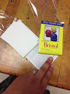
I have all of these ATC but I haven't used them this year so far. Last week there was a major school-wide field trip that happened though with the Science department and I was left with only half of my students in almost every class! It was the perfect time to break out some ATC for the students to do some creative processing and exploration. I found it especially useful with the interactive art history students since they are prepping for doing the Mini Masterpiece project and the ATC are just the right size to get them to start thinking about scale in order for them to do more successful works of art when they get their final materials.

I put my hand in this shot so you can get a better understanding of how small they are! 

The students used the Portfolio brand Oil Pastels that we are such a huge fan of and they all turned out some pretty amazing ATC that many of them took with them in order to be able to give to their friends and/or hang in their lockers.

I have never done ATC before but I feel like it really worked as a nice stepping stones for art history students to feel a little more prepared and confident for when it comes time for them to put paint to canvas.

Tuesday, April 23, 2013

Why ride waves when you can paint them :: Oil Pastel studies of waves

In continuing to prepare the 2D Design class to jump right into landscape painting from picture reference for their turn of doing a Place of Grace, we got our proverbial feet wet by wave painting!

While we could have done a youtube instructional video for this one, after the clouds in the sky and the tree, I felt like they should attempt the waves a little more on their own. I did provide some instruction for the purposes of prompting them to connect what they would do with the waves back to the tree and the clouds - like helping them to realize that the crest of the wave is not unlike the clouds or the foliage of the trees. I also helped them to see the darks, mediums, and lights of the sections of the wave as well as helping them to understand where things should be more heavily blended and where their marks should be preserved as they are.

Overall, the goals of the wave painting were to allow them to have a lot more autonomy, be a little more intentional with their marks, and prove to them that they can paint (and well at that!) by using a picture as a reference. I differentiated the instruction by allowing them to select which wave they would do but by the end of the exercise they all had attempted to do both to of them. I projected two pictures I found of wave paintings online and I projected them split-screen style on the dry erase board so I could label them as I needed to.

You can see some of the labels I drew on top of the pictures. 

And here is the student work! The students are getting better and better with their marks and I am so delighted with how they are becoming more "painterly" with their work overall. I am especially excited because this is a class of student artists who are very much foundational in what they know of art so this is their first major endeavor into really producing something that (for them) will feel a lot more legitimate. See if you can figure out which wave (A or B) that they did based upon their work!


This student wasn't done but I believe they have the essence of the wave they were attempting.


There was a lot of peer tutoring going on amongst them a they did their work and I know that helped. Many of them also learned (and demonstrated!) the importance of not just drawing in the center of the paper and using the whole space of the paper. Showing them how to bleed and anchor the shapes, colors, and values to the different sides of the paper really helped them to better understand the overall composition of each of their pieces.

One last thing I did was to play a youtube video as background "music" in order to make their painting as full sensory as possible. It was so relaxing hearing the waves crash every day that they did this. Here is one I used...


This is the first year that I have used youtube at least every other day - for either co-teaching instructional purposes OR to do things like helping to create a more authentic experience of creation in the studio classroom and I am going to keep doing it because it has really made a difference for the students and their work.

Something else of all of this painting of landscapes? I am convincing them (as I told them I would!) that despite any of their individual claims that I ALWAYS hear from them of "I am not an artist," they not only will come to love and crave the experience of painting but they will also be good at it too!

Wednesday, April 17, 2013

Co-Teaching Art Education with Youtube :: How to Paint Realistic Trees

One of my favorite things to do with my projector set-up is to use it to present e-book pages, student work, masterworks, etc. on the white board instead of the projector screen. Why? Because then I can write and draw things on top of and/or around the image in order to better tell and show the students different things that they need to remember for their work. This teaching methodology works just as well for Youtube videos, too!

You can see some of the labels I drew in order to help the students focus on key points for their tree paintings.
In addition to the labeling, I also wrote a bulleted list (not pictured) for the students that included items like, "Don't forget that the silhouette of a tree's foliage is ORGANIC in shape - not perfectly round and lollipop-like." I also made a connection with their prior knowledge from Science studies and said that the shapes of their tree foliage should be almost amoeba shaped and the trunks with their extending branches should be almost arteries with their vein systems. I LOVE drawing connections from visual art studies to core content areas!!!

Here is the Youtube selection I used for the "co-teacher" this time...


And here are the before and after works of the students' trees! This time I had them each quickly draw what they thought trees looked like and, as expected, there was lots of "lollipop" stylings initially. Luckily, they learned a lot and quickly too about how to go about doing a more realistic and painterly visual depiction of a tree! The improvement from most all of their befores to their afters is astounding in some cases and even the most advanced students learned how to improve their technique!


In this example, the before is very broccoli like with the trunk being stalk like and everything! 


This student took it upon themselves to attempt a second tree (in the after) and was able to achieve great results  too.


What an improvement from before to after, eh? I think this one was very successful with the value and color work too.


Actually a very advanced student's work but even the before is very broccoli like. 


Much improved since the after doesn't have the exposed roots - though I get what they were going for.

I feel like some of the hardest (but most requested by them) techniques to teach are things like drawing/painting clouds and trees. Both are very similar in how you do them - and the students are slowly making that connection - but this repetitive exercise between what I shared yesterday and then today really help them to see that what looks so hard actually isn't that hard. Also, they are learning to see simpler shapes and masses within larger and more familiar forms (like trees and clouds) in order to better create them in their individual works.

The next step I took them to after this one with the trees (and yesterday's with the clouds) is to have them create a realistic sky with clouds. So, basically I am taking yesterday's work and having them apply it to today's so that they have a finished work of art. I am also going to encourage them to look up other tutorials like ones for waves or mountains in order for them to better understand how to combine different techniques to achieve a more realistic and refined landscape piece for the place of grace project that they are about to launch into.

One of the biggest woes that I heard the last time I did place of grace last semester was students who had issues doing the simple things like clouds and things. After doing these brief exercises with Youtube the way I have, I predict that the students will turn out even stronger work than last semester just because they will be more confident and will have a decent amount more working understanding and real experience to apply to their individual works.

And one last reason why teaching using Youtube as your co-teacher? If you have students who are out of class for any number of reasons, you can simply direct them to your collective of linked videos and they don't have to be totally behind because they missed in-class demos!

Monday, April 15, 2013

Co-Teaching Art Education with Youtube :: Teaching how to paint realistic clouds

How do you feel about co-teaching methodology? Is it something you use at all? Do you like it? Love it? Or could you honestly just leave it?

I teach at a private high school currently but I used to teach core subject (Reading and then Social Studies) in a public middle school. While I don't have a requirement to use the co-teaching model anymore - both because of where and what I teach - I, honestly, miss it. Whether in a special education setting or not, I feel like it's an effective way to teach students especially for certain things. Now, visual art education is not something that would typically have co-teaching even in the public school because it's usually restricted to special education settings for core subjects alone. However, that doesn't stop me from trying to bring it into my visual art education classroom. Sometimes an extra set of hands in the classroom for the sole purpose of doing "hand over hand" type guiding would be awesome and it occurred to me that I could make it happen with the extra set of hands being my own!

Perhaps I am behind the game on this but I am discovering that Youtube is a wonderfully useful instructional tool to use in the art classroom specifically for the following reasons:

  • You can start and stop it or replay portions of it as often as needed
  • In real time demos, sometimes you can't redo certain steps but maybe one time for the students to see again so it can feel like you are using unnecessary amounts of materials. 
  • When you are doing real-time demos you also can't see the students doing things alongside you as easily because you are the one in the front of the class. 
  • If the students end up really going in the wrong direction while following you (in a real-time demo), they keep going that way (and using unnecessary amounts of materials, in turn) until it's too late to stop them. Of course, you can use their misstep as a teachable moment like anything else but? Well... I don't have an exorbitant amount of materials to use like this - do you?
  • Youtube or streamed video almost always yields a captive audience for this age-group. Even if the video is bad? Well, it's that much more compelling for them to watch from beginning to end.
First off, picking the right Youtube video is key. I have about 53 minutes of instructional time but even with that much time, I have to consider getting the students set up with their materials and then the stopping and starting and replaying of the video that will inevitably happen. Through trial and error I have discovered that five minutes running time is about the most ideal. Below is a video that runs slightly longer than that but not so much that you can't make up the time with just fast forwarding through it. 


Here are some samples of what was turned out! Bear in mind that many of these student artists have incredibly limited experience in the studio arts. The 2D Design class is a foundational course which means many of them have never taken a high school art course before and maybe even never will again since taking this course satisfies a half fine art credit that they need for graduation. Considering all of the aforementioned, I would say the student work is very successful.


Some of my goals with this were the following:

  • Quick(-ish) skill building for the purposes of having more successful and realistic finished works in the Place of Grace painting project that they are about to embark on. 
  • Help them to realize the importance of the integrity of the marks they leave in their work so they are more painterly and, in turn, produce more realistic depictions of things in the end
  • Teach them to paint what they see vs. what they think a cloud looks like
  • Build confidence within them so they can see that doing something the right way can be learned relatively easily, can be very fun, and makes a huge difference in the quality of their work in the end
  • Show them how to use color AND value together along with layering in order to show depth and dimension on a 2D surface
  • Prove to the students the importance and power of following directions just as they are given because it really does produce stronger and better results in the end
  • Complete an assessment for the creative processing of their individual paintings
Something that can be done in conjunction with this for the sake of really strong experiential learning and connection is by having them do a quick exercise before this where they draw/paint what they think a cloud looks like with no reference whatsoever about how it really should be done. They will likely draw the puffy, cartoon-like clouds and be convinced that is not only adequate but even successful visual depictions overall. Once they do the follow along with the Youtube demo at least one time they will see how easy it is to draw/paint realistic clouds and they will want to do it that way because it honestly does look so much better. 

Tomorrow I will show you one more round of co-teaching with youtube along with student work that was before the demo and after they had completed it. I will also discuss where to take this skill-building and how to connect it with others in order to have a series of assessments to evaluate them from in the end.  

Tuesday, April 9, 2013

Lesson Idea :: And so they prayed - Illustrations :: 2D Design

This lesson idea is not my own and was inspired by the book I so love called Drawing Lab for Mixed-Media Artists. The book suggests a creative exercise that challenges you to draw something silly or funny that someone says. I have seen this sort of thing elsewhere on the web (but I can't seem to find it to connect it here) and I have always loved the idea of this but I have never done it. This year and this semester's 2D Design class seemed to be the perfect time to take the idea for a spin.

One of the biggest challenges for me were collecting silly quotations said by kids that could be colorful and interesting enough to yield super imaginative drawings. You would think such a thing as this would be easy but actually it wasn't. A lot of the collective I found online featured "kids say the darnedest things"-type items that included bad language or otherwise very suggestive things that is just inappropriate for my high schoolers to attempt to take a part and then reassemble. After struggling to find maybe a handful of appropriate things I considered using my almost five year old daughter for fodder and consulting this small book that I keep with silly/funny things she has said or done. Surprisingly, only a few of them fit the bill for what I was looking for. Many of them were darn near impossible to try and imagine much less visually interpret in mixed-media works. The ultimate winner for me was when I stumbled upon a collective of cute and silly prayers that kids have said and people have submitted to online collectives. It was totally appropriate for my purposes because 1) it was faith-based and I teach at a Christian school and 2) none of the prayers had anything inappropriate but all would definitely guarantee some colorful and imaginative depictions.

Below are some of what the 2D Design students came up with along with the prayer snippets that they randomly picked from a bag. The goal was for them to be as literal as possible with their visuals in order to properly illuminate their prayer snippets. They used watercolor and ultra fine sharpie ink pen on aquabords.
"Dear God, thank You for the baby brother but what I prayed for was a puppy."

"Dear God, did you mean for giraffes to look like that or was it an accident?"

"Dear God, did the unicorns miss the ark? Too bad the skunks didn't miss."

"Dear God, I heard the moon was made of cheese. Tonight half of it is missing. Did you get hungry?"

"Dear God, I heard the moon was made of cheese. Tonight half of it is missing. Did you get hungry?"

"Dear God, I know you see everything. Please don't tell my mom about my bad test grade!"

I don't know that I will attempt this project idea again but if I do I might likely do it as one of the first project endeavors for the 2D Design or Graphic Design class. It seems to have great potential to serve as a bit of a pre-assessment sort of tool for the purposes of gauging skill/technique in beginning artists and it also is fun without sacrificing the opportunity for the students to really gain something important from it which is to force themselves to think in the most colorful and imaginative ways possible.

Wednesday, March 27, 2013

Maybe I will take a nap instead

Merely taking up space for the past 6+ weeks

I suppose I could have pulled myself out of bed at a reasonable time this morning in order to get things accomplished but I didn't. And this is the third morning that this sort of thing happened.

I would use the excuse that I am on Spring Break and that's why this sort of thing is happening but I don't know. To me that's hardly a reasonable excuse or justification or whatever you want to call it in order to explain that my serious lack of anything creative in the direction of personal works.

I mean... I don't know. I don't have any very good excuse other than the fact that when I am sleeping I am even dreaming about being able to take a nap so I'm just going to say that I am tired. I am REALLY tired and worn out.

I have one more day (tomorrow) of this Spring Break where I could possibly get in some really good uninterrupted painting time without having either a husband and/or a child wanting for my attention in some way, shape, or form so tomorrow I gotta get back to the easel and make SOMEthing happen.

Today, I really do think that I will take a nap instead. It just goes like that sometimes.

Monday, March 25, 2013

Keep Calm and Paint Sumi-E

In addition to Spring bringing all of the studying of installation art with the 3D Design class, the other thing that Spring brings is the Interactive Art History's class unit of doing Sumi-E ink painting...


I have already shared the lesson/project idea HERE and it's quite popular as it's become a real mainstay in the popular posts list link in the right sidebar over there. ------------------------------>

This year I found a great instructional video on how to paint Sumi-E on youtube and I shared this in addition to showing them some quick demos. I think this particular video is really great for an introduction to Sumi-E painting...


Also, as I mentioned previously when I originally shared this lesson idea, I ban the listening of "personal music" (that is: music that the students listen to from their own music players with headphones) and everyone listens to nature sounds while they do their ink wash painting instead!

Here are two that I used this year and they were quite popular and it was amazing how calming it was for the otherwise hustle and bustle of the classroom...


I would turn either of the two videos above and just play the sounds through the speakers as I would quietly circulate the classroom in order to check on the students as they worked. Also? There were very few protests from the students! Well... at first a few kind of fussed about it but after just one class period of this - and we had four total - there wasn't a complaint that I remember because I think the students really appreciated it in the midst of their days.

I don't have finished pieces of work to show you right now because I am currently on Spring Break and I forgot to snap some pictures of them before I left campus but I hope to share them with you in the coming weeks when I am back to school and in the swing of things.

Friday, March 22, 2013

The ROYGBIV Project :: Put a fork in it! :: Pt. 5 of 5

Without further adieu... I present to you The ROYGBIV project in all of it's finished glory!!!!

The installation makes the gallery hallway such a happy place!

Once the students got to the point where they were able to start installing their individual sections of the total installation and they got to see it all come together they were really motivated to get the whole project DONE and it took only a matter of a few days for them to all really pitch in and get things hung up and adjusted no matter what subdivisions they originally volunteered themselves for.

One element that was a final "finishing touch" was hanging painted (with tempera) sheets of acetate sheeting on alternating window panels all the way down the hallway. The hope was that the natural light could shine through the painted sheeting and then cast colored light into the hallway. It didn't work but it did look pretty interesting from the outside and it has served as great encouragement for people to see it across the "quad" and then come walk through the gallery hallway when they otherwise didn't have a reason to venture that way in the first place.

Next  year when we do a different ROYGBIV installation I will allot money in the budget for colorful cellophane.

The sun group had some serious challenges with trying to rig up something that would support the overall structure, girth, and unexpected weight of the finished work. Fishing line did not work after trying it multiple times so the winning solution was to use 14 gauge aluminum sculpture wire that supported the sun from three different points. It doesn't look like a literal interpretation of what the sun looks like but I think it works being abstract the way it is.

The sun is suspended at one end of the hallway where it can hang the highest from the ground.


Obviously a good number of the rainbow drops didn't hold their shape perfectly but I think it's OK. The student artists who worked on them weren't totally disappointed and I was really proud with the way they pushed through to the end even when it was very VERY challenging and discouraging at times. Their perseverance is so commendable and they really pulled things together in the end.


And the clouds group? Well, they had a bit of an unexpected advantage from the get-go because they didn't have to figure things out since they followed some directions found online. *shrug* They did have one of the messiest portions of the whole installation though so they had their fair share of challenge at times. Their original plan was to shade the clouds a little to make them look "stormy" but in the end that wasn't necessary and they simply used some of the natural darkness that was cast from the inside out that derived from the newspaper that they used for the center form of the sculpturing!


For a second try at studying installation art with the 3D Design class, I would say this attempt was successful. So many people - students and faculty/staff alike - have commented really positively on the entire installation and part way through the hanging of everything I already had inspiration come upon me for what will be done for next year's endeavor! If you can believe it it will be much of what you see here PLUS a little bit of some extra that is pure fun and lightheartedness. Hard to believe it can be bigger than this? I guess you'll have to hold me to that and visit me next year to see what it will be all about.

Thanks so much for sticking with me for this week long series! Next week is Spring Break for my school but I will be queuing up some postings that have been waiting around for their chance to be shared in addition to working on graduate school assignments and also (FINALLY!!!) doing some painting at the easel at my home studio.

Have a great weekend! See you next week!


This installation art study was student-centered and collaboratively designed and constructed (across two classes). It utilized paper sculpting and papier mache, string wrapping, spray painting and brush painting, fiber application in order to create a sun, clouds, and rainbow display suspended from the ceiling of the student art gallery hallway. It was originally presented in a week long series that showed the planning and creative processing, the beginning part of the sculpting/working stage, the point just about when everything was done being sculpted, and then some notes about when things went awry and how those things were dealt with. The final view of it can be found HERE. This project was meant to be a re-imagining of The Ombre Experience project idea.

Wednesday, March 20, 2013

The ROYGBIV Project :: Pulling it All Together :: Pt. 3 of 5

A view of the sun and some clouds without embellishments
The sculpting/fabrication process for this project went surprisingly quick despite how much work needed to be done. Before we got started I predicted that the clouds and the sun group would progress faster than the rainbow group and I was indeed right.

Every day I would have a brief discussion at the start of the class and give them feedback and also insight about how and why things were going as they were during the sculpting process both from my own observations as well as from the perspective of me being the "expert consultant" or the mentor to all of them. I would also remind them of the timeline that we were attempting to keep to and I would offer them suggestions about what could be done in order to either speed things up of the whole process OR attend to issues that might be arising. They also had the opportunity to ask me questions or present concerns about the overall scope of things and I was able to address things in some reasonably timely ways.

The second most exciting thing for them to do was to take each of their different elements to the next stage beyond just the foundational sculpting phase. The sun group needed to do some careful cutting work and then paint their object before embellishing it...


And the clouds group had to use a glue mixture to adhere the cotton batting and fiberfill to the cloud forms in order for them to look more realistic and have real texture...


The rainbow group? They plugged away wrapping more and more balloons in glue covered string while they also took breaks to spray paint what they had already made and dried completely...


One of the greatest challenges for me apart from managing some expected challenges betwixt and between them (and I will be address this in tomorrow's installment) was the fact that all of the fumes from the glue mixtures and spray paints being used were not fun to contend with in the studio classroom that I have which was never intended to be the studio art classroom that it is today. After about a week of me doing the best I could to air out the classroom just by propping open the door and then having all of the fumes waft out into the hallway, the building maintenance finally gave me my own window key!!!

The coveted GOLDEN key to the windows!!!

I am on pretty decent terms with the building maintenance team/management AND custodial staff because my path crosses with them in so many endeavors I might have but they like me enough because while I can present challenges to them, I am also one of the folks who can take care of their own messes and I frequently do so in such a way that I don't create a huge amount of extra work for them to do. For this endeavor? They finally just slipped me a window key and told me to be responsible with it - meaning, don't go opening everyone else's windows who might be asking for such a thing and also only use it in the art room when absolutely necessary!

Tomorrow I will share with you some hiccups and snafus of this whole endeavor chock full of some serious teachable moments before Friday when I will share with you all the final view/unveiling of everything as it is all installed in the art gallery.


This installation art study was student-centered and collaboratively designed and constructed (across two classes). It utilized paper sculpting and papier mache, string wrapping, spray painting and brush painting, fiber application in order to create a sun, clouds, and rainbow display suspended from the ceiling of the student art gallery hallway. It was originally presented in a week long series that showed the planning and creative processing, the beginning part of the sculpting/working stage, the point just about when everything was done being sculpted, and then some notes about when things went awry and how those things were dealt with. The final view of it can be found HERE. This project was meant to be a re-imagining of The Ombre Experience project idea.
Related Posts Plugin for WordPress, Blogger...