Showing posts with label Composition. Show all posts

Thursday, April 25, 2013

Mini Masterpiece prepping with Artist Trading Cards :: Interactive Art History

This is my third year of doing the ever popular Mini Masterpiece project with the Art History students and this year I decided to add something into the creative process of it by having the students do some trial runs with artist trading cards (ATC). Do you do ATC at all with your students?

In all honesty, I have wanted to get in on the ATC "game" for quite a while and I even have quite an inventory to do it - I ordered different supports in ATC size at the beginning of the year - but I haven't been able to get it and keep it going. I blame the ridiculous schedule I keep at any given time with working full-time, graduate studies (also full-time), married and family life, and everything else in between.

(Next year, my goal is to definitely get ATC creation and exchanges going here within the school's art community and then eventually have it connect with another school/art community. I think it would be a great for a student leader to spearhead and so it's on my goal list to make happen in that way. Anyway...)

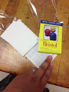
I have all of these ATC but I haven't used them this year so far. Last week there was a major school-wide field trip that happened though with the Science department and I was left with only half of my students in almost every class! It was the perfect time to break out some ATC for the students to do some creative processing and exploration. I found it especially useful with the interactive art history students since they are prepping for doing the Mini Masterpiece project and the ATC are just the right size to get them to start thinking about scale in order for them to do more successful works of art when they get their final materials.

I put my hand in this shot so you can get a better understanding of how small they are! 

The students used the Portfolio brand Oil Pastels that we are such a huge fan of and they all turned out some pretty amazing ATC that many of them took with them in order to be able to give to their friends and/or hang in their lockers.

I have never done ATC before but I feel like it really worked as a nice stepping stones for art history students to feel a little more prepared and confident for when it comes time for them to put paint to canvas.

Tuesday, November 27, 2012

More finished pieces of "a place of Grace" landscape painting project

As I previously promised, here are the rest of the student work examples from the landscape painting project "a place of Grace." The original positing discussing the lesson and showing the first round of student work was HERE.


Monday, November 19, 2012

Lesson Idea: A place of Grace | Landscape painting with Water-miscible oils

So... it's been at least a month and if not more than that since I blogged a lesson idea. It has happened like this not because I have been sitting around twiddling my thumbs but much more because I have been doing this lesson for that long and on Friday was the final day of it!!

I have already blogged about the WiPs stage of doing this landscape painting project with my 2D Design class HERE when I shared about the creative processing related to establishing strong and successful visual composition and then HERE when I showed the students applying color (for underpainting purposes) to their sketched (on canvas panel) pieces. This project was intended to be a very long-term type endeavor both because I wanted the students to do well in painting their selected places of grace landscape paintings as much as I wanted the painting process itself to be a place of grace in the midst of their busy school days. I am happy to report that on both accounts there was major success!!! 

By encouraging and supporting their learning processes of painting techniques and manipulating/working with water-mixable oil paints, they ended up learning not only about how to create some incredible examples of great visual composition not just in the structure of the overall elements of the pieces but also by using color relationships and intentional value work to push and pull the painting in the directions that it needed to go. The students worked from photo reference and they were required to go through a number of stages before they got to the point where they were laying paint to canvas panel. 

If you can believe it, the majority of the student work that I will be showing you was done by students who have never painted in this style/type of painting before. I did a lot of 1:1 consulting with each of them every day to ensure that they would move along swiftly as much as confidently and this project endeavors has turned out the greatest amount of successfully created student artwork examples ever for me!!! I am so incredibly proud of these kids. The below is just a small sampling of what I could have shared with you but I will be doing at least one more round of sharing more examples tomorrow so come back and see me then! 


Each piece was painted on a Blick-brand canvas panel that is 11x14 inches and the brand of paint we used was Reeves class pack of water-mixable oil paints. Also, I went through three entire large tubes of Titanium White (purchased separately) that I distributed/rationed carefully to make sure nobody took more than they needed but everyone got exactly what they wanted.

I just LOVED doing this project and I cannot stress how proud I am of my student artists for turnig out the incredible work they did. Many of them discovered what their personal artistic voices look like and a select few will be embarking on developing what they have discovered and refining it in their own (and mine as well) time. (More about this on another day.)

Anyway, like I said, tomorrow I will share another handful of student samples of this project. Hope you enjoyed the above so far!!

Thursday, October 18, 2012

WiPs: "a place of Grace" - the lay of the Land(scapes) | 2D Design

The 2D Design classes are working very hard and most are in the midst of the Figure out & Focus stage from my teaching model. Some of them are even in Stick or Scrap (in an effort to make some final decisions about what to ultimately do with their paintings) and are actually working their way back to Explore & Experiment since they are scrapping what they have done.

One thing that is really helping to inform their decisions about their individual creative processes is the use of color to do underpainting for their works. This project is mixed-media because I am allowing them to do underpainting with the Portfolio brand water-soluble oil pastels (that I love so much and reviewed HERE).

The oil pastels are a great way to ease them into painting because they are able to apply the color with a technique they are familiar with (like coloring with crayons, markers, or coloring pencil) but then they can take a wet brush and spread and manipulate the color like watercolor paint and they are already familiar with that as well. Altogether, it's less overwhelming and intimidating for them to do what they need to do (with color) to just get something down on their canvas panels. They can also scrape their canvases (and scrap, if you will) their ideas if they really need to without wasting paint the water-soluble oil painting classpacks we will be using to layer over top of the oil pastel underpainting.

Before the underpainting happens, I am encouraging them to sketch their designs directly on their canvas panels with pencil.


While they do this I am encouraging them to think critically and strategically about the placement of the different elements of their image (either directly taken from a photo OR done in composite-style) and I am encouraging conversation that implores them to know what type of composition armature they are using. Basically I am doing essential questioning. Examples of what that looks/sounds like are the following:
  • Is it an L-shape? Is it an S-curve? Is it possibly the cruciform? 
  • How can one element of their overall composition add to/detract from the strength and success of the whole piece? 
  • How is space being used in order to suggest depth and dimension to better communicate the feeling that what is pictured is indeed a place to be experienced?
There are a handful of students in each class who are beyond the pencil drafting because they are confident that they have strong visual composition so they are working to strengthen it all even more so by using color and value in the underpainting with the oil pastels...


The majority of the classes are brand new to painting but I feel like overall they are all doing REALLY well with thinking critically about what they do BEFORE they do it on their canvases in addition to being able to be objectively analytically when they are evaluating what they have just done or already done.

I have not instructed them yet about how to use color theory to strengthen their work or communicate a feeling or mood OR to suggest a stronger sense of space (like using complementary color palettes or lightning one element in order for something else to feel darker, etc.) but that is what we are working on this week.


Friday, October 12, 2012

WiPs: "a place of Grace" - Blueprinting the Visual Composition | 2D Design


In continuing on with my endeavor to attempt to teach the 2D Design students how to paint landscapes from picture/2D image reference, They have officially entered the stage of the creative process that is Figure out & Focus. Most of them have selected their inspiration pictures - found via image searches on the web as well as combing through their own instagram and other personal image archives.

Each of the students is required to bring in their images - whether it is singular or it is a collective in order to create a composite painting - so that they can figure out a strong visual armature for the composition of their individual paintings. I have been running them through exercises every day of looking at masterworks to both read paintings/images as well as how to identify leading lines, forms, and differentiating contrasting values and colors in order to understand how they all relate to one another in order to inform strong and successful composition. For as complicated as it makes my job sound? They are getting it. They are really really getting it!

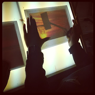
One thing I am having all of the students do for each of their designs is to make composition blueprints (for lack of better word). What they do is they lay a piece of clean paper on top of their inspiration image and then they have to draw on the clean paper all of the leading lines and simple forms (see above picture). Once they do that they have to identify and label the foreground, middle ground, and background as well as match/lay out basic colors in their blueprints...


I have shown them examples of images where there is a strong foreground, middle ground, and background as well as showing them images where there is just a foreground, subtle middle ground, and obvious background. I have also shown them how leading lines can steer the viewer's gaze to draw it into a picture/painting so that a person can't help but experience the visual depth in addition to perhaps naturally skipping their eyes (with rhythm) from object to object in the image. I have also been using the instructional book Mastering Composition (in e-book format so I can project the pages and visuals from the book onto the white board) to show the eight different types of composition and visual armatures that can be employed to help add more obvious structure and order to a painting.

We haven't discussed how to use color and value as a tool to create depth and space on a 2D surface but I will be showing them how to use complementary colors in order to make elements of a work of art appear as if they are advancing or retreating within the space/surface of the painting to make it appear to have a lot greater and more dynamic depth. 
Related Posts Plugin for WordPress, Blogger...