Showing posts with label Digital. Show all posts

Wednesday, November 13, 2013

A mini walking tour of the Digital Art Studio Lab Classroom

I always showcase things of the studio art classroom but rarely do you see anything of the digital art studio classroom/lab other than finished artwork on occasion. So, here is a mini walking tour of that classroom.


The two courses that I teach in the digital art studio computer lab classroom are Graphic Design (which utilizes Photoshop) and Digital Studio (which uses Illustrator). Despite what the names of the courses imply or suggest, the Graphic Design is basically Digital Art I and Digital Studio is Digital Art II. One of my goals for this year is to change that within the course catalog so it makes a little bit more sense and there is better clarity with regard to how the two classes are connected.

Something else that you might have noted from the video is that I use a classroom management tool that is something I found from Pinterest. It's an "am I done" sort of check-list and I have it printed in color and laminated and then tacked in strategically decided upon places all around the classroom. The art teacher who originally designed it deserves so much credit for it and MORE because it is beautifully designed and created and BRILLIANT for the purposes of answering the question that the students always have of, "Am I done (yet)?" If you are interested in it, I wish I had the direct link to it but I cannot find it but the blog is HERE and it's called "The Lost Sock."

Tuesday, November 5, 2013

Following Directions is a Good Thing | Reading in Art Education

A little more than a year ago I proudly proclaimed the fact that I, too, am a reading teacher no matter how it much it might seem that reading in visual art and design does not naturally exist or belong. I'm happy to report that later I am still insistent on teaching reading in my content area!

One of my favorite ways to do this is to teach students to read directions and how to follow them exactly as they are written. I do this in graphic design by requiring them to do tutorials from one of my favorite photoshop reference books called The Photoshop CS3/CS4 WOW! Book. I have used this book for four years now and though that might seem like what it offers would be dated, I still feel like it's a great text to teach with. It offers all sorts of useful tricks, tips, and teaching of techniques in clear and concise ways that also include screen captures alongside the very technical but also user-friendly language.

Wednesday, October 9, 2013

The countdown (to the end of grad school) is ON!!!

Seriously, guys. I'm sorry I have been so absent so far this year. I am less than FIVE DAYS from completing my final two classes for graduate school and then I will have my MEd!!!!!! And these classes that I am in right now? They are the dooziest of doozies (of classes) that I have taken yet. But then what do I expect, right?

Thought I would share with you yet another Powtoons creation that I put together and submitted as a part of my capstone project for my Directed Practicum project. I was allowed to propose anything I wanted and so I decided to put together a "starter package" (for all intents and purposes) for a beginning secondary art education teacher. There are (4) components of it including the powtoon (see below) that took me a ridiculous amount of time to create. The other parts are a lesson planning template (the one that I am always hocking to you all that uses inquiry-based learning), an idea for studio art classroom design (if money were no object or anything - see pics below the powtoon created with Interior Design App on iPad) and a comprehensive list of suggested supplies (available upon request - just leave me a comment and let me know how to get it to you OR email me!)

Anyway, here's the powtoon that I call "State of the {ART} Education" (that's what I called my who project) and below are the images of the interior design for my "dream" art education classroom that go along with the notion of what I believe to be "State of the {ART] Education."


Here are some of the shots of the classroom design...


In my original presentation of the classroom design, there were "walking" views of each space shown in the aerial views of the total space. It was a LOT OF WORK but kind of fun and I really enjoyed how simple the interior design app was for iPad to use. It was very much "what you see is what you get" in its functionality and capability and also saved me quite a bit of moo-lah seeing as how it wasn't the hundreds of dollars that a CAD program like that would have been had it not been a (more expensive) app the way it is ($10.99 is what I think it was but it was worth every single penny).

Anyone, I am in the throes of my last (and most gauntlet-like) graduate assignment which is for me to write 18 weeks of curriculum. I have a lot of it done but that's not nearly enough because in addition to all that I still have left of that? I have a bunch of other items that need to also be attended to in order to wrap up both of my courses. I've come this far, right? When all is said and done I might start calling myself the "Little Engine that could." *wink*

See you next time when I have finished it all and I have (FINALLY) have my masters degree!!!

Friday, September 6, 2013

My Back to School Night "Commercial" :: Multimedia Teaching Tools

I know. This is my second Powtoon in a week. I guess you could say I am slightly obsessed with them. *shrug* I can't help it! They are so creatively challenging and fun to make!! Anyway...

My last one was for the students but this one is actually for their parents because I "premiered" it last evening at Back-to-School night in an effort to introduce myself. This one is definitely more elaborate than the last one however it's over half as long in running time (exactly 30 seconds). I think it might have taken about the same amount of creative processing and design time as the last one though and I believe this is because I am just a lot more familiar with how Powtoons work and so I'm getting a lot faster.


I doubt this will be my last one but so far I might like it the best of all. I really enjoyed layering all of the elements, editing in the transitions, thinking about how things should be done in order to visually communicate and SHOW what I was trying to tell the parents of my students.

You might notice that what I didn't do was give a mini lecture about what goes on in my class and this is because we are encouraged not to do that so much as to offer the parents/school community a little bit more of a personal side of ourselves. That's why you didn't see any educational jargon and other bally-hoo of that sort.

One thing I know I want to do though after logging so much Powtoon time already is that I already know that I want to include this as an assessment tool for the Graphic Design student artists. There is just so much range and it's so fun. My only concern is that I don't know that the computer system we have right now can handle it.  Well... I guess there's only one way to find out, right? I'll let you know when that happens.

Tuesday, September 3, 2013

PowToon is my new favorite thing!!!

Can't remember where I saw this recently but another brilliant art education blogging teacher used the amazingness that is PowToon web-based design platform to make a really cool multimedia and fully animated and soundtracked video for the purposes of welcoming her students back AND refreshing their memories about classroom rules, procedures, and expectations. The program is sort of like Xtranormal except WAY better. (I mean A MILLION ZILLION times better.) It's currently in beta and mostly free but there is educators discount pricing which was only $60 for the year.

(Too rich for your taste? Well, I plunked down the money because I work with the school's marketing team, I might be able to finagle being reimbursed for it, AND I seriously love it so much I might use it over powerpoint or even Keynote from here on out.)

Anyway, I could not help but be inspired by this new and "shiny" technology and this week we are getting into the whole business of learning how to do critiques (both self and peer) and I thought this would be a great way to introduce the purpose of critiques, the process, and the layout of the goals and expectations. Here is the video short I just finished and while the learning curve started rather steep, it's a lot like iMovie (actually, I felt like it came more naturally to me even) and it was fun to do. You should try it out if you are interested in something new and unique to show your art students how creativity and creation can be stretched beyond paper, canvas, and other such traditional surfaces.

Wednesday, April 24, 2013

iHeart this iPhone app :: Toca Tailor app review

One of my daughter's favorite apps on my phone these days is one by a company called Toca Boca called Toca Tailor. Toca Boca makes a bunch of really cool apps - Birthday party is a close runner up for us but Toca Tailor is the hands-down favorite so far. It is a paid app but it's only 99 cents and since that hardly breaks the bank I have felt like it's more than worse the money. 

(I know this is a departure from the norm here on the blog but as an art educator who is also a parent, I am always interested in apps that have a little more intrinsic value than just temporary amusement. I also appreciate apps with decent illustrations.  I feel like Toca Tailor provides both of those things. Also, I am not being compensated by them in any way. I am reviewing this strictly because I am a fan of it.)

The way Toca Tailor works is it takes the idea of virtual paper dolls and it stretches it so far that you you can use patterns to actually create clothing for the little doll! It's really pretty neat and I feel like when my daughter is using it, she isn't just mindlessly passing the time and is even sometimes thinking critically about what she wants to do next and how she is going to do it. Here is a youtube video about the app (from the developers, of course)


And here are some amusing examples of what my almost 5 year old daughter did on my phone while on the bus on the way back from a field trip to the zoo last week. She is an obvious fan of mixing patterns and wearing as many accessories as possible. And the backgrounds that she chose for the pictures were ones she imported by taking them with my camera phone!


I love how grumpy this girl looks. 
The funny thing about this app is my daughter creates and dresses ensembles much like what I support her to wear in real-life. At any given time she is a visual conglomerate of clashing shapes, colors, and patterns and she will wear as many accessories as she can get away with. (I limit the accessories only because I don't want them to get lost since they do so easily and many of them mean a lot to her.)

Monday, April 22, 2013

Work Smarter, NOT Harder :: Why you should sometimes use PicMonkey instead

So, obviously, I am an art educator but did you also know that I am quite well versed in graphic/digital/visual design overall? It's something that I have been doing for 10+ at this point while going the many paths my career has taken me in the way of printed marketing material, creating or refreshing visual brands, doing web design and publication, and designing multi-media presentations (powerpoint, keynote, prezi, etc.)

While it might seem strange and also strongly support the argument that I am nothing less than a workaholic, I really enjoy doing visual design work. It's always challenging for me to be able to create (or re-imagine/spruce up) something and it is really gratifying and relaxing for me because you can literally start with a blank (digital) canvas and then let your imagine go wild! As it goes, I have become the go-to gal where I work for visual design work that has essentially made me their in-house graphic designer. I always love being able to support and help my colleagues in this way - I see it as a way of sharing the things that I have been blessed to be able to do. It has taken a few years (yes - years!) to "train" everyone to understand that I do my best work when it isn't requested at the 11th hour but even when it goes like that, I always try and churn out the best thing I can and honestly? Visual design work comes pretty easily for me and through the years I have really been able to hone my workflow and technique so that if/when I need to pick up pace? I can deliver whatever is called for.

Two weeks ago my department head (whom I adore and would do anything for!!) emailed me asking me to take an old poster design (see below on the left) and fix it to have new information so that it could be used for my school's soon to be inaugurated outdoor theater. (I will share about this at some point if I can!) She said that nothing fancy would have to be done with it, she just wanted new info to be "plugged in" but since she knows very little about how digital and graphic design is done? Well... she didn't know that it can't just be done like that without it looking pretty bad. I worked up a fresh design from her original and gave her what you see below on the right with the goal to maintain the feel and look of the original design, including the new information, and also making it look a lot more polished. The whole thing took me maybe a few hours start-to-finished that included researching some inspirational ideas via Google Images and then whipping it up in various visual design software.


Perhaps all of this is small potatoes or "Greek" to you but I gotta tell you that when I "whipped up" the newly designed poster, I kind of really mean it as it is suggested to mean and that is that it was sort of a cake walk of sort. I mean, I can use photoshop and illustrator but honestly? There is something out there that is even more useful than that! And that is PicMonkey (formerly known as Picnik).

PicMonkey saves time, money and hassle - EVERYTHING you see here was done in PicMonkey (with upgrade)
Why is PicMonkey is a great web-based platform that makes visual design a little bit more approachable (and take up a LOT less time) usually?

  • It's drag-and-drop in a WYSIWYG (what you see is what you get) kind of way 
  • It requires very little technical knowledge like photoshop or illustrator or even gimp need in order to get it to work the way you want it to.
  • It is completely affordable since a lot of what it offers is for FREE and requires ZERO registration.
  • You can upload already existing photos and/or graphics to it and then do effect work on them and/or add text or graphics to make things look that much more snazzy. 
  • Overall, it makes photo editing and simple visual design very approachable and even enjoyable.
  • Even if you pay for the upgrade, it's only $5/month OR it's $33/annually and it opens you up to a whole bunch to graphics that aren't totally canned in addition to macros/actions for photographic editing - also, all of these bonuses are regularly updated to match whatever is trending in graphic design at the time. 
  • It's a GREAT alternative to not having to pay for vector graphics one by one since it has that regularly rotating inventory to begin with. 

One drawback of PicMonkey that is a little hard to explain to you all is the fact that it can be hard to fully originate a working file. This means that you can't totally start something from scratch in PicMonkey and for my purposes sometimes I will create a blank file in Photoshop - with the dimensions that I want and everything to begin with - and then I will import that into PicMonkey and then export it back out again (to Photoshop) if I need to. Does it sound like extra work that I have made for myself when I otherwise could have done everything in Photoshop? Well... I at least save money doing it like this by not having to buy vector graphics one by one OR I save major amounts of time by not having to make them first and then bring them into Photoshop.

Now, for those of you who are veteran visual designers, you are probably either laughing at me or scoffing at me and insisting that what I am doing is not REAL graphic and/or visual design. Well, let me tell you - and I am not trying to sound haughty or like a jerk - I don't really care about if people think I am legit or not. As far as I am concerned and from actual experience, NOBODY CARES or even asks how I accomplish most things I need to get done. My philosophy is almost always to work smarter not harder and don't get hung up on the details because doing so will actually keep you from getting anything done at all let alone doing something well. In my opinion and experience, what I do sometimes (with PicMonkey in the mix) adds to the success rather than subtracts from it.

Of course, you can't do every single thing with such ease in PicMonkey. Some stuff is better left to Photoshop because it is faster and a lot more painless. Working with layers IS a lot easier in Photoshop and being able to save in editable format (with layers) is something else that Photoshop does and PicMonkey simply does not allow. Other things like pixelating things for censorship and privacy (like what I might do here on the blog sometimes) is also a lot easier in Photoshop because it requires being able to create and manipulate layers. Still, it's completely do-able to do as much as you can quickly in PicMonkey and then import it into Photoshop and do a little more specific things per whatever you need. (See below)

Here I photoshopped in a layer of texturized revolver graphic and pixelated out the location information for privacy

Here is the finished poster with a different graphic since the criss-crossing revolvers are not quite to friendly for our purposes of them hanging around school. I expected that they would be edited out but for the purposes of having a visual placeholder until it was decided what would go in there (which was the locomotive)...


So there you have it! And perhaps if you have never tried PicMonkey before? Now I have convinced you that you must do so. And by the way, I am not plugging the service because they have compensated me in any way and I am telling you about it just from my own personal fandom.

Thursday, March 14, 2013

Social Media for GOOD :: Turning Emoji into ART

I am a fan of Emoji. (There I said it!) Do you know what Emoji is? It's a Japanese term for a keyboarded language (think texting and online communications) that used picture icons and characters in order to communicate messages. Basically, it's modern day pictographs and while it's not something that all smartphone users have/can do, it's something that is a bit of a fun bonus if you are an Apple/iOS user because it's the Emoji keyboard is one that you can enable on your Apple device (iPhone or iPad) in order to create little scenes in the screenshots below that I created in text exchanges with a friend of mine...


To put credit where credit is due, the above Emoji art scenes were not originally designed by me and I searched through #Emojiart on Instagram in order to be able to find ideas and then I created them and sent them to my friend through texting bubbles. Still, they are fun right? And Emoji keyboards have TONS of options that include food items, animals, people, transportation vehicles, and buildings! And after I did the above, I really got to thinking that Emoji art could really work for art education and would be a great way to interact with my art students electronically if I wanted to. I mean, it seems like it could really lend itself to an Emoji Art contest or something and I think that could be kind of cool. Also, even though you sort of need to have an Apple mobile device to be able to do it, it's becoming a standard enough that kids could do it as teams and submit their Emoji Art jointly from one person's phone.

Anyway, Emoji Art is pretty fun as it goes and if you haven't tried it before? Try your hand at it. It's pretty fun and can lend itself to a unique outlet for creativity.

Monday, March 4, 2013

Behind the Music(al) :: Hairspray :: Propping up the show

One major-ish task on my list of tasks to take care of was to make labels for the "fog in a can" props that would stand-in nicely for real spraying hairspray cans. For whatever reason I seriously put off this item for as long as possible despite the fact that it was probably the simplest and (in turn) most gratifying thing of all of the things I was supposed to do.

The finished cans of "Ultra Clutch" labeled and ready for the show!

As you can see, the finished labels look pretty much like the giant can I previously shared. For whatever reason I got it in my head that labeling these cans would be a real pain in the rear so I think that's why I put off doing them for so long. Then it occurred to me - much like most other things I was trying to do and failing miserably at - that I was really overthinking things and pretty much working harder and not smarter. And with that I sat down, gave myself a pep talk and realized that I should just use digital illustrations I already had from the poster design I created and then bend and twist that into what you see above! The power of digital illustration is amazing isn't it? I was able to cut my workflow in half if not even less than that and voila! I had hairspray can labels cohesive to the design work already established for the show and then all I had to do was size them accordingly, peel off the original labeling and then paste them on to look like they had always been like to begin with.

And because I like to share and am all about helping others to NOT reinvent the wheel, if you are in need of Ultra Clutch hairspray can prop labels, here is what I printed off and used in the aforementioned photo. If it works for your needs? Please feel free to use it. Just click on it to enlarge it and then right-click it to save it for you to print off as you like.

This is a jpg version but I have a psd version and if you want it please just ask and I will email it to you!

BTW - if these Hairspray updates/this series is boring you, I'm sorry. *shrug* This is basically what has been ruling my life these days but with the show opening up this past Friday and closing next Saturday, I promise there won't be very much more of this for very much longer. Thanks for your patience and humoring me if this alone is changing your mind about frequenting/reading this blog that otherwise about art education.


Tuesday, February 19, 2013

Behind the Music(al) :: Hairspray :: Tickets

We've got tickets!!!!! 
 

This is the first year that we have done vertical orientation of the ticket design but with the hairspray can that is easily the core of the overall design of the show, well... it works, don't you think?

The tickets are color coded not only because it looks really cool like that but more to help differentiate between the different showings. We haven't done color coded tickets before this year but it has worked out so well to do it like this that it easily might become a standard thing for every show from here on out.

This past long holiday weekend I spent the majority of my time at school working on the set so I will be sharing pictures of those adventures soon enough. We still have a week and a half until opening night and thankfully we are pretty well on schedule with everything. 

Something you can't see about the tickets are that each are hand numbered to correspond with assigned seats in our performance arts center at our school - it is actually used as much by other organizations as much as it is by us - and the tickets are printed on nice heavy-weight paper with a semi-gloss finish so they serve as mementos for the show just as much as they serve as functionality to provide access to the specific shows!

Friday, February 15, 2013

Behind the Music(al) :: Hairspray :: Promo posters

The promo posters has turned out pretty well, don't you think?

So I previously shared with you all what the general graphic design would be for the annual musical production would look like at least in its working stages and I am happy to report that it was approved - not only by the directors and producers of the production - but also by the governing organization of musicals (who provide us with the materials for the musical) themselves! One of my colleagues who also does graphic design and handles a major amount of the performance arts goings-about here took the core design that I was able to pull together and the above is the official poster for the production! Hurrah!!! One more thing down!!!

The graduated color and the pink and white writing work well for it I think and the general design (colors, layout, etc.) is also going to inform both the ticket design - this year is the first one we are doing a vertical design for the ticket - as well as the roadside banner that will be staked out at the school's entrance gates.

I will try and share the ticket designs when I finally get to see them as well as the roadside banner and then also the tweaked t-shirt design when it is finally printed and shipped in next week sometime. Until then? I am working over this coming long weekend on the actual set of the production. There is a TON to be painted, detailed, and still constructed yet. An art teacher's work is just never done! (Good thing I love my job so much and I would do all of this anyway. *wink*)

Tuesday, February 5, 2013

Behind the Music(al) :: Hairspray

Sorry I missed you all yesterday! I had a sick day because I had to go to a sort urgent doctor's appointment but thankfully I checked out OK so here I am! And today I bring you the design process and (mostly) finished graphic that we will be using for the Hairspray production...


If you didn't know, part of my job is teaching digital design and art as much as it is teaching traditional studio design and art. I teach two semester classes of this - one focusing on Photoshop and the other focusing on Illustrator - and because of my know-how for both design platforms, I have become a bit of an in-house (read: and too many times to count last minute) graphic designer for things at times. *sigh* I have a love-hate relationship with this sort of thing for all of the most obvious reasons.

For the purposes of Hairspray, there was never a plan for me to do the design work and the goal was to have a very talented senior graphic design student do it. Then all of the craziness of January happened and all of the best laid plans that were made (to have it be student created) went out the proverbial window. Thankfully, there was just enough time for me to be able to do it and I had enough information from the student in addition to a rough digital draft of what she had planned to do that I still feel like it would be fair enough to call this a collaborative effort.

Now before I go looking like some rockstar graphic designer, please know that the design work of this was not entirely my own! As I said before, the original student designer had a specific idea in mind to have a hairspray can as a central part of the design. The asterisks were something that were specifically requested by the faculty director and producer of the show so that they could be a graphic element that was seen throughout the set designs. The classic wig and "cut-out"-style lettering are supposed to be an obvious nod back to the original design of Hairspray. In terms of the actual elements I used, I did not originate all of them myself. The hairspray can was actually a generic vector file that was editable and I bought it for about $5. I mean, I suppose I could have made it but when I was in the midst of figuring out how I would do it, I stumbled upon the vector image and figured why not just save myself what would have been a few hours of work and buy it. I mean if time is money, my time that would have been hours long is certainly worth a measly five bucks that would allow me to call it DONE. And so? That's what I did. Why reinvent the wheel right?

In terms of the color palette, I tried my best to adhere as much as possible to the color palette that we picked for the show (seen previously in a posting last week) and I also tried to pick colors that would work together to make each other pop. Case in point: the background of the logo is purple (it's supposed to be representative of the official t-shirt that the design will be printed on) and the spray represented by the triangle is yellow.

Overall, I am pretty satisfied with this piece and it has gone over well for the most part. I did do some slight tweaks to it - so what you see up there on the right is not final - but I will show you the final design once it gets back from the t-shirt printers as well as showing you how the design was also put on promo posters, the roadside banner, and the tickets and front cover of our "playbill" once all of everything is printed and delivered in a few weeks.


Friday, October 19, 2012

Go Green with Google | Art Teacher Hack

I am not very good with my conservation efforts but I am always very envious of people who are. I mean if there is a (not full yet) recycling bin in the general area where I am  at the time when I could use it - like after I just finish ANOTHER Dr. Pepper - I have no issue putting my empty can in it! Mostly though? My "green" efforts only occur at my convenience.

(I know. I Know. I KNOW! Trust that I am not bragging about this and rather this is me confessing my own sinfulness because I feel convicted at the notion that I am hardly as "green" as I could be.)

All of that being said, there is one thing that makes me decidedly very green despite my best lack of efforts. How is that? Well, in any of the digital art courses I teach, I do things entirely paperless!!! That's right. They get their assignments via our school's closed server/shared drive and they submit their work for grading electronically as well. Recently though, because of server issues, I switched to using Google Docs (well, not it's Google Drive but I am also the person who continues to call New York & Company, Lerner).

 Here is a snapshot of me sorting through student work on Google drive...


I really REALLY like Google Drive because it has made it possible for me to not be on campus and still access all of the student work when I need to grade things. (Which I do. I am SO backed up with things lately. *sigh*) I don't know why I never used Google to do file sharing but now that I have switched? I am NOT going back.

Recently I made a HUGE discovery that is changing the view of the way the shared files are presented to me. I used to have to deal with a long list of text but I discovered on accident the other day that if you toggle the switch (indicated below in the picture) you can see snapshots a little bigger than thumbnails of ALL of your files!!!!


This is SO awesome because it means that I don't have to deal with reading and for as much as I don't like to broadcast it? (Especially after my one posting about teaching reading in Art Education) I am not a fan of reading and I try to avoid it usually to not slow myself down. (Because of my unique learning challenges)

Google Drive is AMAZING and the upgrades they make to it for the purposes of networking, sharing, storage, etc. etc. etc.


Wednesday, October 10, 2012

Lesson Idea: Fruits of the Spirit - Contemporary Propaganda study | Graphic Design

 In a little less than one month, the United States of America will be casting their votes to elect the next president. I normally don't involve or concern myself with anything political but it's hard for me not to take notice of the hub-bub of it all. Even I can easily get caught up in the spirit of things and I am perhaps one of the most unconcerned and unlikely political types (for the most part) ever. And for this reason? I decided to do a politically inspired project idea with my Graphic Design students.


*** Feel free to scroll through this to get to the project notes***

A little background: Recently, I made the decision to take myself off of facebook (for personal networking purposes - my business ventures still have a presences there). I had been toying with the idea of doing it for quite some time now both because of my disagreement with Facebook user policies that not only readily permits but also encourages people to overshare things about themselves. This coupled with the fact that the upcoming election has made people almost combative with their personal political platforms and concerns? I don't know. I just think Facebook has become a place that simply isn't for me anymore. Still, even with all of the reasons I feel like it is bad (disguised as good), I didn't leave there without taking some inspiration for an art project idea for my student artists!!

I don't really watch TV that much these days so I have been pretty shielded from the ridiculous political mudslinging that is likely happening and picking up momentum in that way. However, I have been able to witness some it via people I knew on Facebook that very much served as the catalysts that I was ready to be done with it once and for all. Perhaps it's because I am very aware of what can be visually communicated but there were a number of memes out there (from and for either side of the political showdown) that I think are just ridiculous. I won't share them because I don't even want to give them anymore web space than they already take up but basically they take some of the most unflattering pictures of both candidates and then they say some pretty ridiculous things about them that are just plain unnecessary, usually untrue, and definitely unfair. Now, normally I don't feel like this is a problem so much but I started noticing that as people were posting things, it was inspiring one of two things:
  1. Serious division between people who were actually friends at one time but had all of a sudden felt like because of their differences of opinion in the realms of politics, they couldn't be friendly or even sometimes friends anymore
  2. Certain people who might have been "on the fence" about politics to believe things that were outright wrong about the two candidates so much that it was actually shaping their motivations to vote in one way or the other
You might be thinking, "What do you care what people think? Really! I mean, and what do you care and WHY do you care?" You know what?  I am not ashamed to say that I do very much care about the fact that such a thing is happening and has happened (and easily this is why Facebook is not the place for me). I care about how people interact with one another because I know (as my faith informs me) that what people say and do to one another whether virtually or in-person makes a differences. It can build up or tear down.

I know this all too well, in fact, because recently I believe that I actively and perhaps even subconsciously contributed to the annihilation of what I always believed to be a very deep and close friendship. I can't take any of it back no matter how much I am shamed by it but I know I was wrong and that the situation itself was just wrong (all together) and it only serves as even more evidence to me that people need to be a lot more careful and intentional about the things they are saying and doing. When you say and do things, you can say your apologies but the digs and cuts that you might make leave scars that are painful to deal with long after they allegedly healed. And so? I (even before the aforementioned event) am keenly aware of the importance of saying what you mean and meaning what you say and trying to make that be reflective of the fruits of the spirit as much as possible. I mean, I will get it wrong. I absolutely will but that truth doesn't have to stop me from trying to do it just the same. And so? That's where the idea of this project idea originated.

*** End of background information, start of project notes ***

I am a firm believer that the Lord and His gospel can be found within every and any part of the grand and intelligently designed thing that we know as the world and our lives. With this in mind, I examined and discuss the work of Shepard Fairey as well as the scandal that ensued because of it with my graphic design student artists. Are you familiar with what I am talking about? He was behind the infamous Hope poster done around the time of Obama's election that became iconic of Obama's campaign and actual election to the presidency. Here it is to refresh your memory...


Now, I totally think that what happened because of it was warranted and fair with the rulings for the Associated press photographer and against Shepard Fairey but that doesn't mean that I don't still think the work isn't truly noteworthy, successful, and just plain really solid and amazing design work in the way that Fairey turned it and twisted it to be what is. And this is exactly what I told my student artists! We also talked about how so much of what might be swirling about (in the way of graphic and pictorial propaganda and promotion) was bad - both in design and in actual content. I challenged them with the notion that we could take inspiration from Shepard Fairey's creative genius and also learn from what others are doing that is negative (with their political commentary) and do inspired pieces that promote fruits of the spirit just as the gospel promotes it. So? That's what we did!

Each student was assigned a specific fruit of the spirit and they had to take that and then design something that visually encapsulated and intentionally communicated what it would look like similar to what Shepard Fairey attempted to do with the Hope poster design. I created a keynote presentation that "unpacked" the details of the design and explained the anatomy in terms of specifics like the use of only (3) colors, using posterization to transform the the colors/images, using a single word to literally communicate in conjunction with the images itself, etc. I also showed them some very amusing spoofs on the Hope poster and talked about why things like that exist as a result of what happened. One last thing I did with them was to not give them a step-by-step tutorial. I wanted them to see what needed to be done and then figure out (by inquiry-based working mode) how to do it in photoshop. 

Here are some of the finished pieces that they turned out...


Now, before anyone says, "You just endorsed them 'lifting' other peoples' work just like Fairey did!!" Calm down. I absolutely did not. They were very aware of the fact that their work was not solely their own AND they would not and could not call it that. They were also made aware that what we were doing was a study and so it was kind of like doing a mastercopy of Shepard Fairey's work and that required them to use what someone else already did BUT they could not take credit for the other person's work and they would need to be able to explain where and how their image originated.


Thursday, August 16, 2012

iPlan with Keynote: Graphic Design presentation

Here is the quicktime movie of the Graphic Design presentation I will show on the first day of Graphic Design class next week.

(Some of the content within the presentation was not originated by me but proper credit will be given in the narration I provide when I give the presentation to my classes. If you see anything that you have done within my presentation PLEASE accept my gratitude for providing me with such great inspiration to draw from and include and share with my students. Your brilliance will be nothing less than a great springboard for them to create their own amazing works of art.)


Graphic1stDay from dreampraycreate on Vimeo.

Some things I tried to do within the presentation were the following:
  • I really REALLY wanted to not only tell but show what I wanted them to understand. I was very intentional with the images that I used.
  • I didn't want to overload them with information but provide just enough that would probe them to think on their own.
  • I wanted to use only examples of Graphic Design artwork and as many masterworks as I could because I seriously subscribe to the belief that some of the best learning is that done from those who really REALLY know how to do it!
  • I really REALLY wanted to use visual art vocabulary straight away so that they start getting used to hearing it and start get used to applying it and using it.  
  • I absolutely wanted to kick off the class with not only a thought-provoking experience that would *hopefully* inspire very natural discussions and questioning but also catapult them into creative processes that would lead swiftly into an art activity that could be done as soon as the presentation was over. 
So there's my Graphic Design's first day of class plans. Don't forget that I also showed you 2D Design and 3D Design's presentations on the days before today so if you are new here to this blog and haven't seen those, check my archives and you can see them!

    Wednesday, August 8, 2012

    iPad App review: Penultimate

    According to my blog stats, it's teacher planning time!!! The most visited portion of this blog lately is the lesson planning idea page. Pretty cool, if you ask me. And like you all? I am doing plenty of planning for next year as well.

    Pinterest has been a huge wellspring for inspiration for me but I also find lots of ideas via my blogroll managed by my Google reader. Every time I see something I like, I will star the posting so that I can return back to it when I need to. Now, this system has worked for me but it has also been a little clunky (if you will). It required me to do a ton of printing, filing, spreadsheeting, and inevitably forgetting about the file stacks of lesson plans that I had printed and never really looked at again since all I ever really used was my single printed spreadsheet that I would write all over and dirty up.

    Enter: Penultimate for iPad

    OH MY LAND!!! This app TRULY blows me away!! It does everything that I was doing in a format that is incredibly efficient, portable, and shareable, but also doesn't force me to give up certain elements of lesson planning that I just can't stop myself from doing - like using pictures for reference, making lists, compartmentalizing my ideas, and physically writing notes about what I intend to do with my project plans for each of my classes.

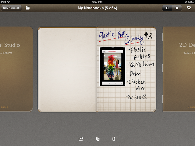
    Penultimate is essentially a wellspring of digital notebooks that you can use to put pictures in and then handwrite notes about what you want to do with them. I created a notebook for each of the courses I am instructing this year and I access them by simply touch-scrolling through the lineup until I get to the one I want.


    When I get to the one I want, I simply touch it open and it brings to me to the last page I completed.


    Pages can be changed to be a grid/graph background, have narrow or wide rule notebook lines, to-do checklists, etc. You can import pictures either from the on-board camera OR from your camera roll. You can put more than one picture of the page and layer them as well.


    After you put your picture on the page, you can hand write notes on or around it as you like. What works for best for me for the purposes of supplies ordering is just putting a picture (for visual reference/recall) and then listing the supplies I anticipate needing right next to the picture. This works well for me because there are a lot of project ideas that I see that are not standard art education lessons and I do a lot of top-down planning.

    Once you have a handful of pages finished, you can view them all together and rearrange them if you like. The below is a view of all of the notebooks open to their last completed pages but this is the same view you see if you look just at the pages within one notebook. You can touch and move any of the pages to rearrange them and reorder them if you need to.


    Something I haven't done but plan on trying is sharing and/or exporting any of my notebooks either to email or to other apps. This is good for people who might prefer typing over handwriting since *I think* the Penultimate imports elsewhere as an image file that is put on a page where you can type things around it.

    Before I got Penultimate I considered Evernote (which I got and honestly don't care much for) and Pages. I got Penultimate randomly but I am so glad that I did. It is the ultimate digitized notebook if ever there was one.

    Tuesday, August 7, 2012

    Fessing up already

    OK so I have a secret that I have been sort of keeping from this blog and it's honestly pretty dumb but I have done some thinking about it enough (perhaps the better word would be rationalizing?) to finally share it with you all.

    Here's my confession: I am (almost) addicted to making virtual pottery on the Let's create Pottery iPad app.

    I know. I know. This is so dumb!  I should have been working on reviewing/playing with other iPad apps that are art and design related vs. playing what is essentially a game that could just as well be called Farmville or Cityville.

    (And you can stop reading now if you want because I will also admit that I have adamantly REFUSED to jump on the Farmville bandwagon so if I have just offended you, I am sincerely sorry because after puttzing around on the pottery game I am here to tell you I. GET. IT. I am WITH. YOU. and your virtual/sim game/life thing that you cannot get enough of!!!)

    But seriously? The pottery game is AWESOME.

    IT IS AWESOME!!!!!!!!!!!!!!!!

    I mean, yes - it IS a game since you don't just fake hand-throw pottery on a fake pottery wheel while fake nature sounds play in the background like you are working en plein air...


    ... and then fake fire it in your fake kiln...


    ... and then fake sell it at a fake art auction with a fake soundtrack of an auction gavel and people bidding.


    Yes. It is definitely all of that fakeness. BUT! There are also "design" challenges that come in fake email requests and are essentially commissioned pottery requests that have a little message with the design requirements and a picture that you can use to inform your sculpting and glazing decisions. And some of the challenges are actually quite challenging! Especially the castle one toward the end - which would be, like, level 30 or something.


    Uhmmm... yes. I did play it all the way to level 30 and beyond and I actually finished the game.

    (I am shamed and saddened because I want the app designers to get off their duffs and MAKE. MORE. LEVELS. ALREADY!!!!)

    But here's the thing. Even after you finish all of the design challenges, you can still just keep making cool designs and trying to get high scores at the auction so you are essentially competing against yourself.


    You can also do things like look up different types of pottery - as in, studying art history (LOVE IT!!!) - and have that help you to inform your sculpting and design decisions.


    And if you get really into it, you can start posting some of your favorite designs to the Let's Create Pottery online community gallery (I KNOW. Don't even say anything about me doing this. *Sigh* Just don't.) And look at other people's work and try and see if you can make some of the cool stuff they make!

    *crickets*

    ...

    ...

    *more crickets*

    (-_-)

    But honestly. It's not all that bad. I mean seriously!

    And on that more serious note, I have actually thought about how this app can extend far beyond it just being an online simulation game. 

    Now, I don't know enough about throwing pottery on a real wheel so I can't tell you if this so closely imitates that process but as far as problem solving and design challenges that a teacher could give to students similar to the fake commissioned pottery requests within the game, I feel like that is definitely something that could work in an art classroom. I mean, it will never ever be able to take the place of the experience of making REAL pottery but I don't see why it couldn't work as a warm-up activity or idle-hands -type activity.  Of course, you would need to have at least one iPad and more than just one would be much more preferred since I can imagine other students would want to partake in the activity as well. Some ideas for design challenges? Well here are some I challenged myself to make...
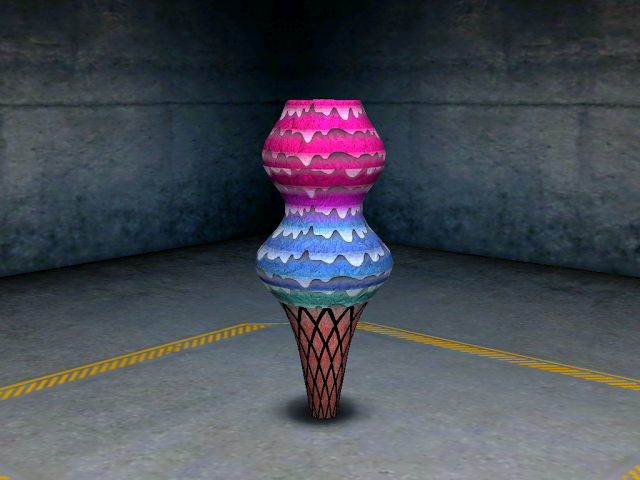


     Pretty fun, no? They are all a similar shape/silhouette but I am sure others could be done as well and it would just take some brainstorming. Other stuff could also be done, like, requiring students to use certain color groupings...


    The way I see it there's actually a lot that could be done beyond just using this app as a simulation game.  So, that's my review for the iPad app Let's create Pottery. In my defense, I haven't actually been playing near as much as when I first discovered the app and I use it as a bit of a motivator (for myself) when I am in the midst of graduate school work and I need a break. Someone else who likes it too? My four year old daughter! Yeah. It's that easy AND fun.

    Thursday, August 2, 2012

    iPad App review: Procreate - sketch, paint, create.

    Of the three art apps that I said I was going to review, this one is what I believe the most complex in what it enables you to do - use layers and fine tune the tools and mediums that you have to use - but now that I have used the others one a little bit, I firmly believe that it is the best of all and I don't even mean this with regard to experience of the artist using. I mean with regard to how well it functions and how intuitive the overall design and navigation seems to be. The Artrage and Art Set just seem clunkier compared to Procreate. *shrug*

    Right now I am working on a bit of a personal endeavor with the help of my church and local community and I have been putting off working on some of the things I need to do for it for a good while now. Well, tonight, with the help of Procreate, I finally got off my duff and did a little bit of what has been hanging over my head. Below is something I whipped up in Procreate.


    Again, I did not use the Sensu to make this - didn't even use the stylus end even - but rather just my finger pad. Ignore all of that for a minute though. Instead, focus on some of the different things that I have in what I made above.

    While the patches/swatches of color underneath the lettering look like pastel, they were actually paint and of a brush setting with oil paint that I feel like was really natural looking. (Can't remember the setting or brush but just trust me.) I also used ink pen of different kinds and tips AND a pattern tool that gave me that awesome planked wood grain background. Maybe I'm easily impressed but I just LOVED that pattern tool. It took me just a few quick swipes and *voila* there was a wood plank wall!

    I feel like the marks that you make in Procreate are just so much more accurate and the action of making the marks - meaning the responsiveness of the touch screen in the Procreate program - is just so much faster than Art set or Artrage. That alone made me love Procreate better. And with me loving it this much even with doing just finger swiping, I can only imagine how much better it might be using the Sensu - either the brush or stylus end.

    Procreate is $4.99 in the app store but I think the app is so good that I would honestly pay even more than that. Even at the price it is, it's the most expensive of all of the apps I have reviewed so far - well, not Art Authority but I mean the art studio ones - and I still feel like I would almost be willing to pay as much as $10 for it. Seriously. I think it's that good.

    So, after this review and the last one, I have about three more that I still plan on doing - Art Set, Auryn Ink, and SketchbookX. I might do a 3D app but haven't decided yet. I kind of made a little bit of a personal rule that I wouldn't do any 3D apps but I might have to break that because I am so curious.

    Wednesday, August 1, 2012

    iPad App review: Artrage and Art Authority

    OK. So I have finally completed what I feel like is a reasonably share worthy piece via one of the aforementioned art apps called Artrage.

    In all honesty, I am pretty happy with it despite the fact that I feel like it isn't all that great. I mean, well... it's definitely lacking in some places in terms of solid technique. Aside from that though, I wasn't looking to create a masterpiece and rather just do a quick study of my four year old daughter while she was sitting still and painting a birdhouse.


    While I would have liked to have done this with the Sensu brush, I did it with the stylus part of the brush. *shrug* The medium I picked was chalk pastel so using the cushioned stylus end just worked better and felt much more natural and intuitive.

    Here is an instragram of the cushioned rubber stylus end of the Sensu.

    I tried doing it with brush end but it didn't work so well. I attribute this to the fact that I am still just trying to learn my way around the app itself. Pair this with the fact that I have very limited experience with the chalk pastel medium and what you get is what you see above.

    My initial aim was to try and do the oil painting but it just wasn't working so I switched to chalk pastel. That's why you see such a heavy grain of the support itself. (I chose a canvas grain support gessoed in black.) I REALLY wanted to try and work with the Sensu but it just wasn't working out. I'll get there though. I feel like it was a good move for me to just think about familiarizing myself with the range of the app versus trying to turn out a masterpiece.

    I *think* Artrage allows for the use of layers but I didn't do that. I am actually going to try not to (for all of the apps that I review) if I can can get away with it. Why? Because you really don't use digital layering in real artwork - I mean, the closest thing would be to let each layer dry before doing the next but I never do that. I like working wet into wet and since my goal is to use the apps to imitate the techniques I'm used to, I'm going to avoid using layers.

    One other app I have discovered that I REALLY am liking is called Art Authority. Basically it's a very comprehensive art gallery (in virtual form) as much as you could ever imagine. I mean, every artist and their works are not in it but the big names and major movements in art history are there enough. I LOVE studying masterworks and this is app is making it really REALLY easy to do that. My goal is to use some of the masterworks to do mastercopying via some of the iPad apps.

    So that's it for now. I would say on the whole I really like Artrage. I almost started doing the above in Artset but it didn't have quite the more specific adjustments (like adjusting pressure and color saturation, etc.) the way Artrage did so I switched from Artset to Artrage almost immediately.

    Will continue to keep you all on the up and up of my experimenting with all of the apps. If you, too, have been trying out the apps, I would love to stay connected with you and trade thoughts, tricks, and inspirations via the comment section below. Thanks so much.

    Tuesday, July 31, 2012

    Product review: Sensu Artist Brush and Stylus

    While I could have just posted pictures and a write up for my review of the Sensu artist brush and stylus. I thought this would be more interesting.

    Please note: I wasn't sent this product and was compensated in no way from the makers of it. I bought this out of pocket for my own personal art endeavors and my opinions are solely my own. 


    And if my review was compelling enough HERE is where you can order it and see some samples of what others have done with it.
    Related Posts Plugin for WordPress, Blogger...