The original idea was to study the work of Peter Max and then have them create designs on neck ties in that style with fluorescent paints. I picked Peter Max because it's something that I feel like has always been fun to look at and served as inspiration for the students (we have a Peter Max poster in the classroom) and I've also had the great advantage and opportunity to actually see plenty of Peter Max originals via his gallery in Vegas, some pieces in a private collection of someone I used to know, and also a number of pieces on a Caribbean cruise I went on last year (at their art auction). The students loved the idea of Peter Max and the neckties but of course attempt to sway me into a direction that allowed them a little more creative flexibility. Because I love them so much and I aim to please and I'm always wanting to let them push and propel themselves as much as possible, I caved and opened it up to being more than just Peter Max inspired designs and also something more and other than just neckties and they really "hit the ground running" so enthusiastically with the door open to them to pick either a shoe OR necktie. I am so proud of the pieces that they yielded and I didn't have to fight for their attention or investment in their work even in the last days of class. If anything they were trying to find time in the rest of their schedule to be in the artroom to work on their projects.
This shoe was designed by one of my students who is a dedicated dancer. The inspiration was Swan Lake and the shoe was heavily gesso-ed in order to ensure that the ribbons would stay in their sculpted shape as much as possible.
This shoe was inspired by the Wizard of Oz movie and book and the student did such a great job at taking so many of the characters and putting them together to have this piece truly speak of the crew if characters that helped Dorothy find her way back home.
This student took an old bedroom slipper so that it looked like a golf course layout not unlike one that her own dad would spend his early tee-times at. She did a really great job at using the textures of the slipper to imitate actual landscape elements and she spent a lot of attention really getting specific details just right.
This student used a favorite scripture and heavily gesso-ed her necktie to create the heart shape at the top of the tie knot as a way to complement the rest of the design of the tie.
This student did a great job with a painted design despite the fact that he was forced to use a color palette that was his secondary and tertiary choice.
This tie was the actual one worn by the student's father when he got married. (I KNOW. I was a little concerned because of the sentimental nature of the tie she chose to deconstruct and fabricate for her project!) The student assured me it was OK though but then used elements of her parents' wedding day in order to inform the design and make a little more of a visual memento of their incredible wedding day from years before. It became something that can now be proudly displayed in the family art gallery space (in their home) instead of being tucked away in a closet. I feel like it was a big risk that was taken but a big win in terms of creative expression and that was the whole point of this project to begin with.
This student ended up painting over this design but I just love it anyway. The quote is so thought provoking and I love how that is juxtaposed by the "doodled" quality of the graphics that surround it.
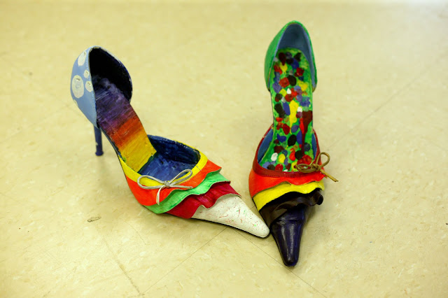
These shoes were designed/painted by two different students and their goal was to design something "fashion forward" that a sort of Carrie Bradshaw clown would wear. I feel like they nailed it pretty well and even thinking back on the time they spent in class, looking at these shoes really makes me smile.
This tie was just awesome. I did an awful job at photographing it because what you can't see is how gigantic it is. It's a GIANT NECKTIE fashioned from a drapery panel. I encouraged the students to go in this direction and only one really took the idea and ran with it. I was so proud of her and bragged about her to no end that of which I'm sure everyone (but the student herself) tired of. *shrug* A giant tie is AWESOME. I don't care what anyone says. A GIANT TIE IS AWESOME!!!
This student took the idea of juxtaposing a black and white palette with a very colorful one. He was very frustrated (at times) with this project but he did a great job at sticking with it.
And I just love this one because it looks completely illustrated in nature almost like it was lifted right out of a cartoon off the character who was wearing it. It's got such a fun spirit about it and all of the students commented continually about how it was just really neat. AND despite the fact that it is of the primary color palette, it didn't have the very specific "feel" that primary colors sometimes yield - that of which can be very scholastic or school-ish in nature.
Overall I was so incredibly pleased with the turn out of this project and (if anything) I will change it in the future to push all of the kids to "sculpt" giant ties and shoes instead of just taking what could be found in the backs of closets or thrift stores and upcycled.


No comments:
Post a Comment