Sunday, October 9, 2011

Lesson idea: reMarkable Macro Fingerprints

I originally stumbled upon this project idea on Pinterest.com. The original idea took the artist's finger print, blew it up to macro detailing and then infused the lines of the print with a narrative of the artist's life story. I liked the idea immediately because it opened the door for cross-curricular learning. For my own purposes though? I felt it could be strengthened by doing more than just a self-reflective narrative and I changed that to using Bible verses instead.

To make the project more approachable for my students I identified seven different types of scripture and set up a printable worksheet for them to collect and organize their scriptures. Each student studied  their Bibles and came up with scriptures that spoke to them of love, faith, courage, forgiveness, hope, healing/comfort, and wisdom. The idea of the project was multi-layered with regard to how and why the scriptures were used within the fingerprint:
  • God's word is something He hopes will leave a mark upon us so that the marks we leave all over the place (since it's so hard to not leave fingerprints wherever we've been) are marks that are infused with Him.
  • God's touch/fingerprints are all over creation and that includes even the tiniest details like our fingerprints. No detail is overlooked and He has taken care to attend to every one of them.
  • Every mark we leave behind should be infused with love, faith, courage, forgiveness, hope, healing/comfort, and wisdom. If everybody was doing that, imagine the world that would be created instead of what we have instead.
I've done a few projects with the students where scripture helps to inform the design of their work and since I teach faith-based curriculum, that works well! However, I definitely don't feel as if I do it often enough. From the stand point of teaching from a Christian worldview, scripture always has a place and always should be in place. And when it comes to art, it's a great connection with creativity/creation to the students and always inspires them to be more invested in their project work no matter the difficulty and challenge that might be presented as well.

This project definitely presented technical challenges to the students. There were many steps from start to finish and lots of new types of media and elements of art for them to be introduced to all at once. I started the project with having the students work on getting good clean fingerprints using black ink stamp pads on copy paper. I encouraged them to try and get prints from all of their fingers and thumbs on BOTH hands and then make decisions about what print they liked best. For the smaller fingers, I required them to print the shaft of the finger in addition to the finger pad to yield more fingerprint lines the way a thumbprint would yield.

Once everyone was printed and they had picked their best prints, I invested multiple planning periods standing at the copier blowing them up to fit on an 8.5x11 copy sheet of paper. I first enlarged them by 300% and then I enlarged the new sized print by 150-250% depending on how large they were at the 300% stage. Once I had them all enlarged, the students used them to enlarge them again onto poster board that was about 11x14 in size. I didn't require them to draw the prints line for line but encouraged them to simply section off the fingerprints in parts where the print lines started to change directions and/or naturally divide themselves. It was challenging for many of them (since they are foundational students with not a whole lot of experience) but it was tremendously helpful for me to help them draw out at least one section - for placement - and then simply encourage them to build from that. After the directional lines and parts were established, I had them just start penning their scriptures over and over again and in whatever color palette they felt drawn to use. It took a LONG time for the students to overwrite the fingerprint lines with scripture but they were very invested in it and the further along they got, the more intent they were to keep at it. As encouragement, I urged the students to use the kneaded erasers provided at each table set-up to erase the underlying directional lines so that the scripture lines took center stage. When all was said and done? Every piece that was completed (there were a few who didn't finish due to time management issues) was truly remarkable - hence the name that I dubbed this project reMarkable.


This was the second major project of about 8-10 total that we will do for one semester. Considering the level of challenge and difficulty that was presented with regard to their own limited experience, I definitely feel as if they rose to expectations that were set forth for them. Their next project is focusing on color theory, form, shape, and space in watercolor media and I think they will do very well with it.

Friday, September 23, 2011

Lesson idea: Name Tangles in Scratchart

This lesson is not my original idea and I found it HERE. The difference in the original lesson plans and what I did is the medium. The original idea utilized pen/marker and ink and I reinterpreted the idea in scratch art. It teaches a number of different elements and principles of art and design (contrast, space, emphasis, variety, balance) and it also introduces the students to a medium that might have always seemed novel and/or fun in the past but a medium that can be used to make a more serious piece of artwork.

I must admit that as the first project for the semester, this was very ambitious for them. It required the understanding and utilization of negative space on top of requiring them to think in reverse - since scratch art essentially reverses whatever design/image you are creating. (So in hindsight, I could almost call this the "Double-negative Name Tangle project"). Additionally, the end result of the work is non-objective in subject matter making it even more challenging for the students since the metric for whether they've done something well enough or not is definitely not concrete or clearly defined. Still, I feel like forcing them to focus on their lines and the way they come together to make patterns and shapes offers them a different perspective as well as a new respective for the creative process of design and the fabrication of a well-thought out piece of work.

Ultimately, the students did very well AND created pieces that are impressive with regard to their reasonably limited experience in art (this is a foundational course).


In the future, I am considering having a stock of matte black ink markers for corrections - I used Sharpie with wedge tips and it worked well but resulted in a glossy finish against the matte look of the scratch art paper we were using.

Wednesday, September 21, 2011

Lesson idea: Photocubism inspired by David Hockney

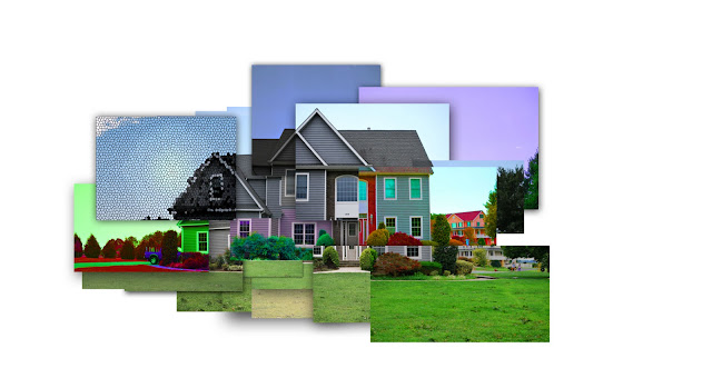
This project is one that I found originally featured on Princetonol. The lesson idea suggests using film and prints but I worked out the details so that the same type of idea could be rendered digitally using layers, layer effects, and image adjustments on individual layers (hue, contrast, texture, etc.) The students were instructed to take their photographs in the same way that the original lesson suggested but we simply pulled all of the image files together to create the photocubist effect in a large digital image a la David Hockney.


The students had a great time with this (it's always a big winner with them so I keep it around year after year) because it's another one of those digital projects that really allows them to independently explore the functions of photoshop but doesn't really require a whole lot of advanced knowledge (that of which they don't have yet) of the program itself. It also draws in fundamentals from their foundational experience in the way of asking them to consider visual texture, balance, color, value, and contrast. I always instruct them to do subject matter that is oriented more around a place than a person but I'm sure a person could be used as a way to do a contemporary spin on Picasso's cubist portrait work.

Friday, September 16, 2011

WiPs: reMarkable typography project

The 2D classes just finished their first project (pics of this are forthcoming) and today we jumped right into their next project: Macro-level fingerprints infused with lines of scripture.

I am SO excited about this project even though it's not my unique and original idea. A few months ago I saw it featured on Pinterest.com. (Great network to be a part of if you aren't! But if you want to be then let me know and I will gladly forward you an invite.) The original idea was to take the lines within the fingerprint and use lines of narrative text to tell the little bit of an autobiography but I felt like using lines of scripture would provide even greater meaning for the students.

Today was the first day of the project and we jumped right into it by literally getting our hands dirty and trying to get some good clean solid fingerprints...


I have already enlarged one class set of prints and I have even managed to streamline my workflow by knowing the exact proportions with regard to enlargements so the two more classes I have yet to do should be a cinch!

Wednesday, September 7, 2011

Lesson idea: The Unfinished Puzzle - Digital Art

 This project is the first one for the Graphic Design/Photoshop class. Students are required to take two foundational pre-reqs in the art catalog (2D Design and Interactive Art History) in order to enroll in the course but most of them have no previous experience with the Photoshop program and limited experience with photo manipulation on the whole - usually it's with web-based programs like Picnik. The course (designed/written/instructed by yours truly) assumes no previous experience of digital art creation but the studio pre-reqs that they all should have taken help because I don't have to teach the elements and principles of art and design. In my own experience with teaching this kind of art, the computer and software presents a huge challenge for the students in and of itself.

Some background of this course that you can skip reading if you only want to know about this lesson idea: This is my third year teaching this course and I really love teaching it. When I first stepped into this position this class was a relatively new course that had little to no curriculum/lesson plans to start with. The instructor before me had limited experience with Photoshop themselves and even less experience teaching a computer-based course. When the course was handed over to me I was basically told that I could build it completely from the ground up if I'd like to so I did just that.

One of the greatest challenges for me with this class was figuring out how to teach it. I stepped into it WITHOUT textbook and if I wanted the kids to do anything I had to do things step-by-step and hand-over-hand style. Before I even started the class I knew this just wouldn't work. There were some tutorials written by the instructor before me but just by looking at them I knew that they would need to be greatly expanded upon because the students would whip through them very quickly. So what did I do? I combed through Google's search lists of Photoshop tutorials that fulfilled the following requirements:
  1. It had to yield a piece of visual art that was reasonably impressive to look at despite the fact that it might not take a lot of skill/Photoshop understanding to create to begin with. 
  2. It had to focus more on creating something new vs. simply tweaking what was already there (ex. changing the exposure of a picture) in order to fully teach the spectrum of abilities that Photoshop enables the user to have.
  3. It had to be compatible with Photoshop CS2. If it wasn't, it had to be something I could rewrite (within reason) and adapt to Photoshop CS2.
After a year of doing the above and hours upon hours rewriting just about every tutorial (I could find) into PDFs that were usually as many as 30 pages in length (Yes, that's right! Don't ever let anyone tell you all an Art teacher does is make "things that are cool." At this point I'm a regular pro at some serious technical writing!), I threw in the proverbial towel and found a great Photoshop manual/guide called the Photoshop Wow! Book. Last year we used the CS2 version but this year we upgraded our software to CS4 so we are now using the CS3/4 version (as linked above). It has some very awesome and easy to follow tutorials that really stretch skill sets to the full range that Photoshop offers and it's awesome to use even now that I have a whole archive of my own Photoshop tutorials. 
 This lesson idea is one that is NOT found within the class textbook. I found this project idea online in a tutorial that I had to rewrite into a CS2 version and you can find it to if you Google for something along the lines of "Photoshop puzzle effect" or the link. [Note: I have a tutorial written up for it in a PDF and I will gladly forward it to you if you'd like to use it but I will not make it available for you here because it's not my original lesson plan.]

I like to do this lesson idea to kick off the Graphic Design class because it uses very simple functions within Photoshop that starts to familiarize the students with the layout of the software features while still creating something impressive enough to look at and provides a feeling that "I MADE this!" It also draws in classic art teachings and forces them to consider visual texture, composition, correct use of space, and depth/relief to create realistic feeling of dimension on an otherwise flat surface.


The students do a tutorial version of this with a self-selected stock photo and then they do the tutorial directions again with a photo image from their own personal archives. While the students are working, I constantly circulate the classroom and remind them that the goal is to render their photographs into something that realistically resembles a jigsaw in process. It helps them to do something more than just texturize their pictures with the puzzle effect and definitely steers them in a way that is a lot more well defined.
Related Posts Plugin for WordPress, Blogger...