Showing posts with label materials. Show all posts

Monday, October 28, 2013

The All-You-Can-Color Bar :: Student-centered Art Education

Don't forget to enter the "Giving YOU the good stuff" (from Prang) fine-line marker giveaway by this coming Thursday, October 31st, at midnight HERE in the comments sectionThis isn't sponsored by Prang and is something that I just wanted to do because I like the Prang products so much after using them.

Remember: You don't have to tweet anything or follow me on any social networking conduits. 
Just answer the question in the blog posting HERE in the corresponding comments section and I will pick a winner randomly and announce it on Friday, November 1st! Good luck to you in winning it the prize!


I teach all of the foundational level studio art courses at my school and I also serve as the department head of the visual arts and in my time leading to me taking the leadership role I now have, I have found that the best way to facilitate the foundational level art courses is by allowing them to be exploratory in nature.

I can't tell you how many times I have heard the student artists that come through my class ask things like, "Can I use *insert any color here*?" or (during a mixed media project) "Am I allowed to use *insert any dry medium here*?" While it might seem exasperating for me to field these questions, I actually don't get exasperated. More than anything, it breaks my heart to hear the student artists ask these things in their obviously timid ways.

I always start the year with a pre-assessment assignment that allows me to see how much they might already know/can do as well as gauge how confident (or not usually) they are starting out. My favorite type or pre-assessment is one that employs mixed-media approaches. This year I took some brilliant notes from a fellow art education blogger and made oversized foldables telling and and showing the elements of art. (I will be sharing these with you hopefully soon even though they are weeks overdue for this.) The endeavor worked out really well because it allowed me to preview some curriculum I would be instructing upon for this whole semester and it also allowed me to do one of my favorite things which was to set up a "color bar" for them to just dig right into.


Friday, October 25, 2013

Giving YOU the good stuff :: Prang Marker Giveaway

Thanks so much for sticking with me through this week of belated Dixon Ticonderoga's Prang product reviews. As promised in all of my reviews, I have a giveaway for you of my most favorite Prang product that I was so blessed to have try this week. And it is? The markers!!!


via

Just to be completely clear, this is not a giveaway sponsored by Prang (meaning: they did not give this to me to giveaway) and rather it was inspired by my experience with all of the Prang products that I reviewed. Also, to clarify things, I did not review the fine line markers but I do own them at my home studio (shared with my 5 yo daughter) and I made the decision to buy them for our supply inventory because of my very positive experience with the Prang broad tipped markers.

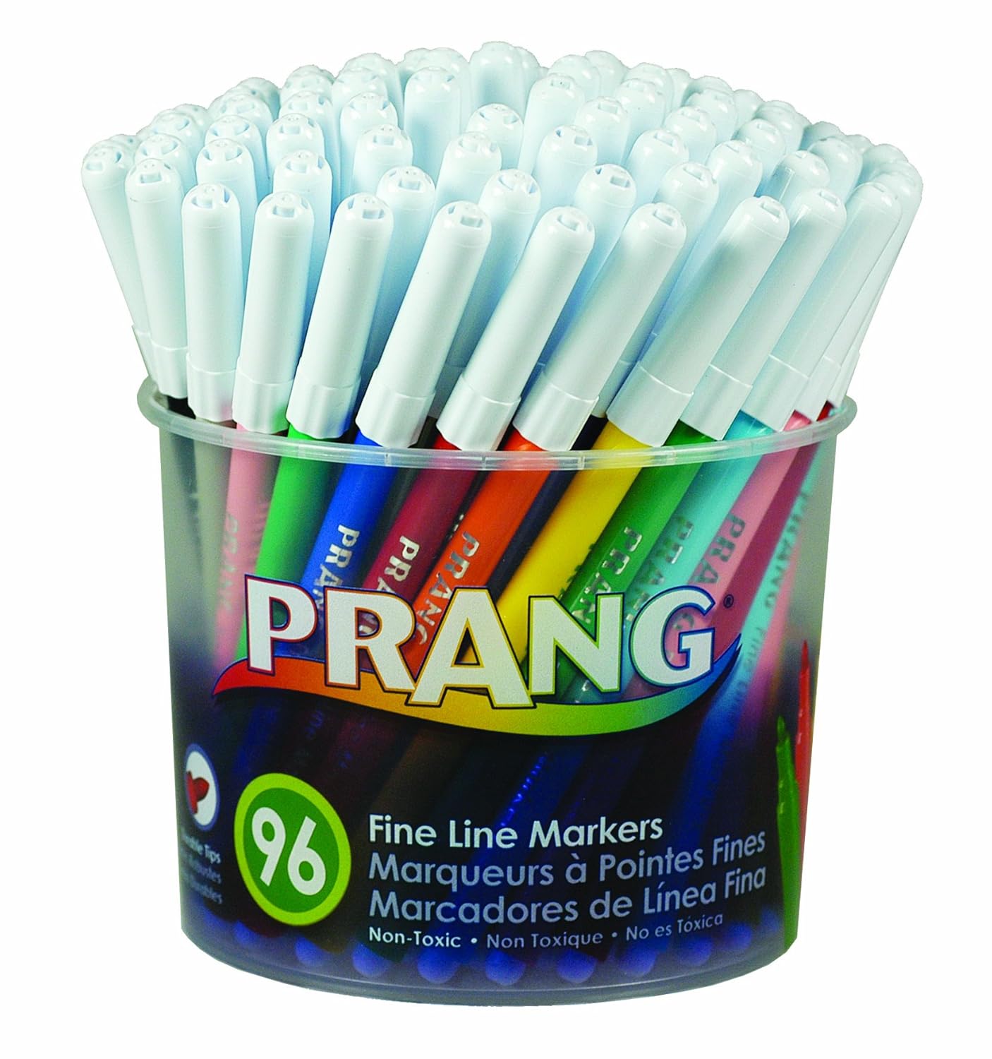
Anyway, I am giving away the 96-set of Prang fine line markers just as you see them above to anyone who wants them whether you are an art teacher, working artist, homeschooling teacher, etc.

Here's how you enter to win them! Leave a comment on this posting telling me the following: 
What was your favorite product from Prang/Dixon Ticonderoga that I reviewed this week and why?

And that's it. That's all you have to do. You don't have to tweet anything or follow me on any social networking conduits. Just answer that question in the comments below and then I will pick a winner randomly next Friday. That means if you missed this whole week of of reviews and and need to go back and read them all then you have time to do that and then still enter the contest!

For your convenience, here are links to all of the reviews that I did this week:

And that's that! It's been a long while since I have done a giveaway on here and I hope that this isn't the last one for a long while but it honestly all depends on you! If it seems that you all are receptive, perhaps I can manage to do some more and more often. Remember! You have until next Thursday at midnight to enter the contest and I will announce the winner next Friday, November 1, 2013 at 7am Eastern Standard Time. 

Thursday, October 24, 2013

Apples and Oranges sure are hard to compare :: Prang Ticonderoga Product Review

Disclosure: Compensation was provided Dixon Ticonderoga company
Opinions expressed herein are those of the author and are not indicative 
of the opinions or positions of Dixon Ticonderoga.

So, I might have hinted to much of what conclusions were drawn with this review simply by the very cliched title I selected but... well... here's the review. 

It's another Prang vs. Crayola showdown and I am impressed (yet again) that Prang opted to send me a Crayola brand product instead of Rose Art or something. I feel like this says a lot about Prang's confidence in their product and I really appreciate that. Upon initial inspection of the packaging it's almost like looking at some throwback (of just a couple days but still) pictures of the marker review. Everything I noted before of the packaging is about the same but this time Prang didn't trump Crayola's palette by more colors... or wait... does it actually?


Wednesday, October 23, 2013

This showdown (of two pencils) was almost a DRAW :: Dixon Ticonderoga Product Review

Disclosure: Compensation was provided Dixon Ticonderoga company
Opinions expressed herein are those of the author and are not indicative 
of the opinions or positions of Dixon Ticonderoga.

To be quite honest, I almost didn't want to do this particular review. This is because I pretty much already have my own opinions formed of Ticonderoga pencils (which is that they are the best pencils EVER) and this isn't for lack of experience with them. I've had quite a number of experiences with standard wood and graphite pencils and I have yet to find any other pencil/brand that can come even close to touching the awesomeness of Ticonderoga pencils. And for all of these reasons I haven't wanted to really review the pencils. I mean, clearly I am biased toward them on top of the fact that I am a brand loyalist on top of the fact that Ticonderoga pencils are the best! (Period)

It's like a duel of the most unexpected two subjects ever. Who will be the winner and who will be the lose?

All of this said, I still did the review and I must say... I was quite surprised by my findings about how a Walmart brand (of all brands!) was able to stand quite strong up against the ever favorite and popular Ticonderoga brand. 

Thursday, April 25, 2013

Mini Masterpiece prepping with Artist Trading Cards :: Interactive Art History

This is my third year of doing the ever popular Mini Masterpiece project with the Art History students and this year I decided to add something into the creative process of it by having the students do some trial runs with artist trading cards (ATC). Do you do ATC at all with your students?

In all honesty, I have wanted to get in on the ATC "game" for quite a while and I even have quite an inventory to do it - I ordered different supports in ATC size at the beginning of the year - but I haven't been able to get it and keep it going. I blame the ridiculous schedule I keep at any given time with working full-time, graduate studies (also full-time), married and family life, and everything else in between.

(Next year, my goal is to definitely get ATC creation and exchanges going here within the school's art community and then eventually have it connect with another school/art community. I think it would be a great for a student leader to spearhead and so it's on my goal list to make happen in that way. Anyway...)

I have all of these ATC but I haven't used them this year so far. Last week there was a major school-wide field trip that happened though with the Science department and I was left with only half of my students in almost every class! It was the perfect time to break out some ATC for the students to do some creative processing and exploration. I found it especially useful with the interactive art history students since they are prepping for doing the Mini Masterpiece project and the ATC are just the right size to get them to start thinking about scale in order for them to do more successful works of art when they get their final materials.

I put my hand in this shot so you can get a better understanding of how small they are! 

The students used the Portfolio brand Oil Pastels that we are such a huge fan of and they all turned out some pretty amazing ATC that many of them took with them in order to be able to give to their friends and/or hang in their lockers.

I have never done ATC before but I feel like it really worked as a nice stepping stones for art history students to feel a little more prepared and confident for when it comes time for them to put paint to canvas.

Friday, April 12, 2013

New and sale products too good not to tell you about

I don't order supplies until summer (about July - it's just how it goes around here) but it's my understanding that a lot of you all submitting your supply orders now. I've noticed a spike in my blog stats/readership that specifically hits pages and sections of my blogsite looking at lesson ideas as well as the materials page - both links to page can always be found across the top header of my site.

That being said, I am getting bombarded with sale catalogs and emails from supply companies and thought I would alert you all to some of the neat things that I will either be ordering in small amounts (to try out for the classroom) OR ordering in order to replenish because it's such an amazing deal and I know that it will used well.

Note: I am not being compensated in any wayby any of these suppliers OR product makers and I am plugging all of this purely of my own volition. That being said? If you are  interested in me reviewing your product/service that is visual art related, I might be open to such an opportunity and please don't hesitate to contact me directly for me to consider it. Thank you!

SKETCHBOX TABLE EASEL - originally $150, NOW => $35


image snagged from Dick Blick's product listing
Right now Dick Blick has dropped the supply on this amazing tabletop sketchbox easel (see left) that we use in the advanced studio classes at my school year after year. We have 18 of them and they are so great for the students to use because they are solidly built of wood AND they have built in storage. They can also accommodate canvas sized of up to 32"!!!!

The are originally priced at around $150 but they are on sale right now for about $35 (and they have limited quantities on hand, of course). Can you believe that price?!!! That is SUCH A DEAL!!!!! And if you want a class set or even just want one for yourself? I can vouch for the fact that one would have been a real deal even at $50 per piece. Don't delay and pick up one of these before they sell out. Seriously. I can't imagine they will last and I don't understand why they are getting rid of them OR how they are lasting this long at that price anyway. Buy it from Blick HERE.


Playcolor brand Water-Soluble Solid Tempera Sticks - on sale!


Are you a fan of Tempera paints? I am very much so. I use the tempera cakes at home with my
daughter and I use jugs of tempera at school for projects that I know cannot risk sun bleached color work - sadly, something that frequently happens in the student art gallery. The only thing I don't like about it is how it can be so dry and flaky after it dries. I like it so much though that I just ignore that part.

Anyway, I have just stumbled upon some tempera paint that is in solid state form! It is by a brand called Playcolor and it is reminiscent of oil pastels a little in that you can blend it, layer it, and it stays highly saturated in color presentation. Something else though? Unlike painted tempera it apparently doesn't crack!!! I LOVE THAT. I mean, I don't know if it actually works like that but it appears that it does. Here is a promo video for it that (of course) presents it in the most positive way possible but I feel like it's at least worth a trial run for me at home with my almost kindergartener daughter...


I have never used this brand and/or product before but right now School Specialty has it on sale in their print catalog that I just received. For whatever reason it's not on the website but Dick Blick does have a listing for it but they aren't on sale like they are in the Sax Arts printed catalog. Sax's sale price is a little less than $2 off the listed price on Blick and regularly in the printed catalog. My plan is to get a 12 count of the standard palette and I will (of course) let you know how it goes once I get them and put them through some trials. 


Monday, April 8, 2013

The perfect match? Hmmm...

Not sure if any of you all caught wind of this last week but I did and was wondering what (if anything) it meant to you...


The above popped up in my email inbox from Dick Blick along with a 20% off to celebrate Blick's official announcement of the acquisition of Utrecht.

I don't know that I actually think this is a good thing or not. I mean... I like Dick Blick and I really REALLY like Utrecht but if it comes down to picking a brand that I would be fiercely loyal to I would actually pick Utrecht all the way because from my experience they have a higher quality than Blick does for artist grade materials and at a very reasonable price point. Don't get me wrong, Blick brand is pretty solid and reasonable for my school's supply budget but when it comes down to it I have time and time again been able to really trust Utrecht to deliver some very high quality products.

Does this new acquisition mean that Utrecht brand will end up going away because Blick brand is the bigger brother now? That makes me sad because Utrecht brand is REALLY solid for brushes and oil paints and all sorts of other things that I use beyond just for my own art education and instruction purposes.

I guess time will tell how this will work itself out. It would be nice if some of the Blick brand bowed to the Utrecht brand and then phased out the Blick stuff over the Utrecht stuff even if the Utrecht stuff ends up being called Blick brand. (That was a mouth full but hopefully you get what I was trying to say!)


Wednesday, April 3, 2013

Hand check


Returned from Spring break but I have so much to do now that I am officially in the fourth and final quarter. Where in the world did the rest of the school year go and how am I at the end of another one?

I have plenty that I know I owe you all in updates and other good stuff but I also need to get my grades in for this week for report cards to go out AND I also have some grad studies work due this weekend so gotta put the blogging on hold even longer! Sorry!!!

The above image is a preview at least of what I have ventured into with the Interactive Art History class. I took a pinterest idea and crossed it with a lesson plan found on Dick Blick for them to be able to study World Art! At some point upon my return, I will share the lesson plan idea as well as some of the tricks and tips (and snafus) that yielded from the endeavor. Probably will see you next week if I'm lucky!

Thursday, March 14, 2013

Social Media for GOOD :: Turning Emoji into ART

I am a fan of Emoji. (There I said it!) Do you know what Emoji is? It's a Japanese term for a keyboarded language (think texting and online communications) that used picture icons and characters in order to communicate messages. Basically, it's modern day pictographs and while it's not something that all smartphone users have/can do, it's something that is a bit of a fun bonus if you are an Apple/iOS user because it's the Emoji keyboard is one that you can enable on your Apple device (iPhone or iPad) in order to create little scenes in the screenshots below that I created in text exchanges with a friend of mine...


To put credit where credit is due, the above Emoji art scenes were not originally designed by me and I searched through #Emojiart on Instagram in order to be able to find ideas and then I created them and sent them to my friend through texting bubbles. Still, they are fun right? And Emoji keyboards have TONS of options that include food items, animals, people, transportation vehicles, and buildings! And after I did the above, I really got to thinking that Emoji art could really work for art education and would be a great way to interact with my art students electronically if I wanted to. I mean, it seems like it could really lend itself to an Emoji Art contest or something and I think that could be kind of cool. Also, even though you sort of need to have an Apple mobile device to be able to do it, it's becoming a standard enough that kids could do it as teams and submit their Emoji Art jointly from one person's phone.

Anyway, Emoji Art is pretty fun as it goes and if you haven't tried it before? Try your hand at it. It's pretty fun and can lend itself to a unique outlet for creativity.

Wednesday, February 13, 2013

Cave Art Lesson idea :: New and Improved!!!

This semester I am teaching one section of Interactive Art History and they are kicking off their first major project doing a fan-favorite: Cave Art!!!!

I have previously shared our adventures with Cave Art located HERE and HERE and this year we are doing pretty much the same sort of thing but I decided to expand upon it a little bit by requiring the students to create sketches and drafts before they get to the plaster sculpting and painting stage.

I don't know why I didn't do it like this before but it's working out quite well and almost all of them were able to adhere to their original design intentions for the faux rock portion itself...


Something else I have done purely for the fun of it, I am playing music that is specifically meant to create an working environment that is decidedly more authentic in order to make all of the student artists feel more like cave artists. Here is one thing I have been playing for them at least once a day/class period...


I don't show them the video because this clip is actually from a movie that is not entirely appropriate for the students to watch in its entirety - though the clip is fine for the most part - in addition to the fact that it pretty much makes fun of prehistoric people/society in the way it is depicted but that's hardly the point of the sounds of the video that I share anyway. The point it, it has actually served as great creative inspiration for the students that has yielded quite positive results. Something very good from something decidedly bad? I'll always take that.

Friday, October 5, 2012

Lesson idea: Continuous Line Art - Wire sculpting | 3D Design

This lesson idea is one I haven't done in quite a while but found I found these pictures (on an old portable hard drive) and thought they were worth sharing!

I did this project with the 3D Design students my first year teaching visual art ever and I led them into the project with a continuous line drawing study. Each of the students was required to come up with one object that they would sculpt in 14 gauge aluminum wire (you can purchase it here from DickBlick.com) but before they could sculpt it, they had to show me their idea drawn with a continuous line. When they had completed the continue line drawing of their chosen object, they each received 90 feet of it that they were not permitted to cut in order to echo what they learned in the continuous line drawing exercise.


Overall, this project idea was a big hit but it I also couldn't push it to last for any more than one solid week of class meetings. That's pretty quick for me because my goal (from the beginning) has always been to do longer term project endeavors. I believe the students turned out very successful and interesting samples of work but it went very fast for them (during both years that I taught it) and I don't know that they learned anything super significant other than that wire wrapping is cool and fun.

If the future I would really push the students to focus on contours lines when they draw in continuous line technique and I would definitely push them to not do just any object but one that has purpose and meaning to it once it is fully sculpted.

Wednesday, October 3, 2012

Lesson Idea: Our Common Threads - Printmaking | 2D Design

In this introduction to printmaking project, some of the learning objectives included the following:
  • Create original works as inspired by the masterworks of printmaking artists such as Andy Warhol and Claes Oldenburg
  • Visually present social and cultural commentary (explained below) from a Christian worldview
  • Learn how to design and create limited edition prints from start to finish
  • Use a 2D surface to show a 3D image/form
  • Learn and use visual art vocabulary of printmaking
I kicked off this project with a Keynote presentation of printmaking that focused on the works of Warhol and Oldenburg so that they students could see and discuss examples of Pop Art. We took the idea of what Pop Art does - glorifying the already glorified - and we attempted to create designs that did  a little bit of the opposite by picking every day object and glorifying those. The students were instructed to pick objects that would be owned by the "haves" just as much as the "have nots." They were to think about and be able to verbalize the reasoning of why their object might be something the "haves" take for granted while the "have nots" might really prize for specific reasons. We had lots of in-class discussions about the differences between the haves and have-nots and I also share the work of photographer James Mollison in the collective he created called Where Children Sleep. (I showed them the website but I also have the printed book - which is outstanding - and the students were awed by what they saw.)

The students used scratch-art foam printing plates to create their printing matrices and they went through an exhaustive process (as framed by this original instructional method that I developed and have been using for all of my lesson plans) in order to go from inspiration to as series of four limited edition prints per student. Each student was required to destroy their individual printing matrices right after their fourth impressions were made in order to absolutely ensure that their prints would all be limited editions.  Why limited editions? Well, because I want them to feel as much like true artists as possible! I posted something of the creative working process last week and HERE IS THAT POSTING if you want to see what we did and how we did it.

Here is a sampling of some of the amazing print sets I will be going through to evaluate and grade. I am SO proud of what the students designed and created but I'm also really overwhelmed by the amount of artwork that I now have to grade!!! Normally it's only one piece per student. Requiring the students to do a four part series of work basically quadrupled my work load. Oh well. It's worth it. (Or I keep telling myself that.)

I think these prints - shown in two different orientations - were very successfully created.

This particular student artist is VERY naturally talented at drawing specifically so her design was very well done.

This is another student who is great at drawing and has terrific attention to detail. (Obviously.)

I am not sure if the misspelling of the word 'homeless' was on purpose or not but knowing this student, it's probably safe to assume that it was completely intentional. Such clever students I have!

This design was so simple but so successful! I had a hard time picking which print to share with you. 

One of the few prints that was done in grey ink. I am such a fan of grey but I love how this student mixed the color and then applied the ink so it resulted in having a very subtle vignette to this print.

I appreciate the distressed quality of this print. I also think the color combination helps to add to its success.

This is one of my favorites overall. The design of the plate itself was wonderful and the use of color to make it look like the color of the flame and then the black that represents charring? And the distressed look of the ink? AWESOME!

I really enjoy the simplicity of this one and the fact that the student used just one single color. 

This project was a HUGE hit for the students and I will most definitely do a printmaking project again with the 2D class. It was just enough of an introduction to this artform that it really whet their palettes and left them hungry to do more art of this type and... well... any type really. Now that this project is over they are super excited to get started on the next one (which is even more challenging). It's all about strategic planning and I am delight to report that my strategy is playing out very nicely. *wink*

Friday, September 7, 2012

Just for Fun: Make your own (mobile) Refrigerator (door) ART gallery!!!

So, yesterday I teased you all with a long drawn out story about my quest to obtain a refrigerator door for a uniquely creative personal project I have been working on for a year and a half for my school. I absolutely want to pick up the story where I left it off but I also don't want to be a meanie and delay you from knowing where I am going any longer than I have to. I mean, forcing you all to sit through ANOTHER diatribe of unnecessary verbosity is just cruel - agreed?

SO! Without further adieu, here is a video explaining the saga of the refrigerator door a whole lot better...


And if you aren't keen on videos? Here is a picture from my instagram feed that might clue you in a little better until I tell the whole rest of the story next week (or something).

This will be a gallery within the student gallery that requires people to put their own artwork on it freely!!! Top picture shows the back of the door (on wheels) with a place to archive work that has been displayed for a while and a storage bin for cool magnets. The bottom left shows a full-length view of the whole front of the door. The bottom right picture shows the full-length view of the back of the door.

While I have named this gallery after a specific scripture, I see no reason that this idea couldn't be adapted to have a more secular vibe by using a quote like, "Every child is an artist..." by Picasso or the like. As far as I am concerned I think EVERY SCHOOL (or art museum or street corner for that matter) could use something like this. Don't you?

For that matter if you do agree with me and you decide to join me in this endeavor? Please PLEASE contact me and let me know how it goes for you!!!! I'd love to see pictures of your journey making it happen as well as pictures of the final product.

Tuesday, September 4, 2012

Worth the wait

How do you feel about paintbrushes? Are they a big deal to you? While I am not solely a painting teacher, I do plenty of painting with my classes - most of which are foundational in nature. Because they aren't super advanced artists (yet!) I insist upon using top-of-the-line brushes and I mostly just want to focus on ones that are solidly built without sacrificing key things I want my students to learn - like which brush type/size is most appropriate for specific tasks of painting - meaning I want to be able to have a wide array of brush types for them to be able to choice from for their individual purposes.

All of that said? I have found that the best brushes to use with my classes are the Big Kids Choice Paintbrush sets (with the classroom caddy if you can get them like this!!) by Royal & Langnickel. They are short-handled craft style brushes (vs. being long handled artist length for painting on an easel) with synthetic bristles and both flat and round tips in three different sizes each...


They are very popular among art teachers (as I have come to find out) and around this time of the year they are almost always sold out because they are so highly sought after. Years ago when I first discovered them on accident, I got them for a STEAL by buying them in bulk (I bought more than 3 of them) and they were only $55 a piece!!! Amazing! Nowadays it is much more likely that you see them for at least $75 a piece and if you are lucky you MIGHT score some for just a little less than $70. I have ordered them every time from Dick Blick and if you search for them you will find that there are two listings that appear to be for the exact same thing with the exception of the price. One is listed as $2 more than the other. Why? Because one of them has a blue handled teeny-tiny brush perfect for details and then a red handled one with a nice wide flat one perfect for painting reasonably large areas and the other one has six sizes - three of round, three of flat that I would guess are in sizes that are the most popular overall for artists of any ability or age. That being said? If I were you I would spring for the set that has the teeny-tiny blue handled brush because if you are buying them in bulk, the price difference is only 9 cents. I made the mistake of not ordering that set and though I wish I hadn't I have enough of them on hand that I am not bothering with sending them back and exchanging them.  Below is a picture of three baskets of the cheaper set.

Better than bouquets of flowers in my book!!

Now, while I have made it pretty obvious that I work at a school with great means (read: budget) as it pertains to supplies ordering or just resources in general? I actually don't always just get whatever I want, whenever I want it. I Do have a budget that I adhere and it doesn't allow for me to just order my favorite things all the time/every year. The way I manage that is staggering the ordering of the the frequently used/favorite supplies that might also happen to be more on the pricey side of things like these brushes. I feel like even if we did have the money to buy these brushes though, I might not do that because then I feel like the students wouldn't understand the importance of taking care of your materials so they last. Afterall, art materials (and nice art materials at that!) are not meant to be used once and discarded forever. To be an artist also means learning how to take care of your materials and that includes maintaining them so you can keep using them if they work so well to begin with.

Something else about the Big Kids Choice Classroom brushes with the caddy? They come in these really great plastic cylinder packages that are so useful to use as storage in the studio classroom! I like using them for every day materials because it's easy to chuck things into them without them looking messy - similar to the way a glass cookie jar might look! Currently I have some of these from my last order that are storing/organizing markers and other coloring materials and it is so nice to put these in a cabinet and be able to SEE what is in them so I can pick and choose what will be taken out for use.


These brushes were back-ordered so I only just got them shipped and despite the fact that I received a heads up email that they were coming, I forgot about them and it felt like Christmas unpacking them, setting them up, and preparing them for use. I completely agree that "Good things absolutely come to those who wait" even if that wait means waiting every 3-4 years to be able to get these brushes.

That being said? I also am the proud owner (FINALLY AFTER 1.5 YEARS OF DILIGENT PRAYER AND ASKING AROUND!!!) of something pictured here...


If you watch my instagram feed, you might recognize this as a picture I posted a couple of weeks back when I was in the throes of attempting to acquire some of what is pictured without success. Am I being annoyingly elusive? Don't get what I'm talking about? I don't expect you too because I wanted to share the fact that I have been working on something VERY special (and I guess secret as it has been) for my school to enjoy - both current art students and not AND faculty as well - that seeks to make art appreciation stretch far beyond the confines of it happening in the studio classroom alone. This "idea" of mine is one I have been carrying around for a seriously long time and this year I finally got it in me that I had to make it happen - no ifs, ands, or buts. And that is ALL I will tell you for now until it's good and ready to go for me to present it as something for you to do in your classes too. ;)

Thursday, August 2, 2012

iPad App review: Procreate - sketch, paint, create.

Of the three art apps that I said I was going to review, this one is what I believe the most complex in what it enables you to do - use layers and fine tune the tools and mediums that you have to use - but now that I have used the others one a little bit, I firmly believe that it is the best of all and I don't even mean this with regard to experience of the artist using. I mean with regard to how well it functions and how intuitive the overall design and navigation seems to be. The Artrage and Art Set just seem clunkier compared to Procreate. *shrug*

Right now I am working on a bit of a personal endeavor with the help of my church and local community and I have been putting off working on some of the things I need to do for it for a good while now. Well, tonight, with the help of Procreate, I finally got off my duff and did a little bit of what has been hanging over my head. Below is something I whipped up in Procreate.


Again, I did not use the Sensu to make this - didn't even use the stylus end even - but rather just my finger pad. Ignore all of that for a minute though. Instead, focus on some of the different things that I have in what I made above.

While the patches/swatches of color underneath the lettering look like pastel, they were actually paint and of a brush setting with oil paint that I feel like was really natural looking. (Can't remember the setting or brush but just trust me.) I also used ink pen of different kinds and tips AND a pattern tool that gave me that awesome planked wood grain background. Maybe I'm easily impressed but I just LOVED that pattern tool. It took me just a few quick swipes and *voila* there was a wood plank wall!

I feel like the marks that you make in Procreate are just so much more accurate and the action of making the marks - meaning the responsiveness of the touch screen in the Procreate program - is just so much faster than Art set or Artrage. That alone made me love Procreate better. And with me loving it this much even with doing just finger swiping, I can only imagine how much better it might be using the Sensu - either the brush or stylus end.

Procreate is $4.99 in the app store but I think the app is so good that I would honestly pay even more than that. Even at the price it is, it's the most expensive of all of the apps I have reviewed so far - well, not Art Authority but I mean the art studio ones - and I still feel like I would almost be willing to pay as much as $10 for it. Seriously. I think it's that good.

So, after this review and the last one, I have about three more that I still plan on doing - Art Set, Auryn Ink, and SketchbookX. I might do a 3D app but haven't decided yet. I kind of made a little bit of a personal rule that I wouldn't do any 3D apps but I might have to break that because I am so curious.

Friday, July 27, 2012

Book Review: Drawing Lab for Mixed-Media Artists: 52 Creative Exercises to Make Drawing Fun [Kindle edition]

When it comes to art books - instructional, reference, etc. - I have an abundance of them but don't exactly like all of them all that much. The majority of them are even mediocre (to me) at best and I reserve them for cross-referencing things for lesson planning OR to bring them in for my students to look at. To date I have probably spent well over $500 on all of those books. What a waste! I am almost embarrassed at the hoard of books I have but don't really ever use.

Well, I'm learning from my mistakes. I have been looking at the book Drawing Lab for Mixed-Media Artists: 52 Creative Exercises to Make Drawing Fun for a little while and I finally decided to get it (well, the Kindle version because for whatever reason digital books work better for me *shrug*) and I am LOVING it!!!! 

Because I am such a junkie for reviews of any sort, I pored through the amazon ones and now that I am halfway through the book (reading it only, I am going to use it to inform some creative exercises soon enough with my new iPad art apps), I am thoroughly convinced that I might even want to buy the physical version of the book and take it into school because it might actually be one that would do more than just take up space and collect dust!

The book is written very matter of factly (something that I LOVE so much) and it really points out not only very good instructional pointers and clarifications about certain techniques and creative processes but it also has a few personal anecdotes from the artist herself. 


The drawing and inspirational exercises are VERY approachable without being dumbed down to something that could/would bore a more advanced artist/illustrator (that which I am not!) and I especially like a number of the approaches that are suggested that really spin old ideas for lessons/projects in new ways. As an art teacher and working visual artist, my battle is always trying to figure out how to reinvent and refresh things to keep things interesting but it gets hard! I can't lie about that. 


One of my favorite things about the book is the insistence within each exercise to do repetitive exercises and to NOT erase things. The author fully encourages you to not be afraid to make little mistakes but if you do? There are suggestions of how to work it into the design/drawing itself. She also talks about different ways to do mastercopy and master inspired type works. I LOVE looking at masterworks! I honestly feel like it's an essential part of being able to become a successful visual artist. 


Something else that is so great about the book is that it definitely starts you from a good square one type place but builds and scaffolds to things that are definitely more challenging and complex within the design ideas themselves. In this way, it is really possible to look at your linear progression with every inspiration prompt to see that you are actually accomplishing things and the stuff looks pretty good! Seriously. I am convinced all of the creative prompts could inspire, instruct, and support most any level artist and even any age artist though there would definitely be some that would have to be modified for ability level in terms of fine motor skills/dexterity and abstract/non-objective understanding and vision. 


All in all though? If I were rating this book with the five star system of Amazon, I might even venture to give it 5.5 stars or even six stars. Seriously. I think it's a pretty solid book and like I said, I might seriously order the paper version of it.

Thursday, July 26, 2012

iPad art Apps nutshell review: Art Set vs. Artrage vs. Procreate

Officially I have had my new iPad for less than 24 hours and though I feel like I am still managing a sharp learning curve (despite the fact that I have always considered myself to be very "tech savvy") I am really understanding the pluses to having it for the purposes of digital art and the art classroom.

Now, to be completely fair, I have railed against using the iPad for art classroom purposes since... well, last night before I downloaded a whole bunch of really art cool apps! One of my seniors from the recent school year mentioned a couple of these to me and I must say that I was completely dismissive to the point that I was unfair. What can I say? For as much as I might claim to be a forward thinker, I can be very stodgy and set in my ways. *shrug* Anyway, that's quickly changing and I am fast becoming convinced that I need to have a class set of iPads for my art classes OR (better yet) they should be made standard so every student will be equipped with them. All of that being said? Let's dish on the apps!

Right now Apple is running a great promo where you can get a new Macbook or iPad and they will give you a complimentary iTunes giftcard - the larger the purchase the larger your iTunes giftcard. Because I just got an iPad, my iTunes was for $50 and that could be used in either the app store or the iTunes store. Now, while $50 doesn't seem like much compared to the $100 I could have gotten for one of the Macbooks, $50 can really be stretched pretty far in terms of getting just apps alone. I think I have a little more than $25 less on the card and that's even with me loading up my iPad with art apps for me as well as almost a screen full for my little girl! (I plan on reviewing some of the apps for her in time just for fun.)

****SKIP THIS PART IF YOU DON'T CARE FOR BACKSTORY****

Now, my major motivation for finally taking the plunge and getting the iPad in the first place is because it's a learning accommodation that came strongly recommended from my educational psychologist. (He got zero kickbacks for my purchase so him pushing the device so aggressively said a lot about the iPad I think!) (I also plan on doing some reviews on the iPad as an aid for learning disabilities when I get that figured out as well.) Still, just because I got the iPad for work doesn't mean I have to make it all work and no play!

Over a month ago, I stumbled upon an amazing paintbrush stylus for digital tablets called the Sensu brush. I was admittedly very skeptical about the possibility that anything digital could imitate real-life painting enough to make any kind of investment in it worthwhile. I totally ate my words on that though once I did a little research and found out just how on point the Sensu was though! Now, I don't have one yet (but it is coming - YAY!! - ordered mine two days ago and have been anxiously awaiting its arrival since getting shipment confirmation).  All of that being said? As soon as I was sold on the Sensu, I was that much more sold on getting my hands on an iPad ASAP. My cashflow just wasn't permitting such a thing though and I had to strategically plan and wait patiently until just last week! So yeah. I finally have an iPad, I will soon have a Sensu brush, and sorry for my long-winded way to get to the Apps reviews.

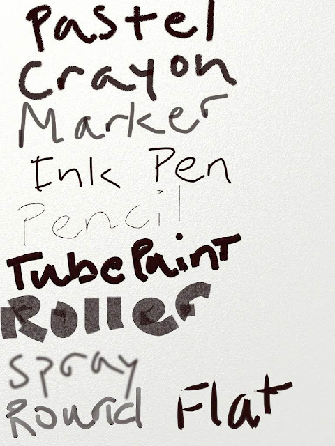
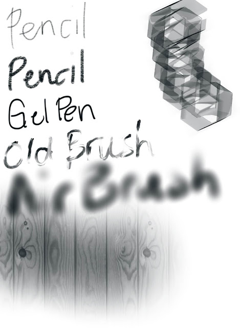
The Sensu website recommended half a dozen art apps but I opted to try out only two of them - Artrage and Procreate. Other people's reviews (in the App store as well as elsewhere online) heavily informed my decision to do so. also ended up picking up Artset in the app store because it was less than $2 to do so and it got really decent reviews because of its simple functionality. Here are all three of them in a side-by-side comparison where I just tried out some of the tools they have within them. The most simple of the apps is on the left and then as it goes right, the apps get more complicated but also have that much more technical range. I was mostly interested in just comparing the marks for this review.

****OK. Here are the actual reviews****
 From left to right there is Art set, Artrage, and then Procreate.


Now, I haven't had time to use any of the apps outside of preliminary poking around of them (meaning, I haven't made any full pieces of art yet) but I cannot help but tell you I am already impressed but one thing of all three: how closely they imitate real marks of studio tools on supports like canvas, paper, etc. Definitely there will never be anything like the REAL thing of pencil, pen & ink, paints of any type, etc. but for these to be digital renderings? I'd say they aren't bad at all. Above you small shots of what I will present to you for all three. For each one I took blank document and then just applied the digital tools in black/dark grey and wrote out (with each of the tools) what each one was for labeling purposes as much as seeing what they looked like when they were applied. (Does that make sense? Kind of a confusing way to explain it but that's really what I did.)

First there is Art set. For quick and easy purposes, I think even my daughter could use it well enough, Art set is pretty nice and the digital marks are pretty close to being like the more expensive/intense art apps.
Art Set for iPad
Another really nice thing about Art set? It's easy to navigate. The actual workspace with the tools seem very realistically design. Your color picker/palette is literally a row of colors (in artist color names) in whatever medium you are using - meaning if you are doing coloring pencils, it's a tray of pencils. Then the different tool/mediums that are there are also lined up in a tray for you to pick what you want. It's definitely very intuitive in feel and then saving whatever you do for purposes of sharing later is just as easy. Pretty much all of the user reviews said what I found to be the truth so that's good to know too! I like having reliable reviews. This app was not included in what the Sensu makers recommended and while I can understand it doesn't have quite the range and functionality for a more advanced user/artist, I feel like it would have been worth a mention at least for getting your digital art "feet" wet.

The next app up is Artrage. This one was recommended by the Sensu makers as well as assorted other folks on the web. Here is the rundown of what it offers...

Artrage for iPad
Now, Art set did allow for you to adjust the width and shape of the stroke but not nearly to the incredible degree that Artrage lets you do it. Also, Artrage has greater range in letting you determine what your surface/support looks like as well as giving you a bucket-fill tool. The tools themselves have a more refined functionality to them but once you lay the marks down, I almost have to say I prefer the way the Art set marks looked. I could change my mind once I get into more advanced functionality because Artrage allows for layer manipulation and effects and filtering of marks (kind of like Photoshop) so we'll see.

The last one I have up is Procreate. This is by far and away the most complicated and advanced of the three apps both in the available tools/mediums as well as the finer adjustments about picking the shape of the stroke itself.  It also has pattern options that you can use (see the wood grain at the bottom and weird geometric thing to the side). It has all of the same tools that previous two had and so I didn't include those in the samples of the marks and tried to include the more unique ones like the gel pen - there were at least four or five other types of pens.


Procreate for iPad

That about sums it up for the preliminary looks at all three apps. I will definitely be experimenting more with them each in time - there definitely seems like specific reasons for each of them considering what kind of artwork I want to work on/mess around with - so I don't forsee deleting any of them just yet. I will say also that I didn't think a stylus would be all that necessary - even though I already bought one but I really just got it for the paintbrush - but I get it now after trying to use each of the apps. For each of them I feel like it would have helped to have that instead of just dealing with the pad of my index finger. So, what I also figured out is if you want to just do your index finger and don't want to deal with a stylus, I would recommend going for Art Set, Procreate, and then Artrage.

Thursday, June 7, 2012

Life as an art student | Day 4 of 20

Started class today with a discussion examining the works of Giorgio Morandi and Paul Cezanne. I am finally understanding (and embracing) the importance and beauty of still life fine art pieces.  This makes me that much more motivated to spend time doing still life studies and I find myself brainstorming what types of objects or unifying themes I would focus on for my set-ups.

I know that the more time I spend painting and thinking in visual ways, the stronger I will be as a visual artist in a multitude of ways. I hardly ever paint at home and I am thinking I would like to try more of this especially this summer. I am going to try and get my 4 yo daughter involved because why not? My professor said when his daughter was in her early elementary years, she was exposed to plenty of art and she actually set her stuffed animals up to imitate the Last Supper. Perhaps I am a big nerd but that absolutely delights me and encourages me to be more bold in the art I share with my little girl.

Our studio time today was a continued study in torn paper collage but today we were directed to not just look at the negative space/background and to focus more on the foreground and proportions and scale of the objects themselves. Somehow my easel set-up ended up getting shifted from yesterday to today so I ended up unknowingly dealing with that and thinking I was crazy because my perspective was all of a sudden off and I couldn't explain it.


The professor was wonderfully supportive and helpful and encouraged me to note the challenge presented but not be overly concerned and just deal with the issue by making decisions based on the fact that I know/understand how to show proper perspective, scaling, and appropriate proportions without relying on the set-up itself. I did most of the hard work yesterday with the negative space and that was enough for me to fill in the foreground correctly enough.

Today after class I finally took a trip into DC to visit my local Utrecht location and I finally purchased the rest of my supplies - brand new PREMIUM-type brushes (read: expensive!) and Gamblin brand oil paints. I was going to order from Dick Blick and because I'm in the midst of "creative budgeting" while I deal with the cash flow issue of waiting for my student loans to be applied to my account, I had to wait until literally today to be able to get my supplies because I have had no money to do it. Such is life but God is so good(!) because not only was I able to take advantage of the amazing sale Utrecht is currently having but I was also able to use a 15% off coupon for one part of my oil and then my teacher discount for the rest (turpenoid, some oil painting medium, a new spatula and razor knife for my palette) - the sales associate who helped me was AMAZING to be able to help me figure this out and truly maximize the money I spent.

Old brush set on the left side, new brush set on the right


I don't have class tomorrow (it's every day of the week for four hours except Fridays) and while (earlier this week) I was excited about that since it gives me some much needed time to both spend with my little girl and prepare for her big birthday party this weekend, I'm bummed that I have to wait until next week to try out all of my new supplies! Oh well... good things come to those who wait (me included).

Have a great weekend everyone! See you next Monday after class!!

Thursday, July 28, 2011

The usual suspects: Materials i love and get every year!

As I stated in my previous posting, I'm currently in the throes of the annual supply ordering for all of my classes. Before I started at my present school I had zero experience in this area. My first go round of supply ordering took me a month. Kind of excessive? Well, I had a VERY tight budget that year and so that month I took was used cross-checking prices on every single product I had on my shopping list so that I could stretch every dollar I was given to the absolute limit and my diligence paid off handsomely because I believe I saved upwards of $400-500 by ordering between two of my most reliable suppliers - Dick Blick and Nasco. These days I order mostly from Dick Blick since they do maintain very competitive pricing on top of having very quick shipping and top notch customer service but there are some things that I will always return to Nasco for even if it saves me a measly $10. (I mean seriously? Ten bucks can go a long way when you're talking raw art materials and tools and could help me replace/upgrade something that is long overdue for such a thing. Call me cheap or frugal or a vigilante - I don't care because it yields me having a beautifully stocked studio for my talents students to use!)

All this being said, I'm a bit of a materials/supply junkie. (THERE. I SAID IT.)

I'm a huge fan of trying out new supplies in order to get the most optimal results possible in every project I do -  whether personal or in my art classroom. I'm always on the lookout for upgrading things that aren't quite that great to work with but I also have a running list of products/brands that I am incredibly loyal to. The way it goes is if I find something and I like it a lot (not even love it) I will stick with it pretty loyally and not budge. (So suppliers? Do it right the first time and I promise you I will stick with you for the longest haul ever!)

I have at least a dozen tried and true supply that I re-order every single year because they are such a hit in the classroom with the kids, they are beautiful to work with, and they are pretty reasonably priced. Curious what they are? (This might be a boring repeat for those of you who haunt the product and materials review section here on the blog) Here you go...

There is more than just that but that's the most of what I always seem to put on my supply list year after year. The quantity of anything (in case you were wondering about that) is determined by the number of students I have in my classes. Since I teach a a private high school, the students I work with pay supply fees per each art class they take - studio and digital alike - and so this helps tremendously with keeping them in the freshest and highest quality/grade supplies possible. I know that the brands I've noted above are some of the best brands out there and many who read the list will be amazed that my supplies budget can afford the things I have noted year in and year out but it's honestly because of the supplies fees that are collected! (And I know this type of thing is a HUGE blessing when compared with the budgets that have to be juggled in the public school sector or even on the college level when poor college students are charged with getting specific items on supply lists and they always end up trying to "make-do" as much as their wallets can't bear.)

Anyway, I'll update again with more about supplies ordering in addition to specifics with regard to new projects I'm doing this next year! And if you ever EVER have any questions about anything I post here on the blog - be it about the supplies/amounts I have just discussed, specifics about supplies as they pertain to projects/lesson ideas I feature on here, etc. - please don't hesitate to contact me via email at dreampraycreate{at}gmail.com. Thank you!
Related Posts Plugin for WordPress, Blogger...