Showing posts with label Texture. Show all posts

Wednesday, April 24, 2013

iHeart this iPhone app :: Toca Tailor app review

One of my daughter's favorite apps on my phone these days is one by a company called Toca Boca called Toca Tailor. Toca Boca makes a bunch of really cool apps - Birthday party is a close runner up for us but Toca Tailor is the hands-down favorite so far. It is a paid app but it's only 99 cents and since that hardly breaks the bank I have felt like it's more than worse the money. 

(I know this is a departure from the norm here on the blog but as an art educator who is also a parent, I am always interested in apps that have a little more intrinsic value than just temporary amusement. I also appreciate apps with decent illustrations.  I feel like Toca Tailor provides both of those things. Also, I am not being compensated by them in any way. I am reviewing this strictly because I am a fan of it.)

The way Toca Tailor works is it takes the idea of virtual paper dolls and it stretches it so far that you you can use patterns to actually create clothing for the little doll! It's really pretty neat and I feel like when my daughter is using it, she isn't just mindlessly passing the time and is even sometimes thinking critically about what she wants to do next and how she is going to do it. Here is a youtube video about the app (from the developers, of course)


And here are some amusing examples of what my almost 5 year old daughter did on my phone while on the bus on the way back from a field trip to the zoo last week. She is an obvious fan of mixing patterns and wearing as many accessories as possible. And the backgrounds that she chose for the pictures were ones she imported by taking them with my camera phone!


I love how grumpy this girl looks. 
The funny thing about this app is my daughter creates and dresses ensembles much like what I support her to wear in real-life. At any given time she is a visual conglomerate of clashing shapes, colors, and patterns and she will wear as many accessories as she can get away with. (I limit the accessories only because I don't want them to get lost since they do so easily and many of them mean a lot to her.)

Monday, November 19, 2012

Lesson Idea: A place of Grace | Landscape painting with Water-miscible oils

So... it's been at least a month and if not more than that since I blogged a lesson idea. It has happened like this not because I have been sitting around twiddling my thumbs but much more because I have been doing this lesson for that long and on Friday was the final day of it!!

I have already blogged about the WiPs stage of doing this landscape painting project with my 2D Design class HERE when I shared about the creative processing related to establishing strong and successful visual composition and then HERE when I showed the students applying color (for underpainting purposes) to their sketched (on canvas panel) pieces. This project was intended to be a very long-term type endeavor both because I wanted the students to do well in painting their selected places of grace landscape paintings as much as I wanted the painting process itself to be a place of grace in the midst of their busy school days. I am happy to report that on both accounts there was major success!!! 

By encouraging and supporting their learning processes of painting techniques and manipulating/working with water-mixable oil paints, they ended up learning not only about how to create some incredible examples of great visual composition not just in the structure of the overall elements of the pieces but also by using color relationships and intentional value work to push and pull the painting in the directions that it needed to go. The students worked from photo reference and they were required to go through a number of stages before they got to the point where they were laying paint to canvas panel. 

If you can believe it, the majority of the student work that I will be showing you was done by students who have never painted in this style/type of painting before. I did a lot of 1:1 consulting with each of them every day to ensure that they would move along swiftly as much as confidently and this project endeavors has turned out the greatest amount of successfully created student artwork examples ever for me!!! I am so incredibly proud of these kids. The below is just a small sampling of what I could have shared with you but I will be doing at least one more round of sharing more examples tomorrow so come back and see me then! 


Each piece was painted on a Blick-brand canvas panel that is 11x14 inches and the brand of paint we used was Reeves class pack of water-mixable oil paints. Also, I went through three entire large tubes of Titanium White (purchased separately) that I distributed/rationed carefully to make sure nobody took more than they needed but everyone got exactly what they wanted.

I just LOVED doing this project and I cannot stress how proud I am of my student artists for turnig out the incredible work they did. Many of them discovered what their personal artistic voices look like and a select few will be embarking on developing what they have discovered and refining it in their own (and mine as well) time. (More about this on another day.)

Anyway, like I said, tomorrow I will share another handful of student samples of this project. Hope you enjoyed the above so far!!

Friday, November 16, 2012

Painting = Finished. Everything else = just getting started.

I am still working on a name for it or even the series/collective that it will belong to but for now I am going to go ahead and call it "The Seven hour painting" because that is actually how long it took me to paint. While the pictures help you to get a sense of it in its finished state, it's truly amazing in person. 

The inspiration was actually an instagram photo I took some weeks ago. I talked about it in my last posting.

That's right. You heard me. That's a 40x40 canvas done with Gamblin brand oil paints, some liquin and some natural turpenoid, and it took me only seven hours. SEVEN HOURS. I seriously cannot believe it only took me seven hours from start to finish. Unbelievable.


I am as astounded by this fact as much as you might be. (Perhaps I am easily impressed? Or maybe I don't know anything about oil painting and large scale painting and this is completely normal.)

Whatever the case, I think it asserts and affirms the fact that giving my professional photography endeavors the "pink slip" from occupying the part of my life it   has was a very good thing. Or, as I like to think of it, very much a GOD thing. I have never ever been able to paint like this. NEVER. I mean, really? But that's kind of the point. I don't believe I did this.

I firmly believe that it was and is the power of Christ working through me to lay out the colors and values on the canvas the way you see it. I mean seriously? I have "dabbled in painting for probably five years or so but I only just learned how to oil paint this past summer in the five week intensive course I had to take at the local community college in order to satisfy some studio art credits for my Masters of Arts in Teaching program. As far as I would tell you (even now after completing this piece) I am a beginner at this whole business of oil painting.


I am still working on figuring out what the Lord wants me to do with my time and talents but I firmly believe that all of this with this painting is something that is very much a part of what He wants for me and from me. Is this the start of me trying to establish myself as a professional working oil painter? I don't know. I really don't know. I am not that concerned with such a thing either. All I know is that the Lord is truly providing me with the thing that makes me happier than anything in the world. And that is to be able to PAINT and CREATE beautiful things as inspired by Him and His creations.

My little girl is more and more inspired and encouraged to work alongside me on her own easel, see? I love the fact that she is learning to associate the delicious smells of oil paints and the colorful marks on a page with HOME. 

While I have not shared the "gory" details of my personal life from the past year or so, I will tell you that I feel like I have been in some serious rebuilding mode. It's been scary and maddening at times and I will tell you that there have been at least a dozen times when I have wanted to look at God and the trials and paces I know He has put in front of me to be tested by (and to choose Him in spite of) and say, "You know what, God? How about NO."

I haven't done that though. I haven't said no to Him. Rather, I have sought shelter in Him and asked for Him to tell me and show me what He wants from me and then comfort me when I have admitted to Him that it's too much for me to do alone.

As things are right now? I feel like I am in the midst of the part of the gospel that is the re-creation of it all. (The gospel starts out with the Creation and then the Fall happens followed by the Redemption and the Crucifixion and Resurrection and then the Re-creation because of it all.) While I know my life can always veer off course back into the Fall again, I know that just like I have in the most recent months especially, Christ is and will be for me always so that I can be redeemed over and over and over again. Lamentations reminds me of then it's discussed repeatedly throughout His word.

If you'd have asked me a month ago if I would be here having these things - an abandoned professional photography career, a fully-functional and actively producing home art studio, and a FINISHED 40x40 oil painting despite the fact that I haven't painted in months - I would not believed you. But because I believe in a sovereign, abundantly loving and forgiving, and truly provident Lord God Almighty, I can tell you that I (indeed) am here and this all is very much happening.

Amen. Absolutely, positively, and as loudly as I can say it - AMEN.


UPDATE:
I removed the the light post at the base of the painting because it was driving me crazy. 
I felt like it destroyed the aesthetics, composition/visual armature of the piece, etc. etc etc. 
Check out the below for what I mean...


Thursday, November 1, 2012

The crucible of painting for The Crucible


Yesterday was my first day back to school after two days of cancellations for Hurricane Sandy and I ended up having to ditch out on almost all of my classes because of set painting for The Crucible.

(-__-)

Well... I didn't really ditch out on all of them, some of them I were drafted to join me in the endless pursuit of dry brushing every surface to make it look like distressed wood grain. Also, my department head covered some of my classes (like study hall) and I took some of her students in addition to some of the ones I had and drafted them into painting as well.

TOGETHER, WE CAN MAKE IT HAPPEN!!!


The official shirts for this production are so choice. Praise the Lord for a marketing and design team that shares the same vision as I do by doing things stylistically in a minimalist fashion and VERY WELL at that. 

As it turns out, we have sort have been doing what we've been doing wrong and after much contemplation, I am going to try and turn this set building ship on a dime and lighten up the wall panels so they look more like the three separate vertical planes (on each side) that we wanted them to be to begin with. It just makes more sense that way!

I was sitting back in the sound booth and it just occurred to me that it should be done but rather than being the killjoy and telling the students, "OK... we are going to have to do at least two more... MAYBE three... more rounds of dry brushing to light the value on some specific sections."


Before I made them all do it, I took a picture with my phone and then burned and dodged it in photoshop to have an actual example of what we were going to be doing when we changed it all up. I say: Work SMARTER not HARDER!! 
This might be the most frustrating and rewarding set design and painting I've done so far. It was conceptualized to be as original as possible - though the two faculty directors/producers did cull and give me inspiration images to (literally) draw the set designs from. The craziness that was Hurricane Sandy has definitely set us all back a little but Lord-willing we will make this all happen and it WILL be AWESOME.

Thursday, May 17, 2012

Lesson idea: Triple Inspiration Egg Carton Paintings

This project is from a while back - as in, MARCH. (I know. Cut me some slack.) It was very fun but VERY challenging since it required the students to paint on a heavily textured/sculpted surface. The idea originated from an artist spotlight done on my blogroll of Dutch artist Enno de Kroon. The spin I did on the project was to make it a triple inspiration idea...
  1. Be inspired by Enno de Kroon
  2. Be inspired by a masterful artist (they could pick one from the resource library we have)
  3. Be inspired by the greatest creator of all - our wonderful Lord above!!

I saw the idea and loved it almost immediately because it really opened the door for a lot of different learning opportunities. It touched upon non-objective subject matter, allowed for some "free" painting (if you will), fully utilized most of the elements of art and principles of design, and also allowed me to not have to spend money for expensive supports like masonite or canvas panels since it called upon the idea of upcycling. (I happen to have some good friends who own a local cupcakery so amassing egg cartons for my students was pretty easy.)

I required the students to pick just about any artist and artwork and while some students went the literal route, plenty more took a lot more liberties and created things that were truly unique. One of the major challenges overall were the following:
  • The egg carton surface wasn't only heavily textured (which challenged beginning painting skills) but the support actually soaked up a TON of paint which required the students to do copious amounts of underpainting.
  • Since the texture was so heavily textured, the view of the painting (as it was being worked on) was constantly changing depending upon the angle you looked at the piece. For this reason? Students were constantly feeling "disrupted" while they were working since they would see it in one way and then see it in another almost immediately after and feel like they were off course.
  • There are so many great pieces of artwork and artists to choose from!!! Many could not pick a good one to be inspired by and this set them behind on the total hours they were able to work on them in class. (I really encourage them to learn how to self-pace and I try not to intervene unless the results will be truly detrimental to the overall finishing of the projects.
Anyway, without further adieu, here is some of the student work turned out. The first one is one of the best overall (to be fair, she is a VERY advanced artist) and there is also a closer picture of the surface of the piece.


Here are a number of other really terrific examples and "spins" of inspiration taken by the many brilliantly talented student artists I am blessed to work with on a daily basis...


This one was another one of my personal favorites.

He "popped out" the eyes by putting them on the parts of the carton that were raised.

I loved the illustrated vibe this one had!


Something interesting to note about the 3D Design students/classes on the whole:

Many of the students in this class are those who struggle with learning disabilities/challenges but the ones who are the most severely afflicted are always the ones who seem to do the best. The reason why? Their brains process, synthesize, and handle the information/ideas in ways that are three-dimensional in nature so they are often most able to do what they want to do before they do it easier than the other students who 1) Don't suffer from learning challenges and 2) have to work harder to "think" three dimensionally. On a more personal note, I am currently enduring the exhaustive process that is learning disabilities testing and I have always done better with three dimensional artwork over two dimensional.

Friday, January 27, 2012

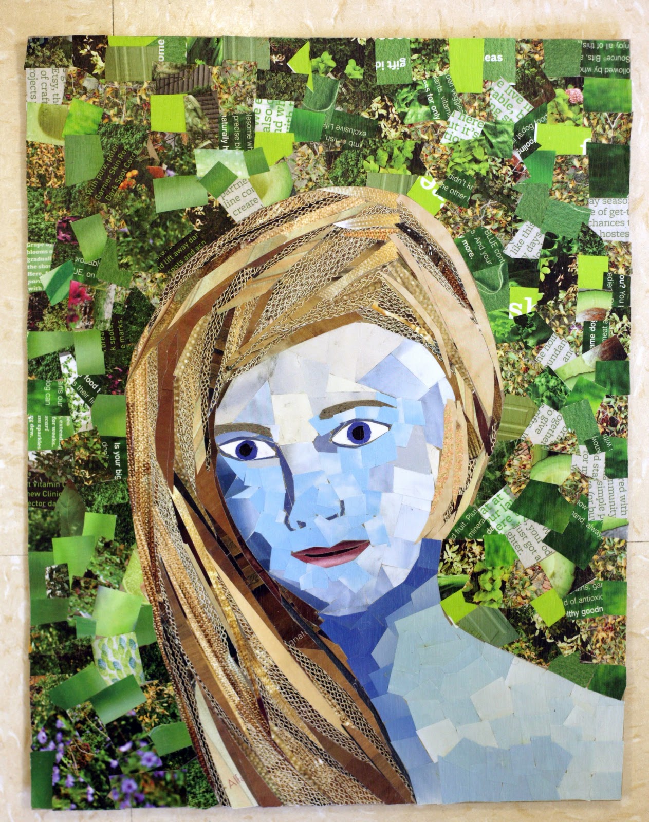
Lesson idea: Junk mail collage portraits

This project idea was not an original one. I saw a version of it first on Princetenol as well as in my Google reader on a popular art blog called Craftzine when they spotlighted artist Sandhi Schimmel Gold and her innovative idea of taking junk mail and turning it into portraits. I think I actually starred the idea in my reader at least two years ago but, as with just about everything that I snag as inspiration, it has been implanted and festering in my brain that this year I finally had to get it out and make it happen.

This project was one of the last ones that I did with my 2D students and I am ridiculously proud of how far they have come as evidenced in the student work you will see below. They demonstrated a real understanding of visual texture and grasp for serious dexterity with regard to their cutting and assembling technique.  They also applied definite knowledge of color theory and each student artist definitely spun their own portrait attempts with very personalized (to them) stylings. Their finished works far exceeded my expectations as well as their own and many of them became more and more serious about their work as they came closer to finishing them and saw how impressive they could be if they only paced themselves and worked carefully.


We used hand-cut (by me) chipboard that I had in our remaining stock from last year and I worked diligently to collect magazines, catalogs, and junk mail from  anyone who would give it to me so that we had a wellspring of paper media to work with. I allowed them the short cut of using graphite transfer paper for the major features of the individuals they picked but they were tasked with making things as 3D as possible with shading and highlighting as well as outlines. Most of them used Xacto-knives to carefully shape and cut their pieces in specific ways and then they used glue sticks to adhere them to their boards. When each piece was finished it was sealed with matte Modge Podge.  A paper clip was hot glued to the back of each piece so it was ready to hang in the student gallery or in the growing personal art galleries in the homes of my talented student artists.
Related Posts Plugin for WordPress, Blogger...